
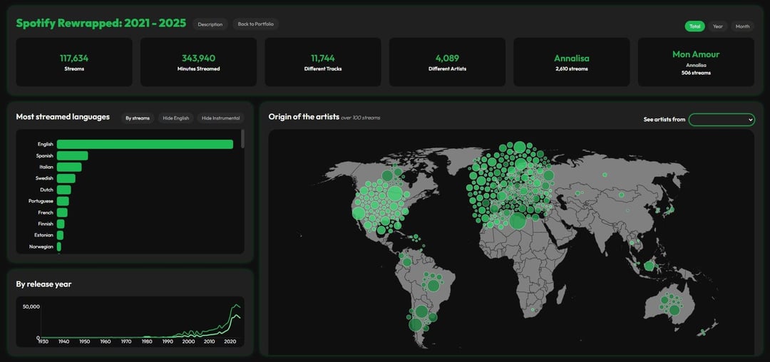
I created a few visualizations using my Spotify streaming history from 2021 to 2025, built with R and Svelte (HTML + JavaScript). The dashboard includes:
-
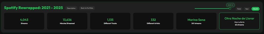
KPI dashboard showing total streams, minutes streamed, top artists, top songs, etc.
-
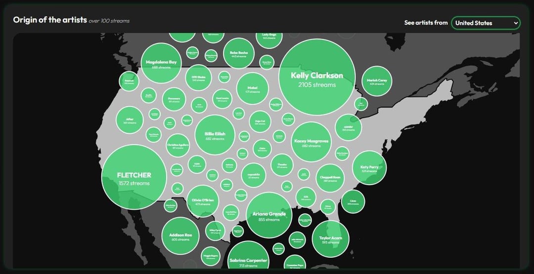
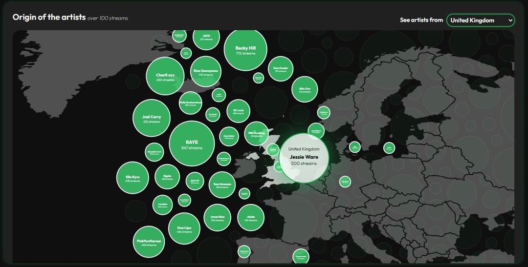
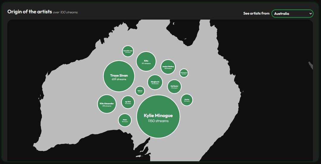
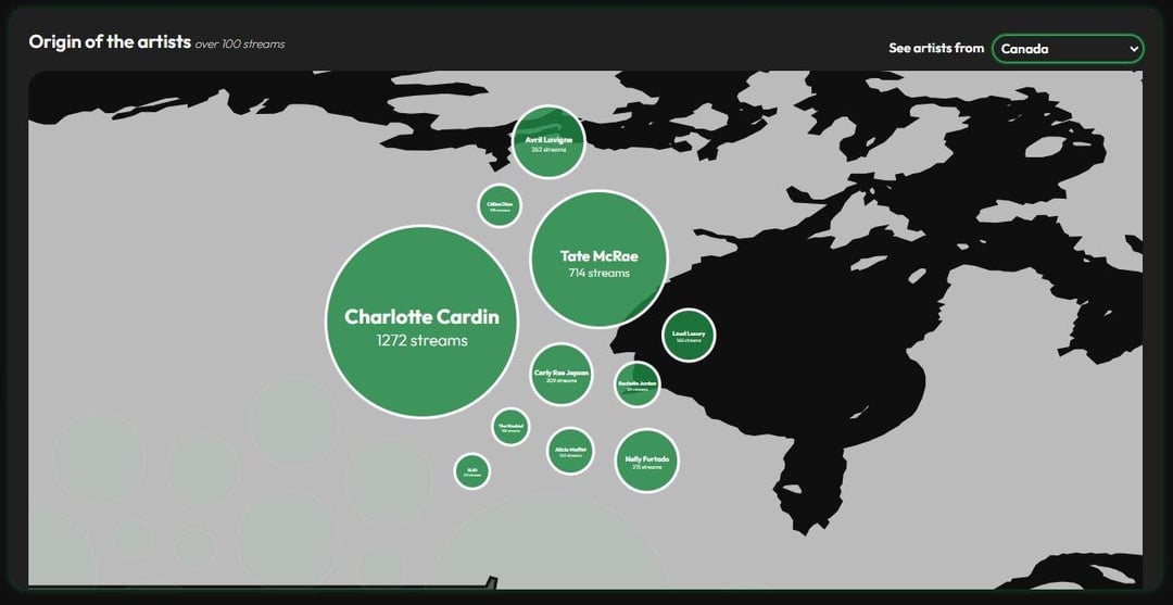
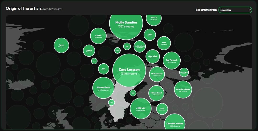
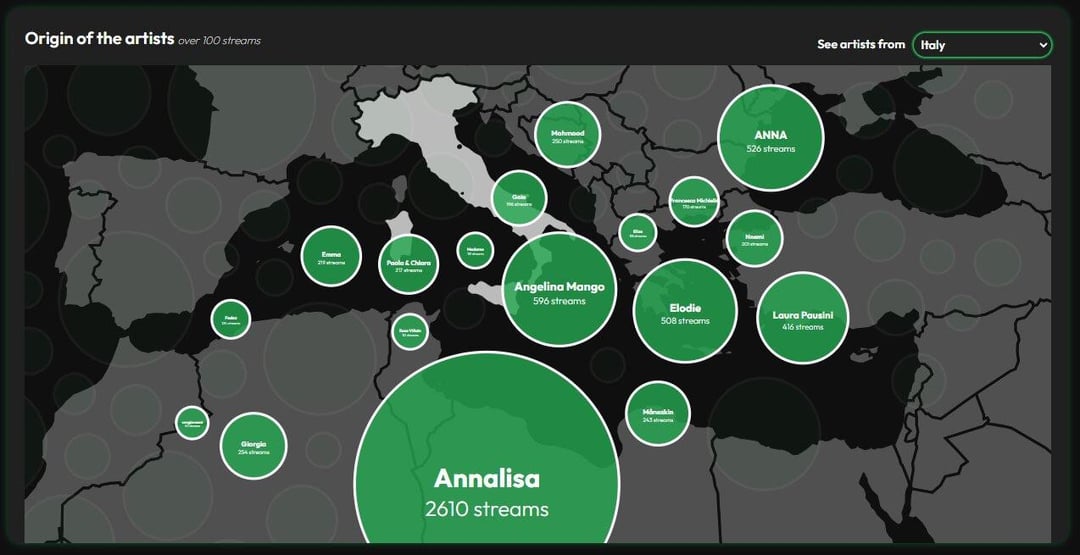
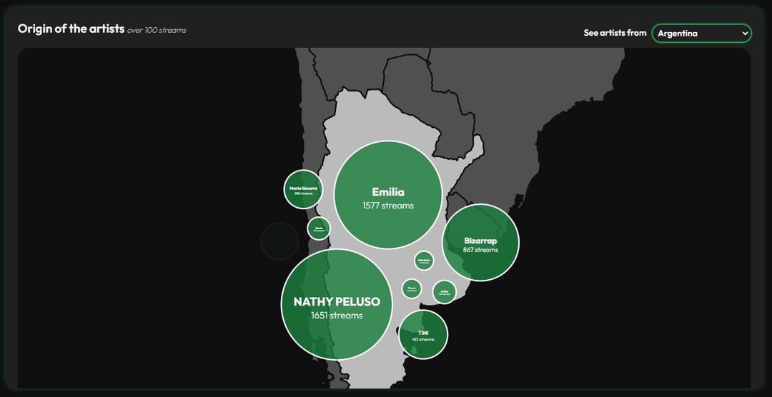
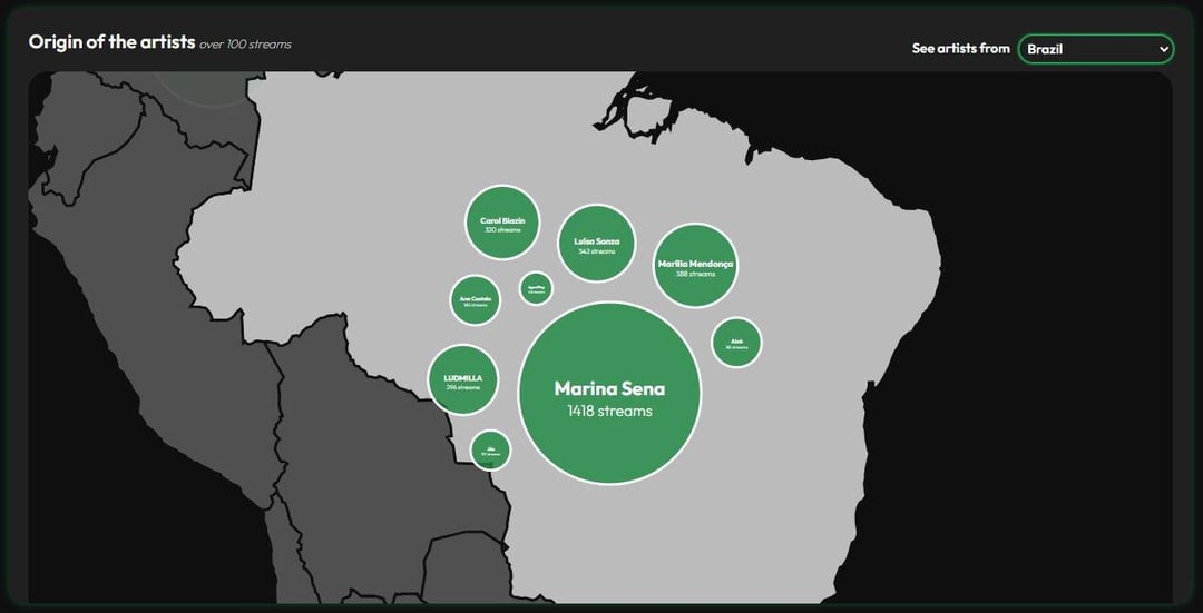
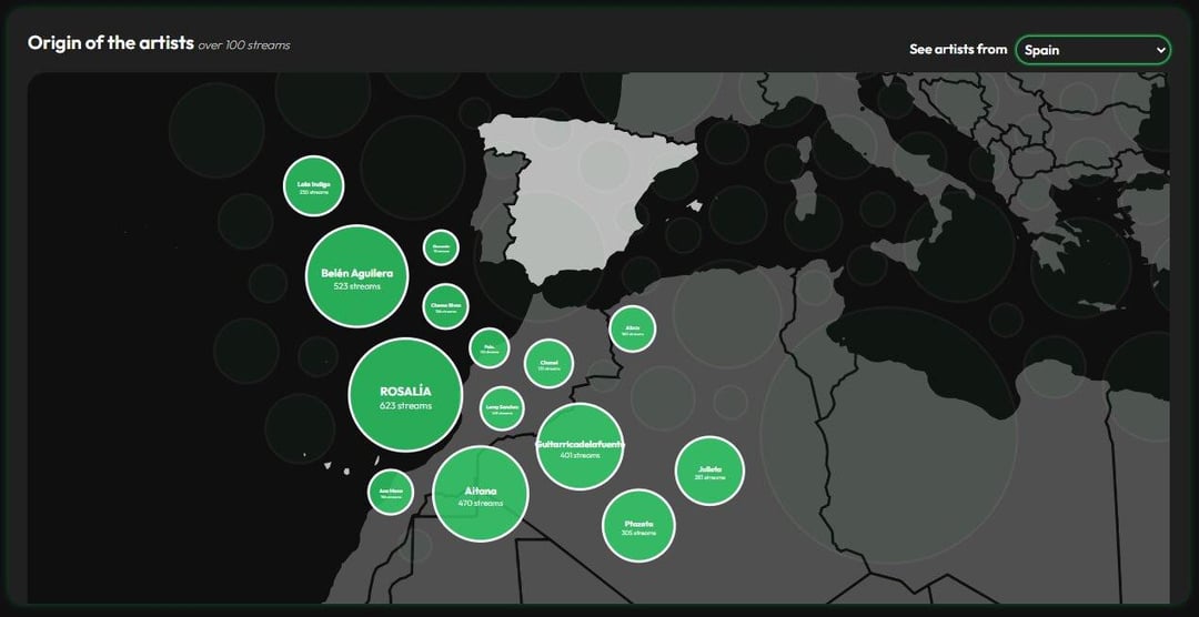
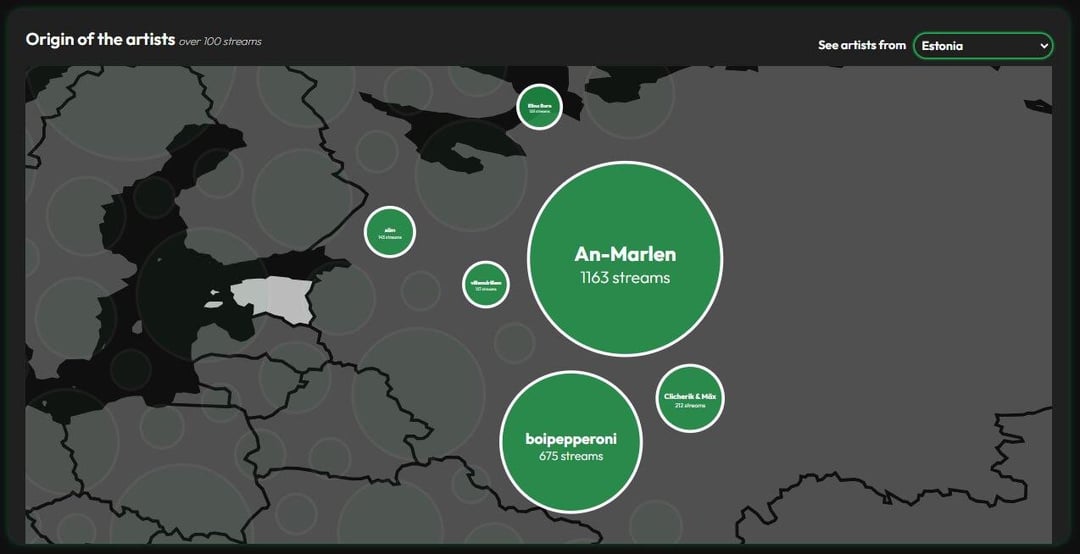
Bubble map showing the origin of artists with more than 100 streams. Users can select a country to view artists from that country.
-
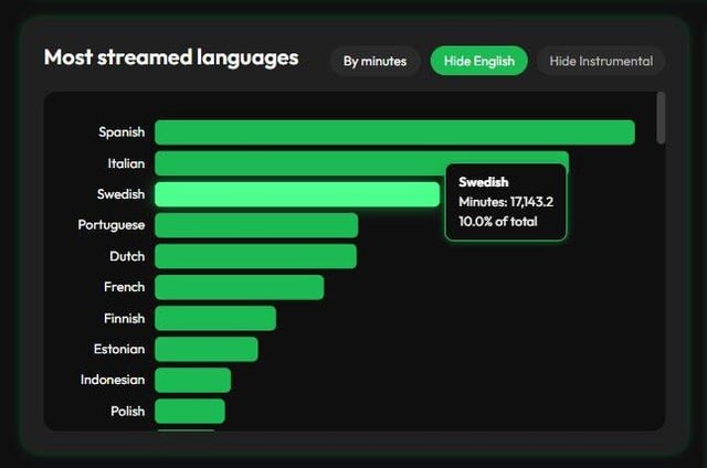
Bar chart showing streams and minutes by language.
-
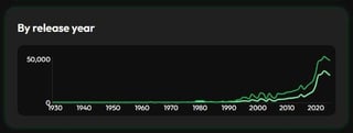
Line chart showing streams and minutes by release year.
I’ve included screenshots for a few notable countries where there are a lot of bubbles. And yes, this is probably the gayest streaming history you’ll ever see 😭 And guess where I’m from!
by armastus98
1 Comment
Data processing: R
Tool: Svelte (HTML + Javascript – D3)