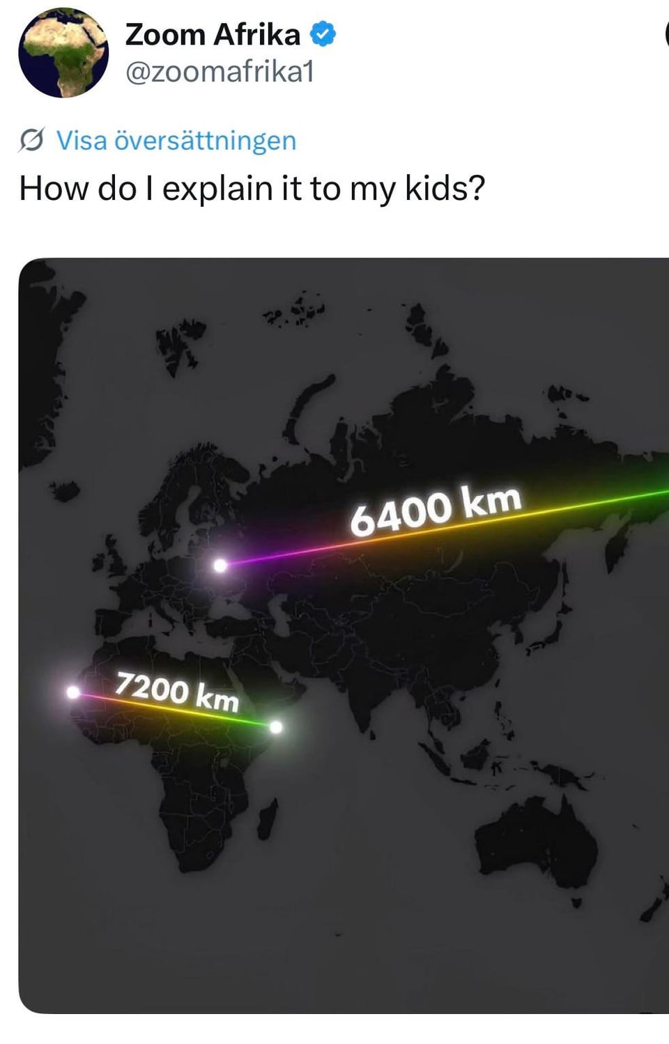
Earth is a ball. It is difficult to bring a round object on a flat surface.
mcabe0131 on
You tell them about map projection by peeling an orange in front of them
tx_nonnative on
Buy a globe…
Formal-Lengthiness24 on
Mercator projection is the answer
TheBlueHedgehog302 on
Theres a few really good videos on youtube explaining why this happens when making a map.
example42 on
In case anyone is missing the facepalm here, the 6400 km line is incorrect. That distance is actually closer to 8900 km.
Busy_slime on
People like this have the right to vote. Never forget this
OddPerspective9833 on
Euclidian geometry is the biggest conspiracy
dumbass_sempervirens on
Show them a globe?
alwaysboopthesnoot on
You show them The West Wing episode S2 Ep 16, with the scene about Mercator vs. Peters projection maps, with the discussion about why this looks the way it does on flat maps that were designed for fitting globes.
EmperorGrinnar on
So many people using big math words and concepts, and I’m just over here doing a Steve Brule cuts.
LeFreeke on
With a globe.
i_am_13th_panic on
You show them a globe? When I was in school they were literally in every classroom.
bronzinorns on
Since when is Russia considered as _West_?
Leprechaun-of-chaos on
As the globe is a sphere (a 3D object) transferring it perfectly to a 2D plane is impossible, therefore cartographers are forced to choose between shape and size, the general consensus is that shape is the most important
T-J_H on
How to explain to kids? Stunningly easy. Get. A. Globe.
MeepersToast on
Get a bag of oranges and start unwrapping. If you want to get fancy, get a sharpie and draw the earth or latitude lines on an orange. Even better, take a peeled orange, lay it on a piece of paper, and fill in the gaps between the peeled parts so it looks more like a projection
changelingcd on
There are so many corrected and alternative projections online: show them to your kids. Look up AuthaGraph or Behrmann projection and go from there. Also, those numbers are wrong.
maddenmcfadden on
i mean, I’m all for teaching children critical thinking skills, but I’m against spreading your stupidity to them in the process.
OneStrangerintheAlps on
The West Wing did an episode about that years ago.
The comment about making European and North American nations bigger to seem more important is true though. That is very much a thing that happens. It’s the same reason the UK is at the centre of maps, because, justified through GMT, the UK being at the centre reinforces its importance and status over everyone else. At this point it’s mostly a tradition thing than a political statement, except that during the Cold War the map exaggerated the “distance” between the USA and the USSR by disconnecting over the Bering Strait.
amigammon on
It’s called a globe. Buy one.
Hatorate90 on
Perfect example of echo chambers. At some point you can’t blame the ignorant, because that is all they know.
Ultranerdgasm94 on
I like the “Guile’s Head” Method.
nixtarx on
I learned about the Mercator projection in the the FIFTH GRADE. In *1982*.
kb7384 on
Check out [The True Size Of…](https://thetruesize.com/) to see size comparisons between countries/continents. Very helpful to understand how wildly we underestimate the size of Africa.
Shifu_Ekim on
Wait till you get to explain the size of the Pacific Ocean
joeljaeggli on
If it’s a flat map winkle-triple and be done with it. You can do worse in some way. Otherwise use a curved projection
Use another map projection. I’d recommend the Waterman butterfly.
Maybe_not_a_chicken on
He’s not wrong
There’s a reason why most maps are centred on Europe and that Africa and Australia are the ones that are made smaller.
ohboyitsgonnabegreat on
Flat earth then into oblivion
iain_1986 on
So many here just going with “projection” ,”peel an orange”
But ironically, without likely realising it, she’s actually right. The projection we known as the common image of
the world *does* give more prominence to the northern hemisphere, especially European countries.
It quite literally is influenced by the geopolitics at the era of navigation.
Africa is literally smaller than it should be because of Europeans at the time.
It’s not just “hur dur, try and draw a globe on paper”
Harmonic_Concord on
The Mercator projection is blatantly wrong
SirPrecision on
Can someone explain this me without being rude lol

36 Comments
Earth is a ball. It is difficult to bring a round object on a flat surface.
You tell them about map projection by peeling an orange in front of them
Buy a globe…
Mercator projection is the answer
Theres a few really good videos on youtube explaining why this happens when making a map.
In case anyone is missing the facepalm here, the 6400 km line is incorrect. That distance is actually closer to 8900 km.
People like this have the right to vote. Never forget this
Euclidian geometry is the biggest conspiracy
Show them a globe?
You show them The West Wing episode S2 Ep 16, with the scene about Mercator vs. Peters projection maps, with the discussion about why this looks the way it does on flat maps that were designed for fitting globes.
So many people using big math words and concepts, and I’m just over here doing a Steve Brule cuts.
With a globe.
You show them a globe? When I was in school they were literally in every classroom.
Since when is Russia considered as _West_?
As the globe is a sphere (a 3D object) transferring it perfectly to a 2D plane is impossible, therefore cartographers are forced to choose between shape and size, the general consensus is that shape is the most important
How to explain to kids? Stunningly easy. Get. A. Globe.
Get a bag of oranges and start unwrapping. If you want to get fancy, get a sharpie and draw the earth or latitude lines on an orange. Even better, take a peeled orange, lay it on a piece of paper, and fill in the gaps between the peeled parts so it looks more like a projection
There are so many corrected and alternative projections online: show them to your kids. Look up AuthaGraph or Behrmann projection and go from there. Also, those numbers are wrong.
i mean, I’m all for teaching children critical thinking skills, but I’m against spreading your stupidity to them in the process.
The West Wing did an episode about that years ago.
https://en.wikipedia.org/wiki/Gall–Peters_projection
The Mercator projection will get you every time!
The comment about making European and North American nations bigger to seem more important is true though. That is very much a thing that happens. It’s the same reason the UK is at the centre of maps, because, justified through GMT, the UK being at the centre reinforces its importance and status over everyone else. At this point it’s mostly a tradition thing than a political statement, except that during the Cold War the map exaggerated the “distance” between the USA and the USSR by disconnecting over the Bering Strait.
It’s called a globe. Buy one.
Perfect example of echo chambers. At some point you can’t blame the ignorant, because that is all they know.
I like the “Guile’s Head” Method.
I learned about the Mercator projection in the the FIFTH GRADE. In *1982*.
Check out [The True Size Of…](https://thetruesize.com/) to see size comparisons between countries/continents. Very helpful to understand how wildly we underestimate the size of Africa.
Wait till you get to explain the size of the Pacific Ocean
If it’s a flat map winkle-triple and be done with it. You can do worse in some way. Otherwise use a curved projection
https://www.reddit.com/r/comics/s/IpwwGry9GU
Use another map projection. I’d recommend the Waterman butterfly.
He’s not wrong
There’s a reason why most maps are centred on Europe and that Africa and Australia are the ones that are made smaller.
Flat earth then into oblivion
So many here just going with “projection” ,”peel an orange”
But ironically, without likely realising it, she’s actually right. The projection we known as the common image of
the world *does* give more prominence to the northern hemisphere, especially European countries.
It quite literally is influenced by the geopolitics at the era of navigation.
Africa is literally smaller than it should be because of Europeans at the time.
It’s not just “hur dur, try and draw a globe on paper”
The Mercator projection is blatantly wrong
Can someone explain this me without being rude lol