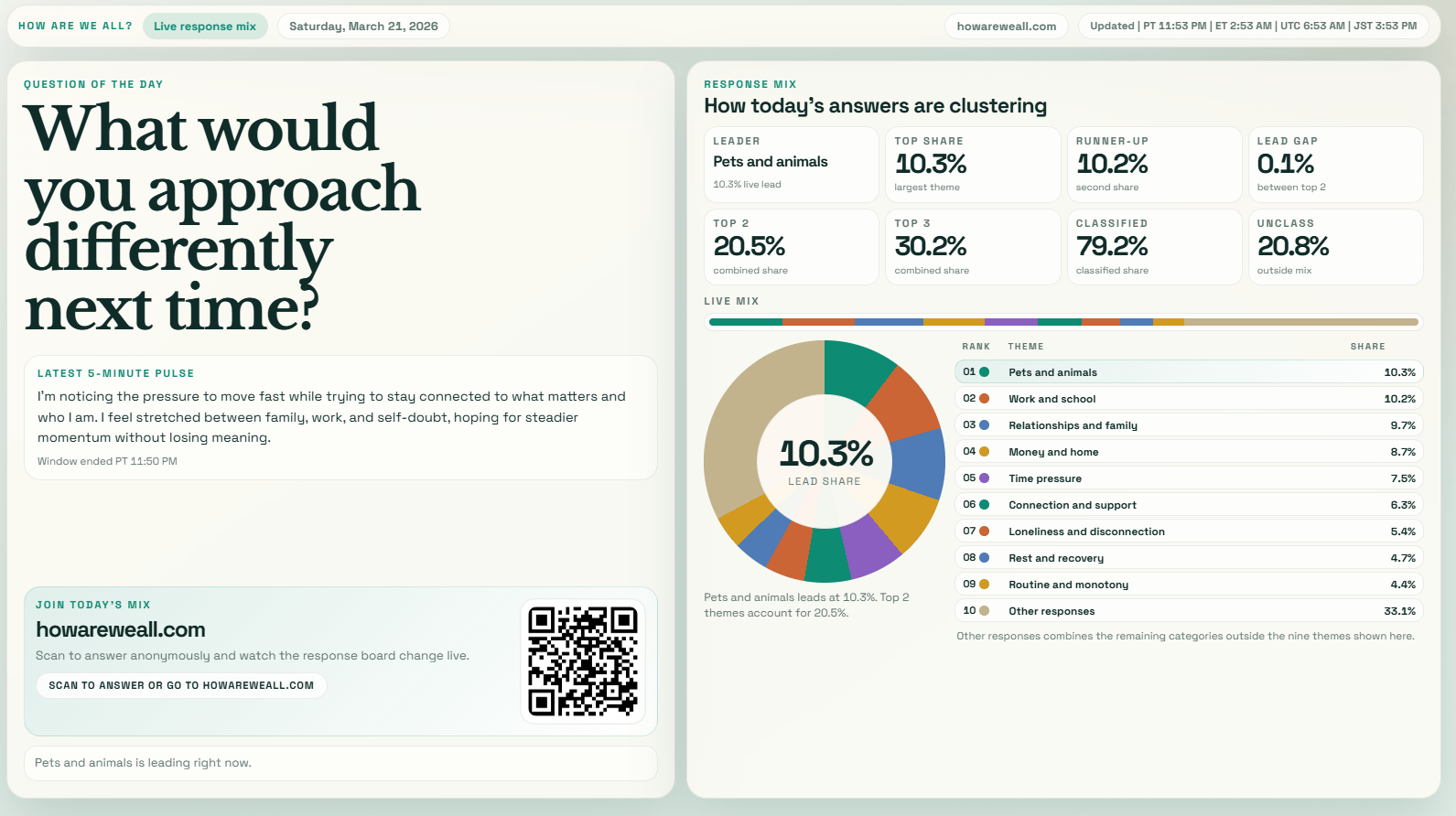
Data source: ~100 anonymous responses submitted to a single daily question
Processing: Responses grouped into themes using a custom clustering approach, then aggregated into percentage shares
Visualization: Generated using a custom web interface (JS) based on the aggregated data
by Another_User_92

2 Comments
It seems that we should interpret this to mean that there aren’t any real trends in what people would approach differently next time.
Those numbers in the top right seem very redundant. The values aren’t attached to the category name… Also what’s unclass? It’s not the same percentage as other responses.