
Outcome of every fixed-rate electricity offer in Ohio since 2019, replayed against the utility default rate, along with variable rate analysis.
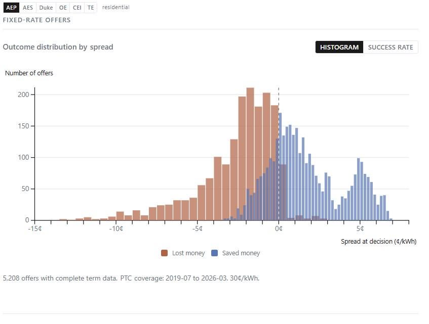
Edit: In Ohio (and other states not analyzed here), you can choose your electricity supplier or stay on the utility's default rate (called the Price to Compare/PTC). This chart replays every fixed-rate offer filed since 2019 against what the default rate actually turned out to be over the offer's full contract term.
The x-axis is the "spread", or how much cheaper (right) or more expensive (left) the offer looked vs. the default rate at the time you would have locked it. The y-axis is how many offers fell at each spread level.
Blue = locking that offer would have saved you money over the full term. Red = it wouldn't have.
The takeaway is that offers that looked like a good deal (right side) almost always were. Offers that looked marginal or bad (left side) usually lost money.
This, and many more interactive visualizations are presented on the site to explore this market. They show, for instance, that the further right an offer started (better fixed-rate deal compared to the default price), the more likely it saved money over the full term. It seems like common sense, but it's good to have data that backs it up.
by thompsonmj
5 Comments
Data source: Public Utilities Commission of Ohio (PUCO) Apples to Apples API (every residential fixed-rate offer filed since 2014) and Ohio utility PTC rate schedules (2019-2026).
Tools: Python, SQLite, Observable Plot. Each unique offer was replayed from its first appearance through its full contract term against the utility default rate (Price to Compare). Blue = the lock saved money overall. Red = it didn’t.
Interactive version with all six Ohio utility territories and many more visualizations: https://safisenergy.org
I don’t think I understand what any of this means unfortunately…
still don’t get it unfortunately
This is a cool analysis! If you’re getting ready for interviews in energy or utilities, being able to talk about this stuff shows you know your market. Make sure you understand how the Price to Compare works and the difference between fixed and variable rates. Interviewers might ask how you’d help a customer choose between offers. I’d also suggest knowing about any regulatory changes since 2019 that could affect future projections. If you need more resources to practice these topics, PracHub has been a solid tool for me when preparing for industry-specific questions.
Charts are meant to be easily digestible. This chart requires a very detailed understanding of the topic.