
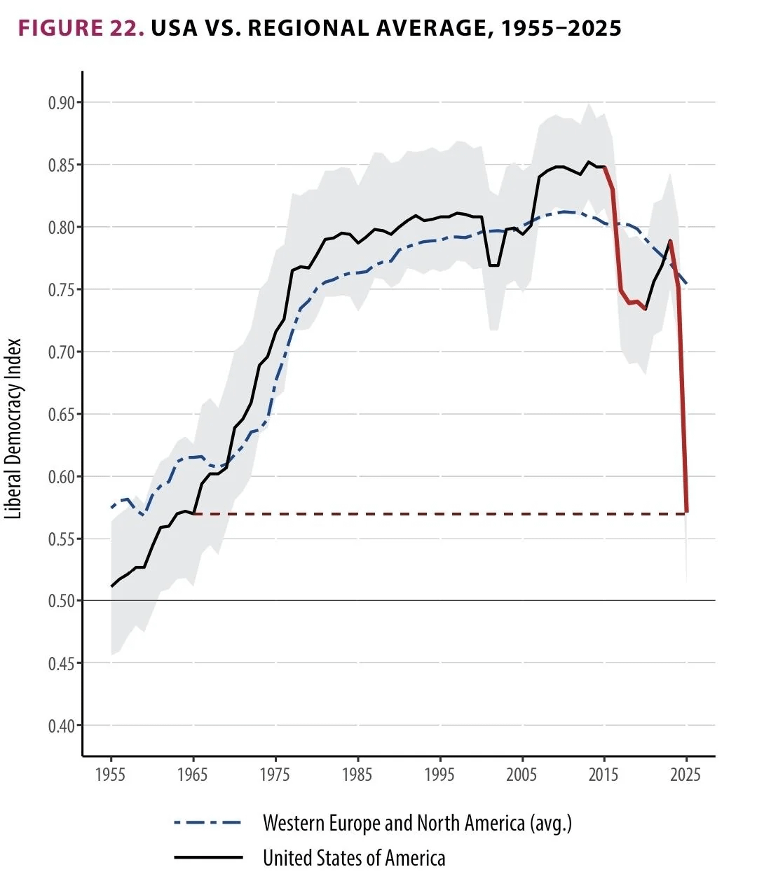
Graph 1 compares the USA to its regional average, Western Europe and North America.
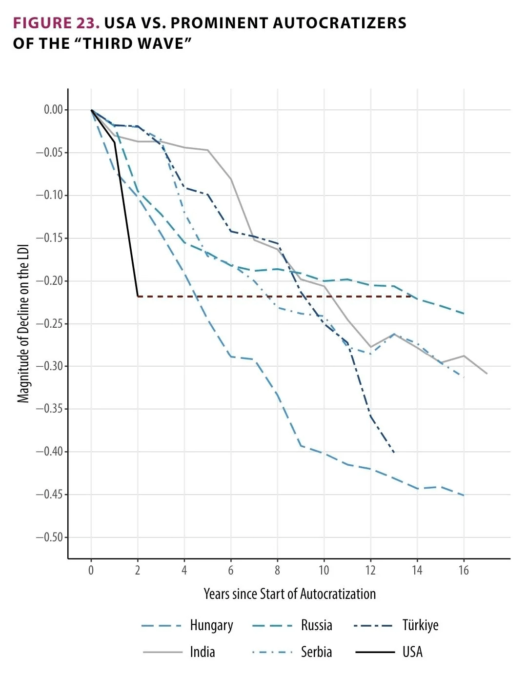
Graph 2 compares the USA to prominent autocratizers of the "third wave" in their autocratization phase. (third wave is just the third wave of autocratization, which has now cancelled out the third wave of democratization that started in 1974)
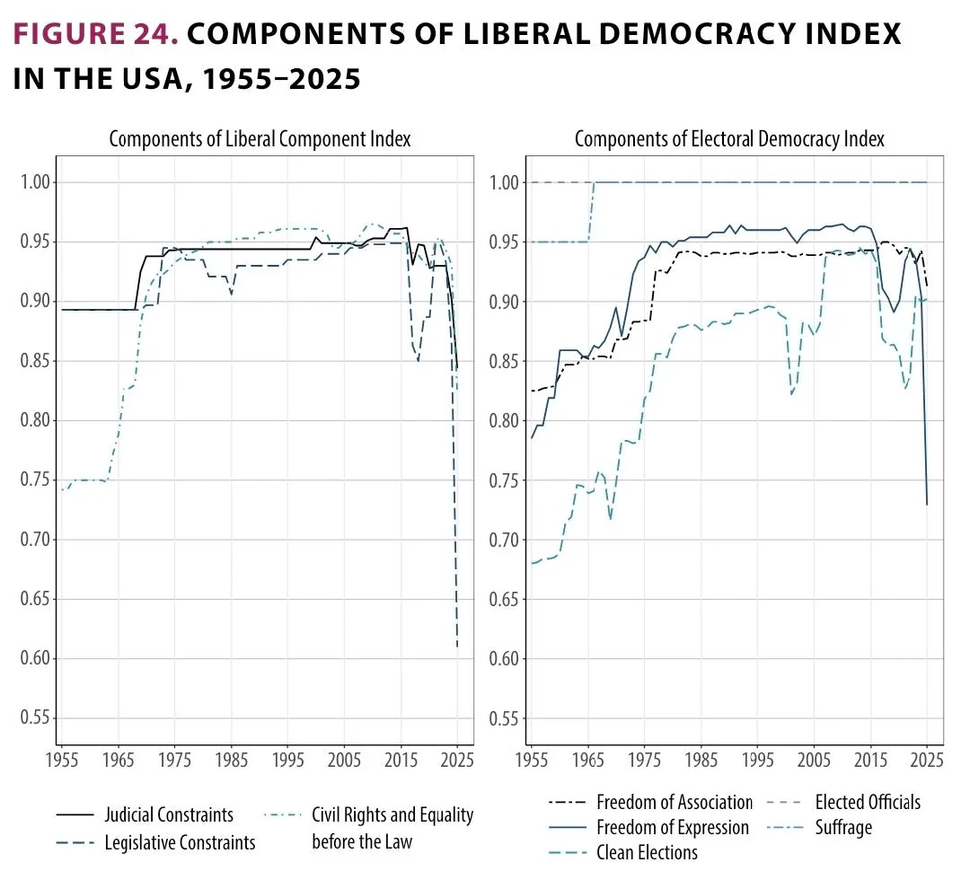
Graph 3.1 shows the development of various liberal democracy indices of the USA.
Graph 3.2 shows the development of various electoral democracy indices.
Source:
DEMOCRACY REPORT 2026 Unraveling The Democratic Era? (V-Dem Institute)
https://www.v-dem.net/documents/75/V-Dem_Institute_Democracy_Report_2026_lowres.pdf
by PresidentZeus
10 Comments
The colours aren’t the best, especially for the middle graph. I believe Hungary is the worst performing line however, and not Russia.
Why use such similar colors? Dark Teal next to Dark Turquoise next to Grey isn’t really conveying data in a “beautiful” way
Abyssmal choice of colors
Nice thank you. And very scary. These midterms are crucial.
Different colours would be great indeed for next time.
Nice thank you. And very scary. These midterms are crucial.
Different colours would be great indeed for next time.
The second image should probably include what year is the baseline for each country. I *think* it’s trying to say the USA is as more authoritarian in 2026 vs 2024 as Russia was in 2005 vs 1991, but it could just as easily be 1931 vs 1917.
However, it’s a weird comparison to make in general since the authoritarian scale is seemingly not normalized to be linear.
Can some one help me understand what this data means, practically? ELI5
Add a slide of countries that recovered, so that I have some hope. 🙁
Hmm, I wonder what happened during those specific dips from 2015-2020 and after 2025?
Global Righting from Brown Shirts Messages emissions.
Can’t wait for the policy transition.
As always, getting rid of the fossils should be a priority.