
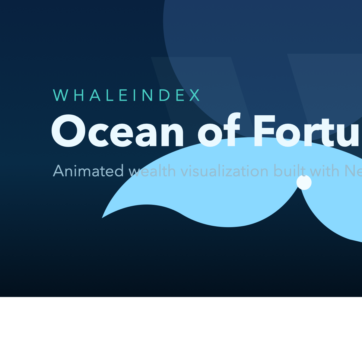
I built an interactive visualization of the Bloomberg Billionaires Index where each billionaire is represented as a sea creature in a scrollable ocean:
- Fish → smaller fortunes
- Sharks → large fortunes
- Whales → the ultra-rich
You scroll down to dive deeper — the largest fortunes sit at the bottom. You can hover for details, click to pin a fortune card, and filter by country or sector.
Link: https://whaleindex.vercel.app
Data source: Bloomberg Billionaires Index (March 2026)
Tools: Next.js 15, PixiJS 8 (WebGL canvas rendering), Vercel for hosting. Creatures are procedurally generated using Graphics primitives — no images or sprites. Development was heavily assisted by Claude Code (AI coding tool).
I'd love feedback on the visualization itself — does mapping wealth to creature size and ocean depth make the scale of these fortunes easier to grasp? Anything you'd change about the data presentation or readability?
by albertsimondev
1 Comment
Fun concept, very hard to use on mobile. You should really be testing everything you build on mobile if you’re serious about people using it.
For a fun little vibe-coded app, though? It’s cute.