
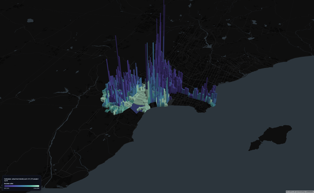
Data: ACS 2023 5-year estimates from the U.S. Census Bureau for tract population (B01003_001E) and median household income (B19013_001E): https://api.census.gov/data/2023/acs/acs5; 2023 Census tract boundaries from TIGER/Line: https://www2.census.gov/geo/tiger/TIGER2023/TRACT/; Los Angeles city boundary from TIGER/Line places: https://www2.census.gov/geo/tiger/TIGER2023/PLACE/
Tools: I pulled 2023 ACS tract-level population and median household income for Los Angeles County, clipped the tract geometries to Los Angeles City, and computed tract density from population divided by tract land area. The 3D map was built in Python with GeoPandas and pydeck/deck.gl, using tract height for population density and a color ramp for median household income.
This map shows Los Angeles city census tracts in 3D. Taller tracts are denser; color shifts from purple to teal as median household income rises. The effect is to show how density and income are distributed across the city at the tract level rather than by neighborhood averages, so you can see both broad regional patterns and sharp local contrasts.
If anyone wants the Git I can share it.
by Live-Fan-7661
1 Comment
Cool visualization! not surprising that higher income goes along with lower density but that is quite stark. Two subjective comments- is there a reason the map is so zoomed out when no data is being presented for much of the area in black? And the legend is too small to read, particularly on mobile devices.