
Source: U.S. Census Bureau state-to-state migration tables, using annual data from 2021-2024: https://www.census.gov/data/tables/time-series/demo/geographic-mobility/state-to-state-migration.html
Tools: Python for data prep, JavaScript/D3 with HTML/CSS for the choropleth design, and Playwright/Chromium for the high-resolution PNG export.
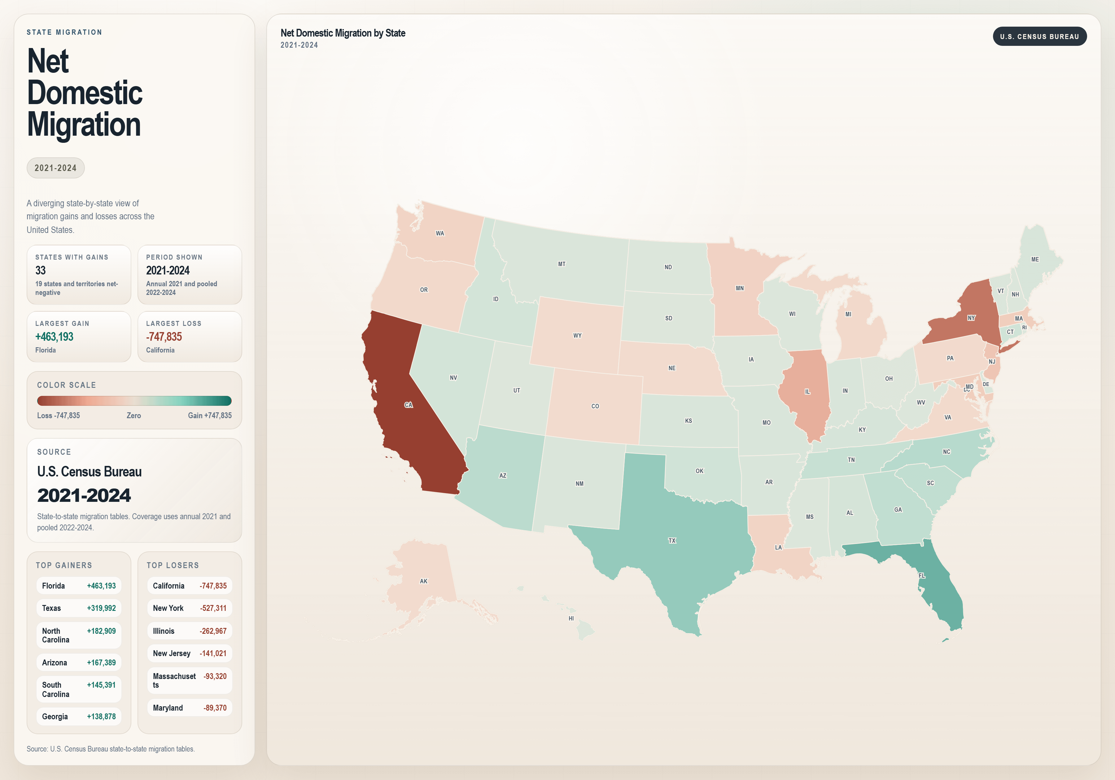
Method: I calculated net domestic migration for each state as inflows from other U.S. states minus outflows to other U.S. states, then mapped the result on a choropleth. Positive values indicate net gains and negative values indicate net losses. The side panel highlights the largest gains and losses over the period.
If helpful, the interactive version is here: https://willsigal.github.io/state-migration-analysis/migration_flow_3d.html
by Live-Fan-7661
20 Comments
Y’all need to show this as a percentage since CA losing people when they have a lot of people doesn’t really mean squat in the big picture. Showing absolute numbers makes it look much larger than it is. Also it doesn’t show that the outmigration from CA recovered in the last two or three years and population is back to increasing. S
Interesting, it’s damn near 1:1 map for majority political party. Really gets the noggin’ joggin’.
It would make far more sense if you showed per capita data. Raw numbers don’t really paint a clear picture.
I wonder what the migration amounts would be relative to age? A lot of the top gainers are your typical retirement states such as Florida, Arizona, and South Carolina, for example.
Every day I thank god I don’t live in Florida
California has had a net negative domestic migration for decades but typically still has net positive total population change from migration due to international migration into California.
Further proof that a lot of Americans will put up with all kinds of political shit as long as they can buy a cheap, big-ass house.
As someone who’s lived in TX all my life – y’all should go back to CA.
Ah not done per capita,
Shocker all the largest movements happening in the largest 5 states.
Poorly analyzed. Why is California more important than several other states that add up to the same total population?
All you told us is which states have large populations and whether they’re growing or shrinking: CA, NY, IL vs. FL, TX. The migration could be insignificant or a huge concern and we’d never know from this mess.
Everytime post like this got posted, there would be tons of people defending California, but i havent seen anyone defending NY.
Do we have data for 2025? I am curious how many people who moved to TX and go for tax purposes started moving out in the last few years
Funny because according to Reddit Texas and Florida are shitholes but the data shows people from left-leaning states are moving there in droves.
Whatever Reddit says, assume the opposite is correct
I don’t understand why folx would be moving out of safe democrat states and into facist (republiKKKan) dictatorships. Are they being secretly converted into republiKKKans? That doesn’t seem legal, how do we prevent them from leaving?
Wonder when people are going to get tired of posting the “during covid people realized they could get away with WFH and moved from expensive successful cities and coastal areas to LCOL and warmer areas” map
The top gainers/losers is opposite of what you’d believe if you read r/SameGrassButGreener
How many people vote for the people and policies of the majority political party in one state, only to flee the policies of that state, and then move to a new state and vote the same way all over again? What you created you didn’t like, and then fled, only to help recreate it in a new place. That makes zero sense. Learn from your mistakes.
Why do I suspect if this showed net migration from red states to blue states none of these commenters would care about per capita or not?
Also, this data is drastically changing in recent years. 2021 to 2024 is a really weird time period to choose.
This combined with the lack of % changes shows that this is just lying with statistics.
Now do by % of state population.