That means very little, sorry. London will have factually the most churches because of its total population but is one of the less Christian areas (that includes atheists too before someone says something stupid). You could compare active churches by 1000 pop or something although the definition of active is complex in that case.
hellohello1234545 on
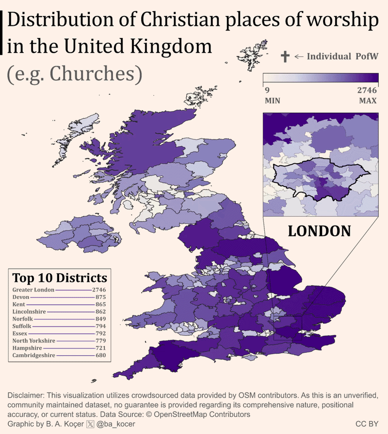
Great visualisation. Very neat, and I like the zoom-in on London.
Some people are critiquing it for not adjusting for population size
Not all visualisation is meant to prove a point, or be surprising. There’s value to just displaying the raw information, which this does well.
And even showing where the population is, is still useful. For someone not familiar with the UK, this tells them that fewer people live in the north, presumably.
Then, the later images that are adjusted for population size have more context.
kam1802 on
Now add distribution of pubs for comparison.
Palladan on
This is eye-opening. I’m from Southend, and I thought every big town had a synagogue. Thought it was just a normal thing.
No-Lunch4249 on
This is really amazing data and clean visualization with the animation, but I do agree that right now it’s just a proxy for population density.
ELRmapper on
This isn’t accurate, there are definitely more mosques than this.
I know there’s a mosque missing from east Hertfordshire (Herts & Essex Mosque) thats been established for at least 10 years.
Cool concept but bad data – for example this is suggesting there no are mosques in Cornwall – again can find one on google immediately.

8 Comments
High resolution
https://preview.redd.it/z5b6eanrxkog1.png?width=3921&format=png&auto=webp&s=3967adb1a65d418f0bebc6bc2c8e568e41ac00b9
I dunno, it’s a ‘people live in cities’ map.
That means very little, sorry. London will have factually the most churches because of its total population but is one of the less Christian areas (that includes atheists too before someone says something stupid). You could compare active churches by 1000 pop or something although the definition of active is complex in that case.
Great visualisation. Very neat, and I like the zoom-in on London.
Some people are critiquing it for not adjusting for population size
Not all visualisation is meant to prove a point, or be surprising. There’s value to just displaying the raw information, which this does well.
And even showing where the population is, is still useful. For someone not familiar with the UK, this tells them that fewer people live in the north, presumably.
Then, the later images that are adjusted for population size have more context.
Now add distribution of pubs for comparison.
This is eye-opening. I’m from Southend, and I thought every big town had a synagogue. Thought it was just a normal thing.
This is really amazing data and clean visualization with the animation, but I do agree that right now it’s just a proxy for population density.
This isn’t accurate, there are definitely more mosques than this.
I know there’s a mosque missing from east Hertfordshire (Herts & Essex Mosque) thats been established for at least 10 years.
Cool concept but bad data – for example this is suggesting there no are mosques in Cornwall – again can find one on google immediately.