
I was honestly surprised our agent could do this.
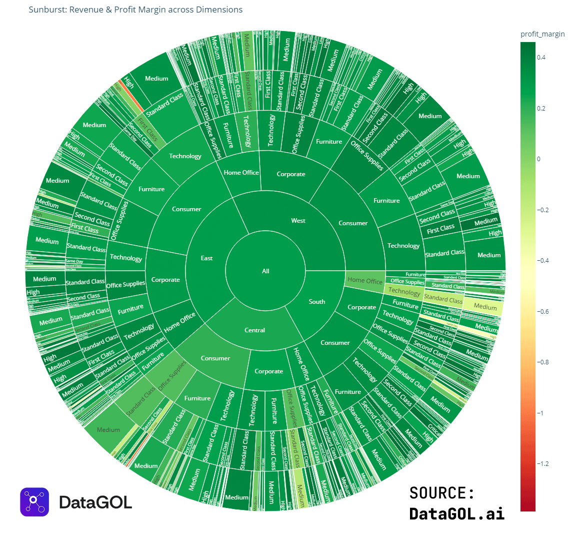
We asked it to visualize the relationship between profit margin and shipping/discount costs to surface what’s actually profitable at the SKU level.
Seeing the trade-offs visually makes it much easier to understand where margin is being lost. To show which customer segments and regions appear healthy on revenue but fragile on profit or delivery performance.
We are looking at skipping cost (they vary between regions, main item sub-type, and discount offered, it was same for everything)
Curious what people think.
Created via DataGOL.ai Data Science Agent
by Ok_Technician_4634
5 Comments
A Chart is ment to visualise complex data to make it understandable and more readable.
If you have to ask that question the Chart isn’t doing its job.
From a visualization perspective, it conveys that whatever this is, it is overwhelmingly green category.
It is unfortunate it chose a red-green color palette, because red-green colorblindness is a thing.
If one were interested in the brighter reds and yellows, you might just as well turn green to white (or black, to make the color pop more).
I personally wouldn’t visualize ANYTHING with a sunburst chart, especially one with this many levels. Trying to visually compare any two data points is virtually impossible, finding the largest or smallest is virtually impossible, literally the only thing this tells me is, “Almost everything is green.” This would have been better shown in a table.
I don’t even know the data you’re trying to present tbh.
I don’t find it super helpful because although sections are labeled, there’s no definition of category for them.
East of what?
What’s critical?
What’s second class?