
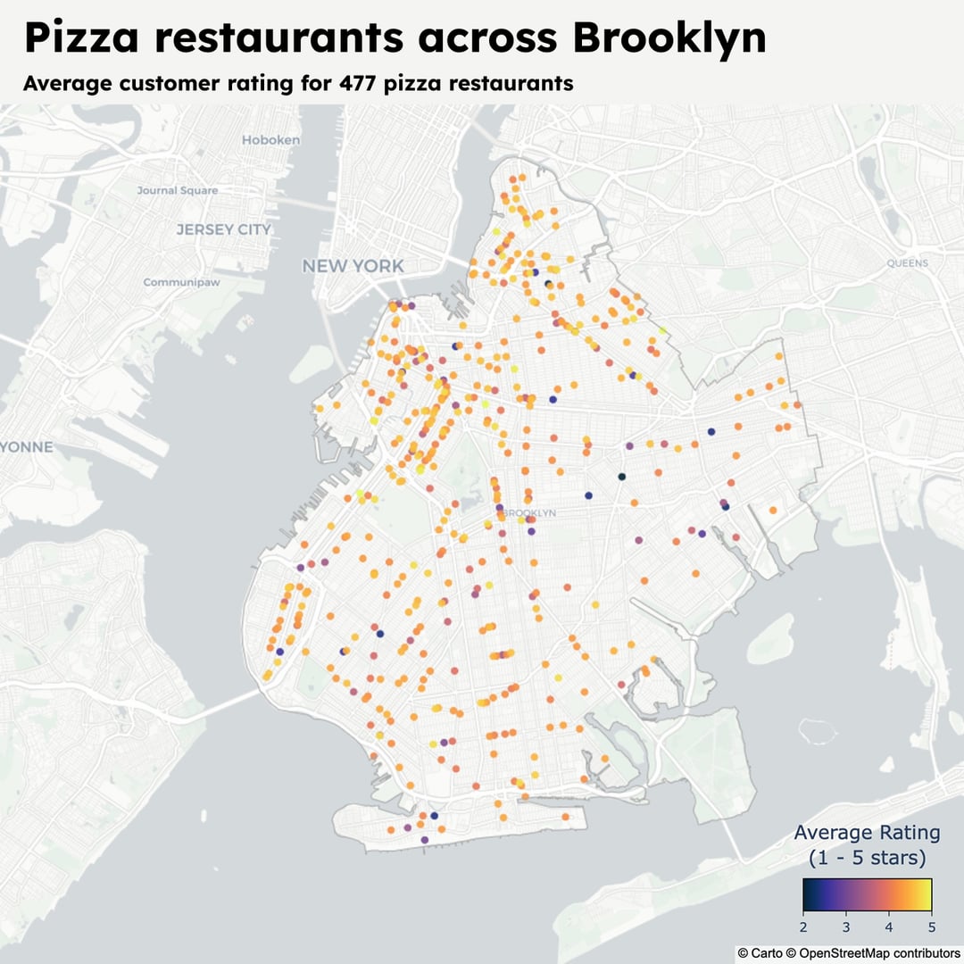
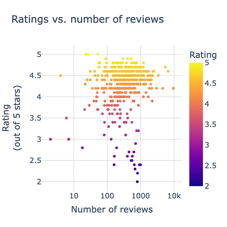
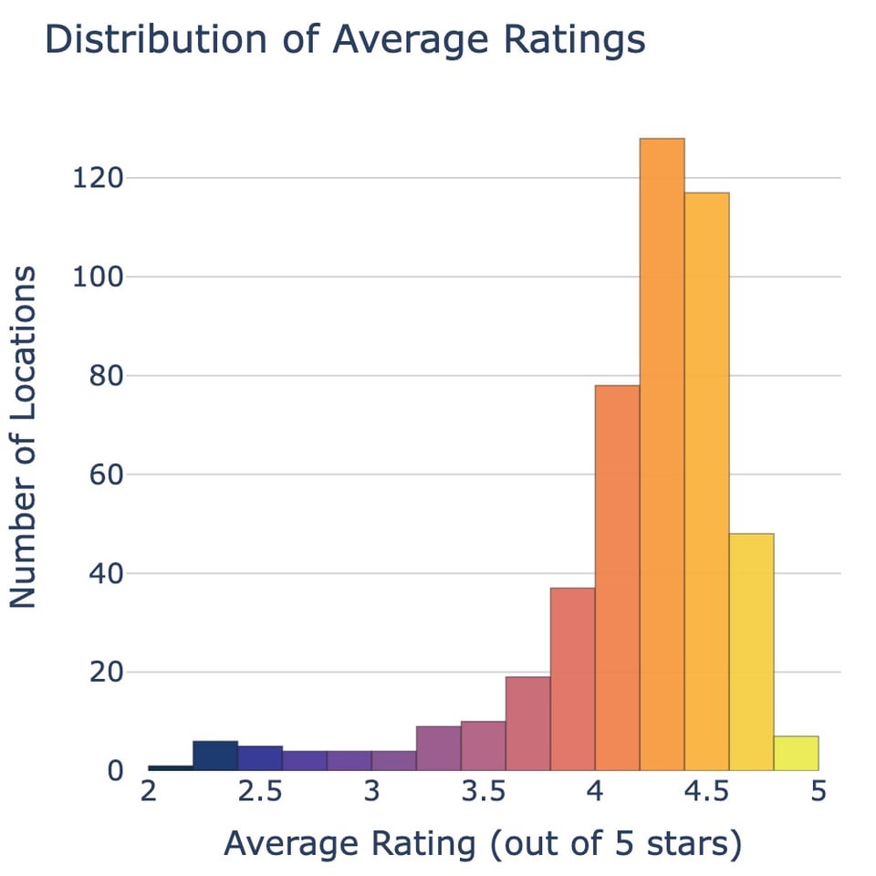
I fetched all the data from the Google Maps API (2026), and visualized it using Python and Plotly. You can read more about it and the code I used to get the data and visualize it here: https://www.memolli.com/blog/top-pizza-places-brooklyn/
by Alive-Song3042
1 Comment
Nice. Since the vast majority seem to be rated >4, feels like this needs a greater visual range between 4 and 5 otherwise they all blend together. Maybe make <3.5 one end of the range?