
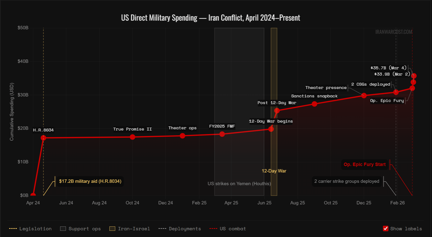
Posted an earlier version of this before and got some great feedback (especially u/ryeballs – thanks!). Hope this is looking better now. I added a legend, labels, and made the chart start at zero to improve the sense of scale. Let me know what you think. I've also got some more data on the site where I'm tracking the Iran war cost: http://iranwarcost.com/
the site is open source, so if you see a mistake or have an idea for improvement, feel free to contribute.
by koverda
2 Comments
Please emphasize in the graph headline that this tracks an estimated us direct spending
Do we really need to spending this much money fighting a war for Israel?