
here's the methodology and sources so we're all on the same page:
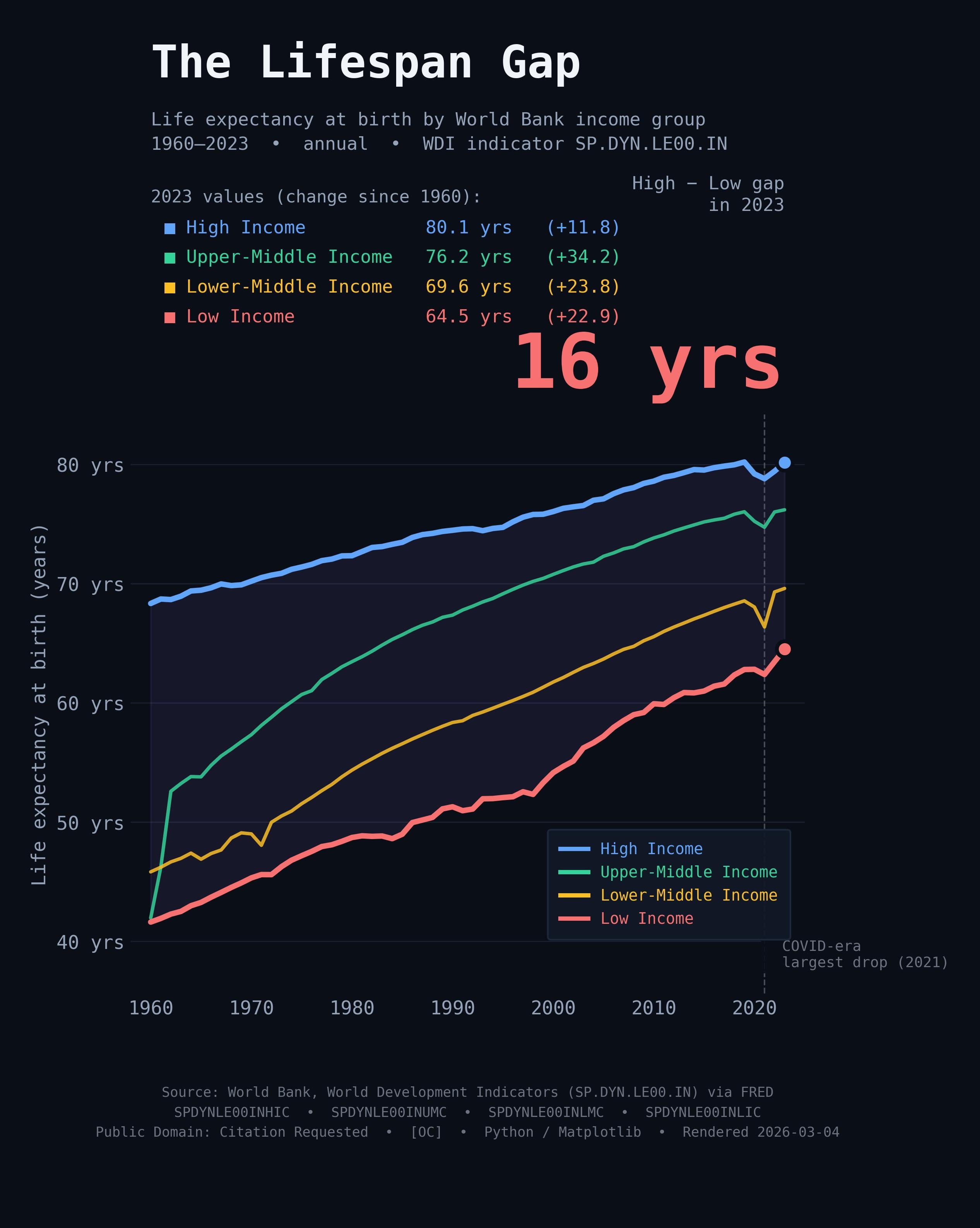
Four World Bank income-group series (life expectancy at birth) pulled
live from FRED at render time. Zero hand-entered numbers.
Series (annual, 1960–2023, not seasonally adjusted):
• SPDYNLE00INHIC — High Income
• SPDYNLE00INUMC — Upper-Middle Income
• SPDYNLE00INLMC — Lower-Middle Income
• SPDYNLE00INLIC — Low Income
The shaded band is the gap between High and Low income groups.
The dashed line marks the largest single-year drop in the cross-group average (data-driven, not manually placed).
Caveats:
• These are World Bank income-group aggregates — countries move between
groups over time, so group composition is not static.
• Within-group variation is large (e.g. not all "Low Income" countries
are the same).
• Life expectancy at birth is a period measure; it reflects current
mortality rates, not a prediction of actual lifespan for anyone born today.
Sources (Public Domain — Citation Requested):
https://fred.stlouisfed.org/series/SPDYNLE00INHIC
https://fred.stlouisfed.org/series/SPDYNLE00INUMC
https://fred.stlouisfed.org/series/SPDYNLE00INLMC
https://fred.stlouisfed.org/series/SPDYNLE00INLIC
by godot_lover