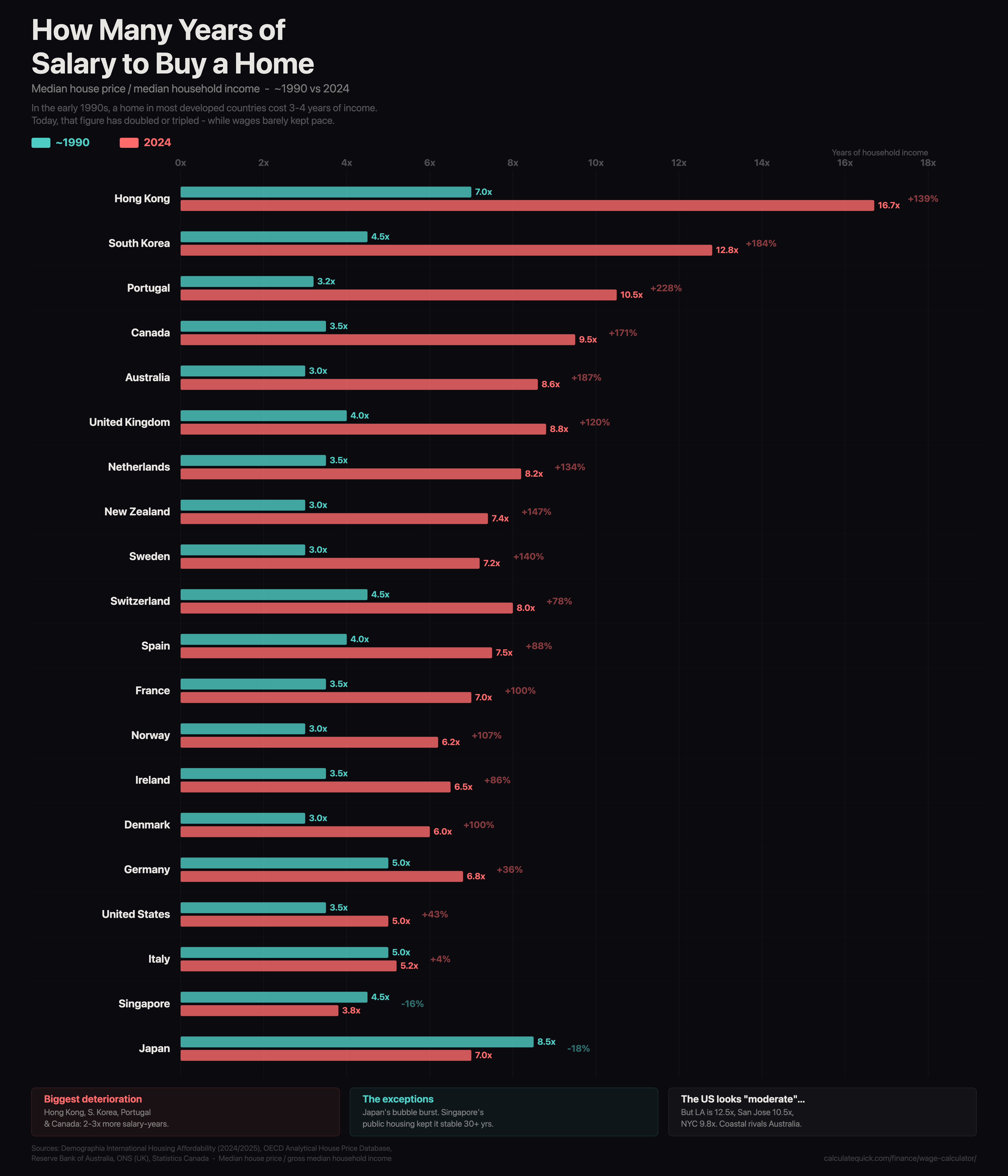
**Source**: [CalculateQuick](https://calculatequick.com/finance/wage-calculator/) (Visualisation), Demographia International Housing Affordability (2024/2025), OECD Analytical House Price Database. Median house price divided by gross median household income.
**Tools**: JavaScript/Canvas.
exomeme on
Is this normalized for Single Family Homes vs condos?
…eg, the proportion of buys for each may vary over time.
StanknBeans on
Am Canadian. Must be lucky because the 1990’s 3.5x is pretty bang on for me.
themodgepodge on
Is “house” here specifically a single-family detached home? i.e. could results be partially affected by some parts of the world having very few SF detached homes compared to apartments, terraced houses, etc.?
Some countries on this list have heavily developed high-rise or attached residential buildings over the period in the graphic, but not much detached. I’m curious how much detached homes becoming rarer affects their price vs. other options.
szhod on
US is fourth last but always whining the most.
Judge_Merek on
Is it worth noting Hong Kong was under the UK until 1997? Not sure if that factors
Looking-for-42 on
If only I were able to spend my complete salary only for my house…
Evil_Merlin on
The US looks moderate? It’s the 4th from the bottom. Which means there are 16 nations rated worse, and 3 better…
noonearya on
No way Portugal is correct.. it’s much much more
KnotSoSalty on
Why aren’t India and China on this list?
BuvantduPotatoSpirit on
Bad news for people who save up 100% of the purchase price before buying a house.
JustAMarriedGuy on
I’m a boomer and I bought my house for $10
poloc-h on
with aging population is western Europe en route for a Japanese scenario
flame_work on
Wait for a few decades. Due to fertility rate i’ll be easier, like Jpn 🙁
Auspectress on
Why only most top advanced economies? What about places like Poland, Egypt, Brazil, etc? Except Spain all countries are in top 5% most advanced economies with GDP per capita being at min 4x that of wold average.
Difficult to take any conclusion from this graph with this low amount of data and at very specific criteria that won’t show bigger picture
ketosoy on
Isnt this seriously confounded by “do the poorer residents buy or rent”
Moist_Farmer3548 on
Would be better if it was ordered by multiple in 2024. I’m not sure what you have used for ordering it, but it makes comparison a little more difficult.
Dracogame on
Italy is deceptive. Cities where people actually want to live the prices skyrocketed. But there’s a lot of small towns in the middle of nowhere where prices went down.
PuffyPanda200 on
If Shanghai was on this it would be at around 37, more than double the hong Kong number.
Chinese house prices are crazy.
Additional_Luck_1508 on
I misread this as “years of slavery”
Candid_Cat_5921 on
Japan’s drop makes sense because their population is plummeting, especially the younger generations. So there a lot less demand than supply now.
With the falling birthrates and reduced immigration in the US, I wouldn’t be surprised if we start seeing a big drop over the next 5 years here too. The signs are already slightly visible as you look at the number of homes up for sale compared to those that sell. Sellers and agents just aren’t willing to accept the reality, so instead of dropping the prices majorly, they just let the houses sit on the market for months and months before pulling them.
Difficult-Cricket541 on
so its not just the US. its most of the developed world. only place that is the opposite is China. The government built so many apartments they had to blow them up. No one would buy it. the thought is that it was corruption and creating jobs. However, if you look at chinese apartments they are small, cheaply made, and ugly. virtually no one has an actual single family home. too many people. most people in cities live in 50 story towers in tiny and ugly apartments.
sithelephant on
You can’t quite do this and have a very valid graph that means what it appears to on the title.
Subtracting off from income (I assume that it’s post-tax income) unavoidable costs for 99% of people, such as food, heating, … makes today look more affordable than it is.

23 Comments
**Source**: [CalculateQuick](https://calculatequick.com/finance/wage-calculator/) (Visualisation), Demographia International Housing Affordability (2024/2025), OECD Analytical House Price Database. Median house price divided by gross median household income.
**Tools**: JavaScript/Canvas.
Is this normalized for Single Family Homes vs condos?
…eg, the proportion of buys for each may vary over time.
Am Canadian. Must be lucky because the 1990’s 3.5x is pretty bang on for me.
Is “house” here specifically a single-family detached home? i.e. could results be partially affected by some parts of the world having very few SF detached homes compared to apartments, terraced houses, etc.?
Some countries on this list have heavily developed high-rise or attached residential buildings over the period in the graphic, but not much detached. I’m curious how much detached homes becoming rarer affects their price vs. other options.
US is fourth last but always whining the most.
Is it worth noting Hong Kong was under the UK until 1997? Not sure if that factors
If only I were able to spend my complete salary only for my house…
The US looks moderate? It’s the 4th from the bottom. Which means there are 16 nations rated worse, and 3 better…
No way Portugal is correct.. it’s much much more
Why aren’t India and China on this list?
Bad news for people who save up 100% of the purchase price before buying a house.
I’m a boomer and I bought my house for $10
with aging population is western Europe en route for a Japanese scenario
Wait for a few decades. Due to fertility rate i’ll be easier, like Jpn 🙁
Why only most top advanced economies? What about places like Poland, Egypt, Brazil, etc? Except Spain all countries are in top 5% most advanced economies with GDP per capita being at min 4x that of wold average.
Difficult to take any conclusion from this graph with this low amount of data and at very specific criteria that won’t show bigger picture
Isnt this seriously confounded by “do the poorer residents buy or rent”
Would be better if it was ordered by multiple in 2024. I’m not sure what you have used for ordering it, but it makes comparison a little more difficult.
Italy is deceptive. Cities where people actually want to live the prices skyrocketed. But there’s a lot of small towns in the middle of nowhere where prices went down.
If Shanghai was on this it would be at around 37, more than double the hong Kong number.
Chinese house prices are crazy.
I misread this as “years of slavery”
Japan’s drop makes sense because their population is plummeting, especially the younger generations. So there a lot less demand than supply now.
With the falling birthrates and reduced immigration in the US, I wouldn’t be surprised if we start seeing a big drop over the next 5 years here too. The signs are already slightly visible as you look at the number of homes up for sale compared to those that sell. Sellers and agents just aren’t willing to accept the reality, so instead of dropping the prices majorly, they just let the houses sit on the market for months and months before pulling them.
so its not just the US. its most of the developed world. only place that is the opposite is China. The government built so many apartments they had to blow them up. No one would buy it. the thought is that it was corruption and creating jobs. However, if you look at chinese apartments they are small, cheaply made, and ugly. virtually no one has an actual single family home. too many people. most people in cities live in 50 story towers in tiny and ugly apartments.
You can’t quite do this and have a very valid graph that means what it appears to on the title.
Subtracting off from income (I assume that it’s post-tax income) unavoidable costs for 99% of people, such as food, heating, … makes today look more affordable than it is.