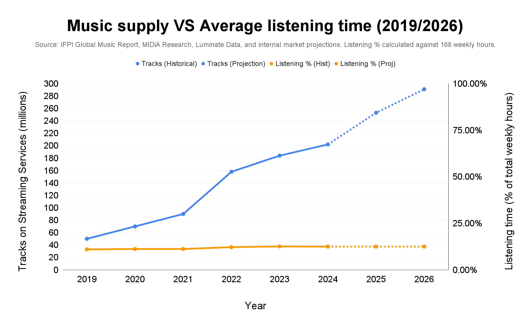
Visualisation comparing total tracks available on streaming services (millions) with global weekly music listening time expressed as a percentage of total weekly hours (168h baseline).
Tracks shown through 2025 with 2026 projection. Listening time based on IFPI global survey data.
by MusenAI

4 Comments
Data sources:
• Listening time: IFPI Engaging With Music reports (2019–2023), reporting global average weekly music listening hours (18.0h in 2019 → 20.7h in 2023).
• Track counts: Luminate year end reports (2022: 158M; 2023: 184M; 2024: 202M; 2025: 253M).
• 2019–2021 track figures are lower bound estimates based on public platform disclosures prior to consolidated Luminate reporting.
• 2026 projection extends the 2025 year over year increase (~37.9M tracks) forward one year under similar conditions.
Method:
• Listening time converted to percentage of total weekly hours (168 hours).
• Derived metric: tracks per listening hour per person = total tracks ÷ weekly listening hours.
• Visualization created using Google Sheets.
They really just extrapolated the weekly listening time out to 100%? Feels like this would be more sigmoidal
total tracks number is incremental (=it’s not going to dimish) while music listening isn’t. wouldn’t it be better to show the number of track released per year?
I don’t think I know what the purpose of this comparison is. Listening time can’t rise since there’s never more than the same 24 hours in a day, year over year. Whereas storage on harddrives and servers can be expanded nearly infinitely.
What am I missing? What is the story this is telling?