
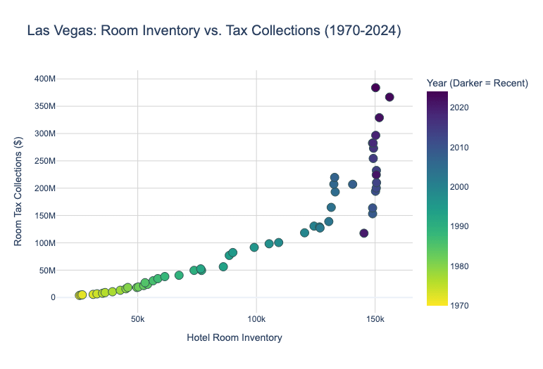
This visualization explores the tradeoffs between available room inventory and revenues (proxied by tax collections) Room inventory has plateaued lately at around 150,000 rooms, but tax revenue has surged to record highs. Hotels are pursuing a price over volume strategy, targeting more affluent guests. Notice the "hockey stick" graph—decades of horizontal growth (building more hotels) have shifted to vertical growth (increasing tax and rates per room).
by DataVizHonduran
5 Comments
**Data Sources:** Las Vegas Convention and Visitors Authority (LVCVA) Historical Statistics. **Tools:** Python, Pandas, Plotly
You gotta normalize that data. I think youre looking at an inflation graph
Nice. 👍
Purely from a data viz perspective, you might consider making inventory the Y axis to better fit the “plateau / ceiling” narrative. Then I’d make X time, and color your revenue.
That would more clearly show inventory growth stagnating over time, but intensifying tax revenue during stagnation.
Or you could have a tax revenue / room metric, to show the spike.
You definitely need to inflation adjust. I also wonder if this might be better presented with time on the x axis with two lines: one for tax collections on the left y-axis, and another for inventory on a second, right y-axis.
2020 really finds a way to sneak into every graph.