
Maybe you've wondered the same thing I have. We go about our daily lives trusting that the air is clean, the water is safe, and the ground our kids play on isn't contaminated. But is it? I genuinely didn't know. So I started digging.
Turns out, the data exists. EPA tracks toxic releases. CDC publishes health stats. USGS monitors water quality. But it's all scattered across dozens of government databases that nobody has time to go through. That bugged me. This stuff matters and it shouldn't be this hard to find.
So I started building ToxiMap.
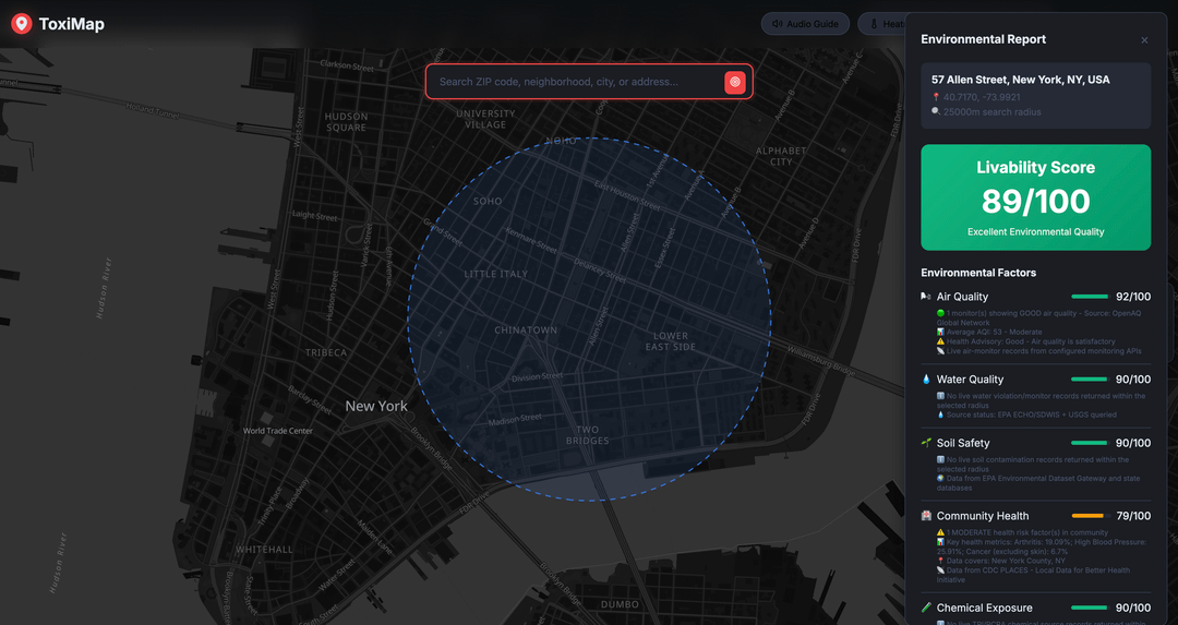
It's a free interactive map that pulls all of this together in one place. Search any US location and you'll see:
- Industrial facilities releasing toxic chemicals (EPA Toxic Release Inventory)
- Superfund sites requiring cleanup
- Hazardous waste facilities
- Water contamination data and discharge permits
- Real-time air quality
- County-level health statistics
- Environmental justice data showing which communities carry the heaviest burden
Everything is color-coded by risk level and shown within a 25km radius of your search.
Built entirely on free and open data sources: MapAtlas for the mapping and location search, OpenWeather API for real-time air quality, and official government databases from EPA, CDC, and USGS for all the environmental and health data. Wanted to prove you can build something genuinely useful without a massive budget.
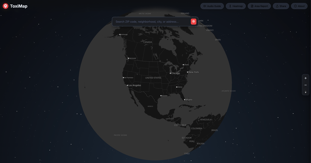
I'm still testing and working on this, but if enough people find it useful I'm happy to push it live. Right now it covers the US only, but if you'd like me to cover your country too, let me know. I'll go where the demand is.
Would love feedback. What would make this more useful? What data sources am I missing? Rip it apart, I can take it.
by Sad-Region9981
18 Comments
Very professional looking and straight to the point. Nice work!
Would be good info to have but not entirely convinced the trumpEPA would allow it to stay
Too many emojis in the UI – screams vibe coded
Wow, amazing project! I wish we had this in Hungary as well, as many big battery factories were planted in recent years, however, I doubt the data is out there or accurate… 🙁
Is there a way to try this out yet?
Is there a link to it or is it not available to look at yet?
I would love it, for me in germany it would be interesting how it is around here as well. I think DWD has at least some databases for that, but i am not sure.
Unless this is you: https://www.toximapp.com/
I think you might need a different name. Cool project though.
There’s a competing ToxiMapp which costs money. You should really consider a better name for your project which doesn’t overlap with other products.
this would be super interesting, could be a good tool to figure out good places to live or furthermore find problematic areas that could need improvement.
is there data on tap water quality?
i myself in germany would find it very interesting to have data here,
10$ per search, payment required for any information…..
If only there were some data at this location, not behind a paywall….
Killer idea. Great execution so far.
My pushback:
Use more varied sources, and go global.
The US Govt is reducing mandatory reporting requirements and record-keeping at both the EPA and CDC, and it is likely to continue either stopping collecting this data, or potentially even begin fabricating it altogether.
Maybe sounds conspiracy-coded, but… look around 😅
For the sake of future-proofing, I’d look to build using reporting from Democracies functioning as-intended, like Europe, Australia, Asia, etc.
Great job with this!!!
I suspect the scattering is by design, to deter community action. If you choose to proceed then realize you’ll be going up against a lot of wealthy folks who would prefer this information remains scattered. Just the reality of things, that’s all.
Consider pitching the idea to international organizations that might be interested like Greenpeace or the WWF, to both fund the project and more importantly provide cover. The organizations also have large distribution networks at their disposal thus can disseminate and act upon the information more quickly, getting assistance where its most needed.
This is a great idea. Looking at your environment report panel, I have two suggestions.
First I would order the environmental factors by most hazardous to least hazardous (allowing users to quickly see what aspects of their area are hazardous).
Second I would add progressive disclosure to the factors list by removing description and leaving the name and score, and on click of the factor either open a modal or a new page on the side panel.
For the world map (even though it’s just the usa), you could add custom tags to the major city names with a composite health score showing differences across the map
Good luck, don’t open the door to strange men in auits.
I suggest adding a flag zone for every landfill that has ever existed and its size.
Cancer rates are substantially higher for people living in homes built on / near landfills.
Is it different than the propublica tox map?
[ProPublica Tox Map](https://projects.propublica.org/toxmap/)
This data is very difficult to interpret. We are engineers that do a lot of professional witness work and I can tell you that lawyers and the general public will often point to these datasets as massive harms that often don’t hold up to scrutiny. For every real problem there are a hundred anxious people getting migrains from windmills.
I’m not saying you shouldn’t do this, but I hope you’ll proceed with caution and not fall into alarmism.