
First time posting. A friend suggested this sub might appreciate this, so I’m sharing.
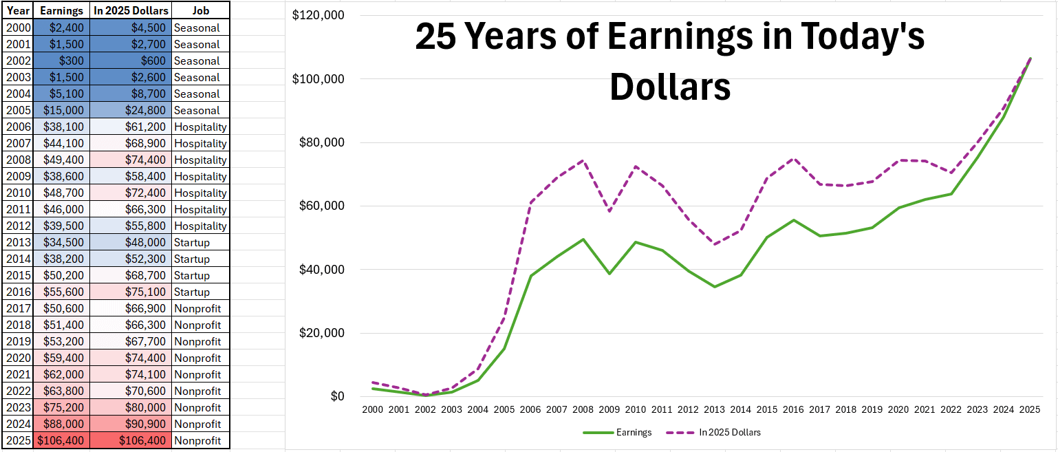
This chart shows 25 years of my earnings adjusted to current-year dollars using U.S. CPI. Figures are rounded, and job labels generalized to preserve anonymity, but the data and trends are accurate.
A few patterns stood out once everything was converted to real dollars:
- Despite multiple raises and promotions, my inflation-adjusted earnings returned to roughly the same ~$74k level (in today’s dollars) five separate times between 2008 and 2021.
- Nominal income growth masked long stretches of real wage stagnation.
- The most recent upward break represents the first sustained move above a ceiling I had previously hit multiple times.
- For additional context, my current salary (~$106k) has purchasing power roughly equivalent to about $66k in 2000, which helped explain why milestone salaries can feel less transformative than expected.
The inflection point coincides with completing a master’s degree and a leadership-focused professional credential. The effect was not immediate, but it aligns with the first sustained break above prior real-income peaks.
Sharing as a single data point rather than a universal claim. Adjusting long time horizons for inflation was clarifying for me, and I hadn’t seen many personal examples visualized over multiple decades.
Happy to clarify methodology if helpful.
by RemarkableElk4306
4 Comments
A major stagnation from GFC until COVID is clearly visible
I’m curious, I’m 10 years younger and sounding like I’m on a similar path.
What was your masters in? What field/role did it assist your career? Did you have to move employers to see the breakout?
https://preview.redd.it/1ki7xij36wjg1.png?width=1149&format=png&auto=webp&s=3e719175be911f113a4ae6e81c57c5c436a360e1
I’ve had a very similar experience in the past decade working in tech. Purchasing power actually decreasing despite a promotion. All at the same company. (I haven’t been able to job hop)
Honest subjective question: Did you feel like in 2016-2017 you were doing well financially? Raise and low cost of items? Was this a good time in your life? Did you buy a new/used car, washer/dryer, other large purchases?