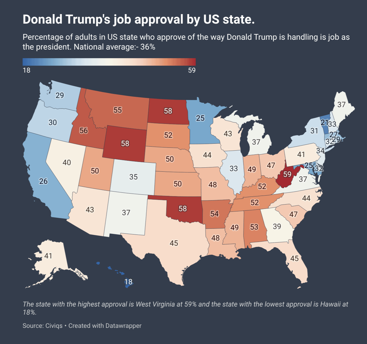
Wisconsin being basically the same as Texas makes me ashamed for Wisconsin and proud for Texas.
I’m conflicted as a WI resident.
worldalpha_com on
West Virginia gonna West Virginia…
baldbonehead on
How the hell is 1 in 4 up in Minnesota saying “yup, this is good”
lucianw on
I think the color scale is weird. You’ve picked 36 as the neutral color. I think it would have made more sense to pick 50 as the neutral color.
sciolycaptain on
The color scale makes this graphic deceptive.
a 50% approval (Utah) is solid red, while 35% approval (Colorado) basically appears to be the neutral color.
Difficult-Cricket541 on
how often are state based approval ratings polled/ I am not sure what Civiqs is, but i doubt they are paying for that many polls. regularly doing 50 polls like that will be expensive. i would not trust this is current or accurate data. several pollsters do national approval polls.
NotDiCaprio on
How are there still so many people… That’s still over 100 million people thinking: hey man, good job.
Streamjumper on
That Maine number bout to go down.
UsefulEngine1 on
Sticking to the presentation, I don’t like the colors here. First, red and blue should be reserved for directly partisan numbers IMO, and this isn’t really even red which kind of makes it worse.
More importantly, setting the gradient from the min and max data points makes the coloration arbitrary, and would prevent proper comparison to a past or future map with the same methodology. If it’s a 100-pecent scale the gradient should cover that range, or at least be centered on 50.
Finally, like all color-by-state maps, the visual takeaway can be very misleading both because population density is so different between states and because states aren’t homogeneous. I don’t think the border between Minnesota and North Dakota is the hot zone one might expect from this picture, for example.b
magicmulder on
So 11 states with a net positive of +2 to +8, 3 states with a tie and 36 states with a net negative of -1 to -72. Wow. He’s even losing the Electoral College of Approvals in a landslide.
Room_Temp_Coffee on
I feel bad for my family stuck in Oklahoma
Trollercoaster101 on
I’d say USA is pretty happy with how Trump is handling his job. /s
I also love that you selected a divergent scale of color where a smaller rate of consensus is actually perceived as less problematic then a higher one.
maringue on
That “45” sitting over Florida and Texas makes me smile. Especially since they gerrymandered Texas based on the 2024 Latino vote going the same way forever
HeavyTea on
Imagine what it would take? Over 50%? Does he have to enslave everyone? Dump everyone i to a shallow grave? Like, what are they thinking??? It is already a hellscape!
Norwester77 on
Should the title at the top say “National average: 36%” rather than “-36%”?
Wellarmedsheepy010 on
Crazy to see Georgia being more rational than Pennsylvania. I feel like PA had gone farther right over the last 2 decades and GA left
calguy1955 on
The polls show he is doing better than every president, ever. Nobody has polls like him. He’s got great, beautiful polls. Why, just the other day he polled his cabinet and he aced it with a 500% approval rating. Maybe it was 600%.
K_Roon on
I can’t tell if the map is purposedly dishonest with its color palette centered at 36 or if it’s just not well thought. First look I thought a majority of the central states were approving job policies… which is clearly not the case.
slpgh on
This would be more informative if it was scaled again the margin in the general elections
djn24 on
One criticism and one suggestion.
Criticism: The subtitle says “National average:- 36%”
Why is there a “-” before the “36%”? That makes it look full rejection could be 100%, rather than 0%. I think you should remove “-” from the subtitle.
Suggestion: Comparing this to approval of people who voted in the 2024 general election would be really informative and add another layer of context. I believe Trump’s approval rating is lower in most states with just 2024 voters than the general public. And those are the people that are most likely to vote again.
No-Werewolf-5955 on
This map proves that Atlanta is the most progressive place of all the former confederate states. Georgia would be red if it wasn’t for Atlanta.
beorn961 on
The fuck is wrong with West Virginia?
NestedForLoops on
Sometimes I hate being a West Virginian.
OttoLuck747 on
I love how Minnesota’s immediate neighbors are like, “Well, that’s happening over there. He’d never do that to *us*.”
Zadiuz on
Interesting. The states with higher education standards and ratings have lower approval, and job satisfaction ratings than states with lower ratings.
KudosOfTheFroond on
My God that’s a huge basket of deplorables…
Gerardo1917 on
Gotta pump down those numbers
kylesmith4148 on
Surprised Texas and Florida are lower than Ohio!
KnightsOfREM on
Lol Minnesota lost for a generation. Keep up the victory tour, ICE
NinjaTrilobite on
West Virginia’s ancestors would be so ashamed. They fought so many violent labor battles against the mining industry, and now they happily bend over and lube up to get fucked by the current “clean coal” regime. Enjoy your black lung and meth, you stupid motherfuckers.
Form_Function on
Putting the red into redneck
SelloutNI on
Need to clean up the edges a little.
goldbeater on
Now overlay an intelligence map and let’s see what overlaps.
IssueEmbarrassed8103 on
Date seems crucial but missing
kingtacticool on
Hawaii swinging for the fences.
lekker-boterham on
I’m surprised that 26% of Californians agree with that statement!
Shurigin on
it mirrors the educations rankings almost perfectly
figleaf29 on
Interesting how range and color palette choice affects interpretation. Looking over this without paying attention to numbers, it looks overall okay for Trump. Then, I notice that the mid-point (white) is around 35% approval rating! If you set the range to 0 to 100, it would be so much bluer.
Silvermane2 on
Ooh ooh ohh!
Now pair this map up with the average education level in the state!
bergieisbeast on
Now show a literacy map and let’s compare
Swanky1499 on
Interesting how the states closer to the Mexican border have higher approval rates. Also, why is high approval rate marked as red on the map? Seems counterintuitive unless you’re trying to imply that approval = Republican
crazunggoy47 on
This is not beautiful. 0 point should not be half way between min and max, but at 50% approval.
SirDiego on
The cutoff for blue/red is kinda weird, is it split just around the average of (astonishingly low) 36%?
I think I get the idea but it makes it seem like the country more in favor of Trump than it is, when e.g. Texas is slightly red but with Trump’s approval rating underwater there

44 Comments
Source: [civiqs](https://civiqs.com/results/approve_president_trump_2025?uncertainty=true&zoomIn=true&annotations=true&map=true)
Tools: [Datawrapper ](https://www.datawrapper.de/)
Wisconsin being basically the same as Texas makes me ashamed for Wisconsin and proud for Texas.
I’m conflicted as a WI resident.
West Virginia gonna West Virginia…
How the hell is 1 in 4 up in Minnesota saying “yup, this is good”
I think the color scale is weird. You’ve picked 36 as the neutral color. I think it would have made more sense to pick 50 as the neutral color.
The color scale makes this graphic deceptive.
a 50% approval (Utah) is solid red, while 35% approval (Colorado) basically appears to be the neutral color.
how often are state based approval ratings polled/ I am not sure what Civiqs is, but i doubt they are paying for that many polls. regularly doing 50 polls like that will be expensive. i would not trust this is current or accurate data. several pollsters do national approval polls.
How are there still so many people… That’s still over 100 million people thinking: hey man, good job.
That Maine number bout to go down.
Sticking to the presentation, I don’t like the colors here. First, red and blue should be reserved for directly partisan numbers IMO, and this isn’t really even red which kind of makes it worse.
More importantly, setting the gradient from the min and max data points makes the coloration arbitrary, and would prevent proper comparison to a past or future map with the same methodology. If it’s a 100-pecent scale the gradient should cover that range, or at least be centered on 50.
Finally, like all color-by-state maps, the visual takeaway can be very misleading both because population density is so different between states and because states aren’t homogeneous. I don’t think the border between Minnesota and North Dakota is the hot zone one might expect from this picture, for example.b
So 11 states with a net positive of +2 to +8, 3 states with a tie and 36 states with a net negative of -1 to -72. Wow. He’s even losing the Electoral College of Approvals in a landslide.
I feel bad for my family stuck in Oklahoma
I’d say USA is pretty happy with how Trump is handling his job. /s
I also love that you selected a divergent scale of color where a smaller rate of consensus is actually perceived as less problematic then a higher one.
That “45” sitting over Florida and Texas makes me smile. Especially since they gerrymandered Texas based on the 2024 Latino vote going the same way forever
Imagine what it would take? Over 50%? Does he have to enslave everyone? Dump everyone i to a shallow grave? Like, what are they thinking??? It is already a hellscape!
Should the title at the top say “National average: 36%” rather than “-36%”?
Crazy to see Georgia being more rational than Pennsylvania. I feel like PA had gone farther right over the last 2 decades and GA left
The polls show he is doing better than every president, ever. Nobody has polls like him. He’s got great, beautiful polls. Why, just the other day he polled his cabinet and he aced it with a 500% approval rating. Maybe it was 600%.
I can’t tell if the map is purposedly dishonest with its color palette centered at 36 or if it’s just not well thought. First look I thought a majority of the central states were approving job policies… which is clearly not the case.
This would be more informative if it was scaled again the margin in the general elections
One criticism and one suggestion.
Criticism: The subtitle says “National average:- 36%”
Why is there a “-” before the “36%”? That makes it look full rejection could be 100%, rather than 0%. I think you should remove “-” from the subtitle.
Suggestion: Comparing this to approval of people who voted in the 2024 general election would be really informative and add another layer of context. I believe Trump’s approval rating is lower in most states with just 2024 voters than the general public. And those are the people that are most likely to vote again.
This map proves that Atlanta is the most progressive place of all the former confederate states. Georgia would be red if it wasn’t for Atlanta.
The fuck is wrong with West Virginia?
Sometimes I hate being a West Virginian.
I love how Minnesota’s immediate neighbors are like, “Well, that’s happening over there. He’d never do that to *us*.”
Interesting. The states with higher education standards and ratings have lower approval, and job satisfaction ratings than states with lower ratings.
My God that’s a huge basket of deplorables…
Gotta pump down those numbers
Surprised Texas and Florida are lower than Ohio!
Lol Minnesota lost for a generation. Keep up the victory tour, ICE
West Virginia’s ancestors would be so ashamed. They fought so many violent labor battles against the mining industry, and now they happily bend over and lube up to get fucked by the current “clean coal” regime. Enjoy your black lung and meth, you stupid motherfuckers.
Putting the red into redneck
Need to clean up the edges a little.
Now overlay an intelligence map and let’s see what overlaps.
Date seems crucial but missing
Hawaii swinging for the fences.
I’m surprised that 26% of Californians agree with that statement!
it mirrors the educations rankings almost perfectly
Interesting how range and color palette choice affects interpretation. Looking over this without paying attention to numbers, it looks overall okay for Trump. Then, I notice that the mid-point (white) is around 35% approval rating! If you set the range to 0 to 100, it would be so much bluer.
Ooh ooh ohh!
Now pair this map up with the average education level in the state!
Now show a literacy map and let’s compare
Interesting how the states closer to the Mexican border have higher approval rates. Also, why is high approval rate marked as red on the map? Seems counterintuitive unless you’re trying to imply that approval = Republican
This is not beautiful. 0 point should not be half way between min and max, but at 50% approval.
The cutoff for blue/red is kinda weird, is it split just around the average of (astonishingly low) 36%?
I think I get the idea but it makes it seem like the country more in favor of Trump than it is, when e.g. Texas is slightly red but with Trump’s approval rating underwater there