
Sources: Data is aggregated from public breach disclosures, Have I Been Pwned database, regulatory filings, and news reports. Updated continuously.
Tools: Next.js, OpenMaps, WebGL
https://www.exposedmap.com/map
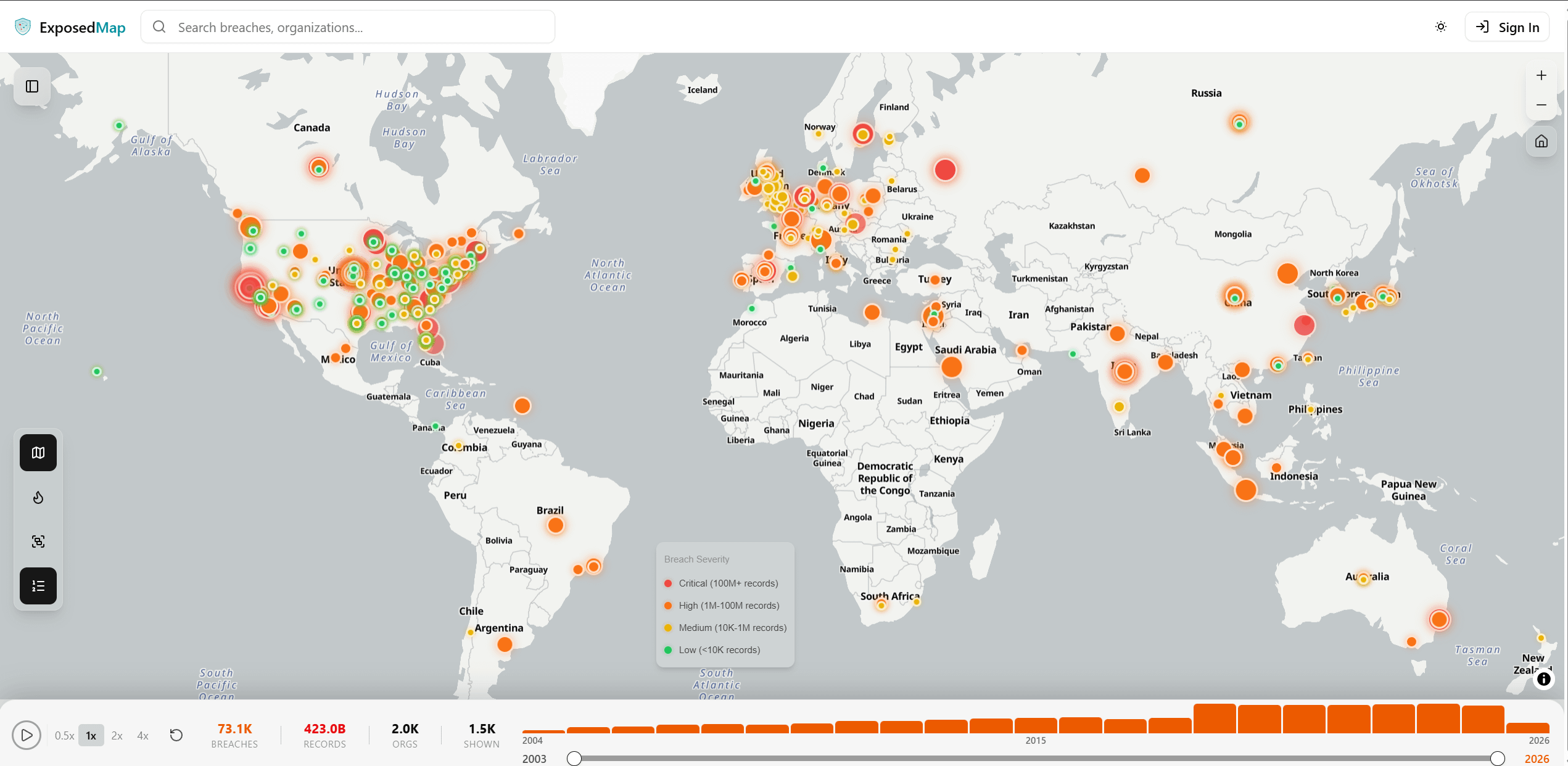
Been tracking global data breach data as a side project for a while now. Finally got around to visualizing it properly on an interactive globe.
Each point represents a reported breach, color-coded by severity. You can filter by industry, root cause, country, and time period. Some patterns are immediately obvious once you see it all laid out — the US and EU light up like christmas trees, finance gets hammered more than any other sector, and there's a noticeable spike every January. Select map marker for breach details.
There's also a free email checker if you're curious where your info showed up in any of these.
by chasindr3am