
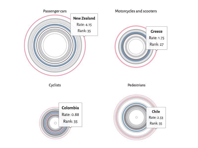
Data is from the OECD (Organisation for Economic Cooperation and Development). You can interact with the visualizations here: https://www.trialproven.com/fatal-crash-statistics/
by kombuchakween88
Data is from the OECD (Organisation for Economic Cooperation and Development). You can interact with the visualizations here: https://www.trialproven.com/fatal-crash-statistics/
by kombuchakween88
8 Comments
Important information! I’m not sure if the data being presented tells the story quite well enough and the interactivity is a bit fiddly.
That’s pretty interesting. I’m surprised that road deaths in the U.S. increased during the early COVID years.
this is what this sub was made for! feedback tho: the mouseover targets on the rings are tiny, they are a bit finicky to interact with.
Data sources: [https://www.oecd.org/en/data.html](https://www.oecd.org/en/data.html) / [https://www.nhtsa.gov/](https://www.nhtsa.gov/)
The information is interesting, but unfortunately I think this is a confusing way of showcasing the data. I can’t quickly compare different countries against each other. This design requires me to hover my cursor over each ring one by one.
Why concentric circles? What do these circles help convey that a chart or bar graph wouldn’t
Yikes! We’ve got a lot of work to do in the U.S. Thanks for sharing.
I think it would be better to show the data normalized by distance traveled (fatalites/100,000 miles) rather than fatalities/100,000 people.