
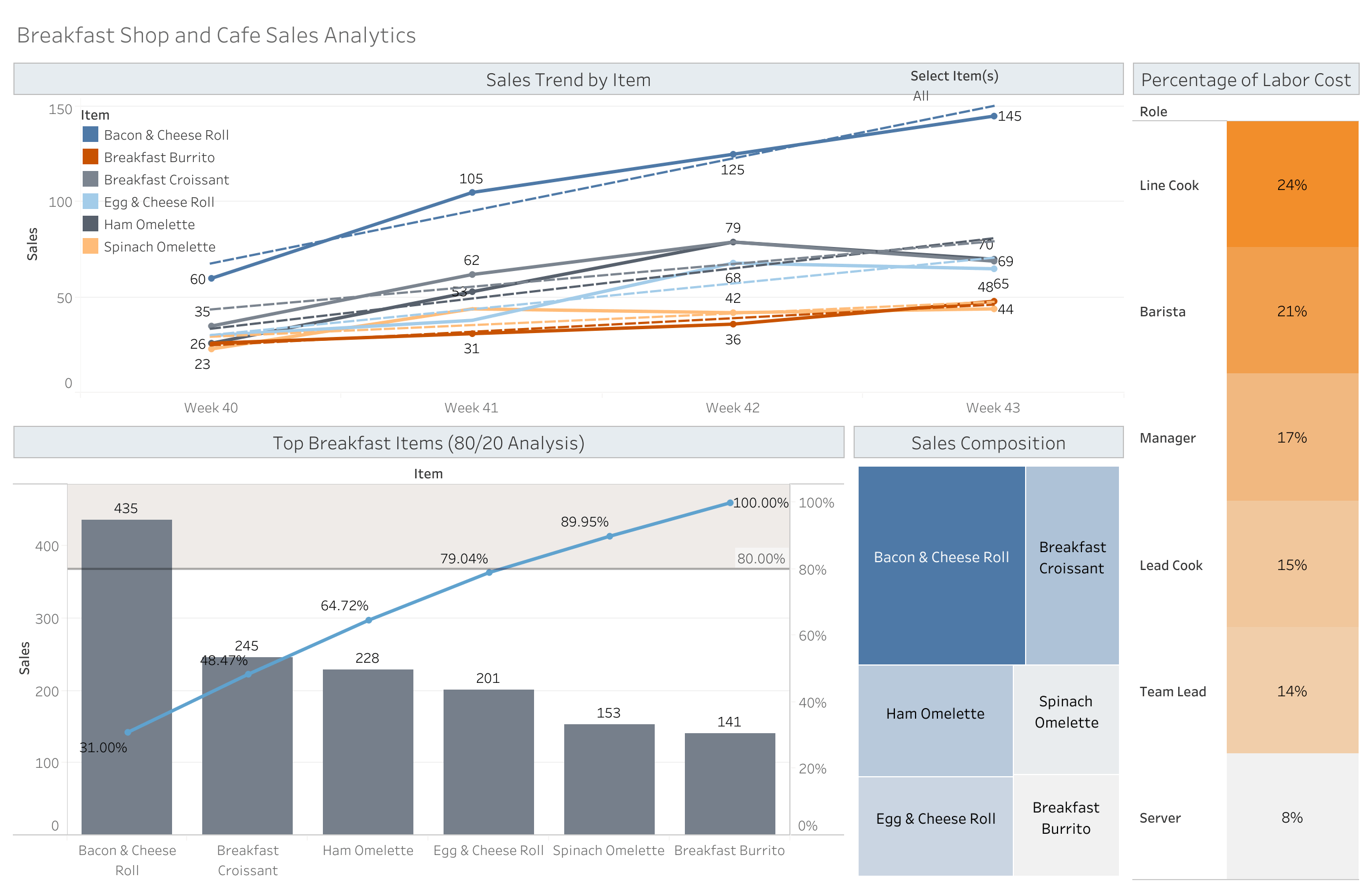
I'm just learning how to be a data analyst, and this is my latest dashboard project in Tableau. It's a personal project where I counted breakfast sales over four weeks. I did this in order to help me understand how much of my food selling, which items are the most popular, so that I can prioritize how many of each item I should prepare in the morning.
This has shown me that my bacon rolls and breakfast croissants are the top sellers, and now I know to really focus on those each day over the lower selling items such as the Spinach Omelets.
I also looked at labor percentages. It is interesting that despite lower pay, the line cooks take up higher labor cost because there are so many of them versus just one manager and one team lead. I'm really proud of myself 🙂
Source: Personal Data
Tools Used: Microsoft Excel, Tableau Public
by Odd-Attention5413
8 Comments
Cool! Do you know your margin for each item (menu price – ingredient cost – labor cost)? e.g. sometimes a restaurant makes more on a $20 plate of pasta than it does on a $50 steak. Understanding how much actual profit you can get from each menu item can help you prioritize too. There’s a reason why places that serve alcohol often incentivize servers upselling it – huge markup there.
Your bacon cheese roll must be good
I like it! Good work. It would be cool to relate ingredients to each menu item to calculate how much of each ingredient was used. Could be used to help decide how much to order, and how much food waste your store has. You could also then relate a cost per item, and show your margin per food item to show not only which item has the most sales, but makes the most money.
If you’re the one doing the cooking, then this is useful. But if you’re running the business, then you want to look at profits instead. Sure, Bacon and Cheese roll is what drives customers in the door, but that Breakfast Burrito brings in 5x the profit per sale.
As it is in most other restaurants, it’s probably the liquid stuff that brings profits, though.
Nice. You can also show the sales in stacked bar graphs (pancake style) or as a a donut.
Less can be more. For example the cumulative percentage line is unnecessary.
Good start though
The only suggestion I have is to be mindful of sharing internal company data online.
Nothing against this post in particular but this sub really should do something about plug and play graphics like this unless they tell a particularly interesting story.