
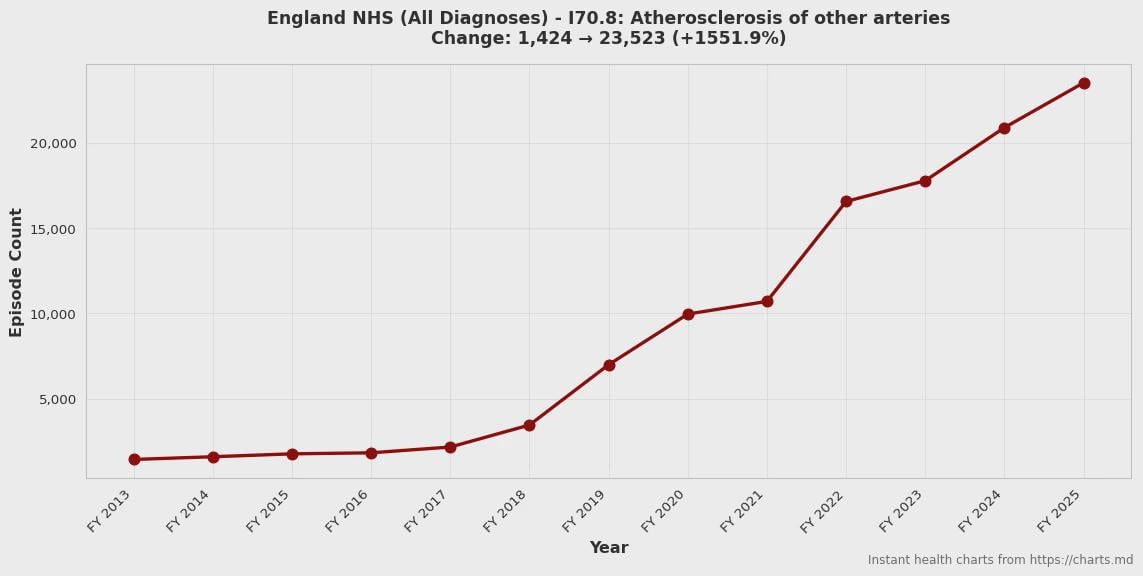
I made https://charts.md with 68,000+ pre-made charts detailing hospital admission trends for every ICD-10 diagnosis code across three regions: England NHS (2013-2025), California CHHS (2016-2024), and Australia AIHW (1999-2024). Just launched it a few days ago; it's not even in Google yet.
You can search by disease or ICD-10 code, and there are also category pages showing statistically significant increases/decreases for major categories such as cancer, respiratory, kidney, digestive, etc.
Tools used: Python (pandas, matplotlib, scipy for regression).
Data sources: NHS Hospital Episode Statistics (Open Government Licence), California HCAI via CHHS Open Data Portal, Australian Institute of Health and Welfare (CC BY 4.0).
I made this site because of the frustration I encountered when trying to research the anecdotal "such-and-such disease is rising/falling" posts I saw on social media, whether from an anonymous account or a known credible organization. The existing sites for researching disease trends often require registration, CSV processing, or learning a difficult interface. Many also cover limited regions or only primary diagnoses. England has the best data (they cover ALL diagnoses, rather than just primary), but checking the other regions helps to confirm trends.
by fastcharts
2 Comments
As a medical researcher using routine care electronic health record data, I salute you!
Does this actually show whether certain disganoses are rising/falling though? How much of the trends is simply due to either increased digital reporting of diagnoses, increasingly detailed notes, or increased awareness of certain dignoses since 2013?
I don’t really think you can infer that (for example) “drug-induced cataracts” are on a huge exponential growth because the number of search hits for that phrase has increased. Actually changes in prevalence require uniform monitoring of a controlled sample.