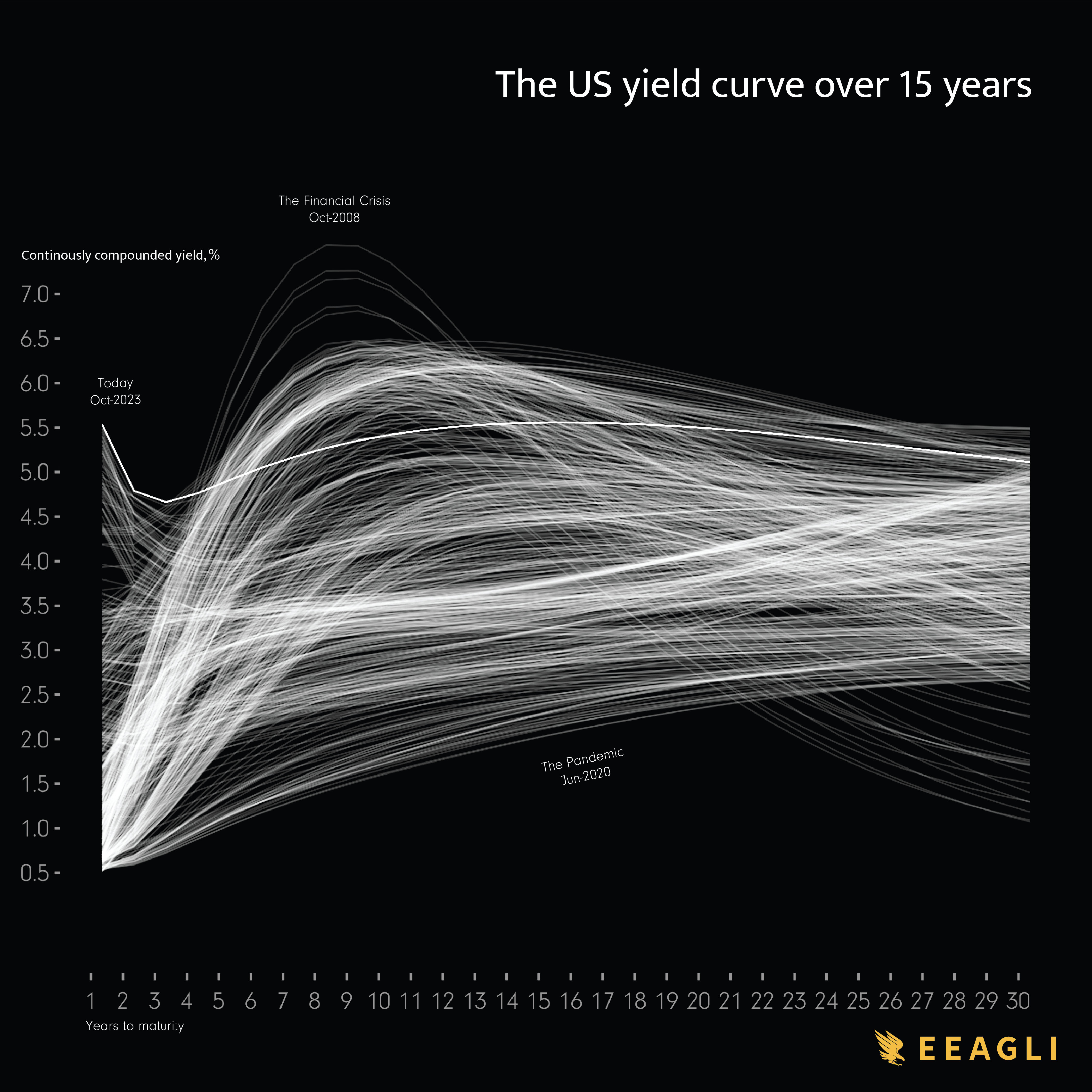
I created this using data taken from the US Federal Reserve. Each line represent the yield curve every 72 hours. I create the chart using d3 on a 4k screen.
faps_in_greyhound on
Beautiful. And utterly nonsense graph with hardly any good information conveyed at first glance. But, beautiful.
wons-noj on
I find it really hard to follow anything in this graph

3 Comments
I created this using data taken from the US Federal Reserve. Each line represent the yield curve every 72 hours. I create the chart using d3 on a 4k screen.
Beautiful. And utterly nonsense graph with hardly any good information conveyed at first glance. But, beautiful.
I find it really hard to follow anything in this graph