
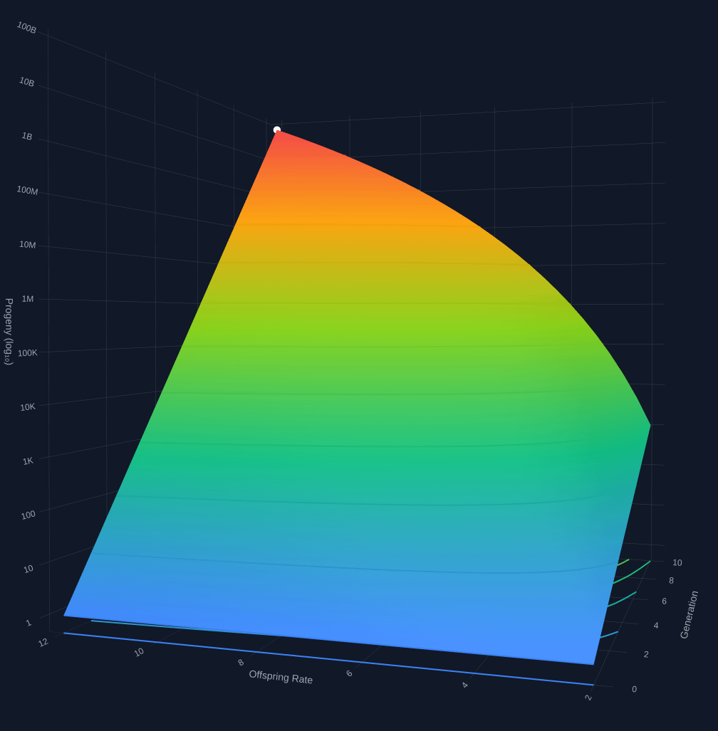
I made this (with help from claude) as I was thinking about the size of families over a range of average offspring-per-generation: https://claude.ai/share/1217e0ef-1ba9-4c1a-b0e9-bd402268d21d
Final output is a static html file plotted in interactive 3D with plotly lib: https://www.6bit.com/spub/progeny-surface.html
by joshperri
6 Comments
I am currently one person and will be zero in like 70 years
Jesus Christ the quality of posts on here just gets worse and worse
Haha why stop at 12 per generation? What about 100 per generation?
I’m sorry to be harsh, but this is just basic n^m stuff presented badly with a 3d plot. 3d plots are almost never what you’re looking for.
Better would be a few curves for 2, 6, and 10 offspring for example presented in one 2d figure. Or better, a figure chosen cleverly to present the data in a non-obvious way. For more sophisticated population simulation I would read some papers. Anything that would persuade the reader into thinking you’ve done anything other than tell an AI to poop out a graph.
This is awful. First of all, 12 is not an average number of offspring. Second, this visualization is completely unreadable. What information are we supposed to take from this? We can’t even read how 12 differs from 2 offspring because you took a headon shot of a 3d map.
Read your title again. Slowly.