
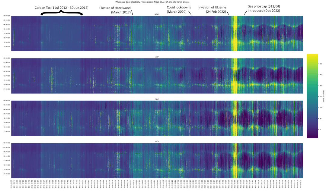
This is an evolution of a great post by another user (https://www.reddit.com/r/dataisbeautiful/comments/1pa5d0e/oc\_australian\_electricity\_prices\_by\_state\_jan/), but I've gone back a bit further and with a separate image with annotations that I think tell a bit of the story.
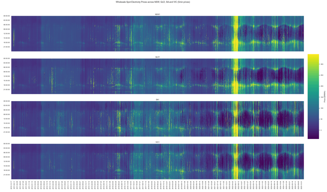
The non-annotated feature that is most apparent is the hollowing out (in fact, going negative) of prices in the middle of the day due primarily to the immense proliferation of rooftop PV across australia (highest per capita in the world).
Note that wholesale electricity prices can go as high as $22,000 AUD/MWh or as low as -$1,000 AUD/MWh. These extremes are rare so the colour range only caters from the 2-98th percentiles, with prices below or above just hitting the end colours.
Data source: 5 minute prices from AEMO (https://nemweb.com.au/Reports/Archive/Public\_Prices/). Older data was sourced from a proprietary copy of AEMO's MMS model as it is no longer available to the public since this year, they started removing reports for data older than 13 months sadly.
Tools: Python, seaborn, getpaint.net for annotations.
by caracter_2
2 Comments
Hmm… reddit’s compression killed it a bit
I love these. It is quite interesting what large impact carbon tax had but also how temporary the cost reduction was after stopping it.
It would be nice to see some sort of average cost in comparison. It is hard to tell if the low costs due to solar are enough to balance out the high costs during other times.