
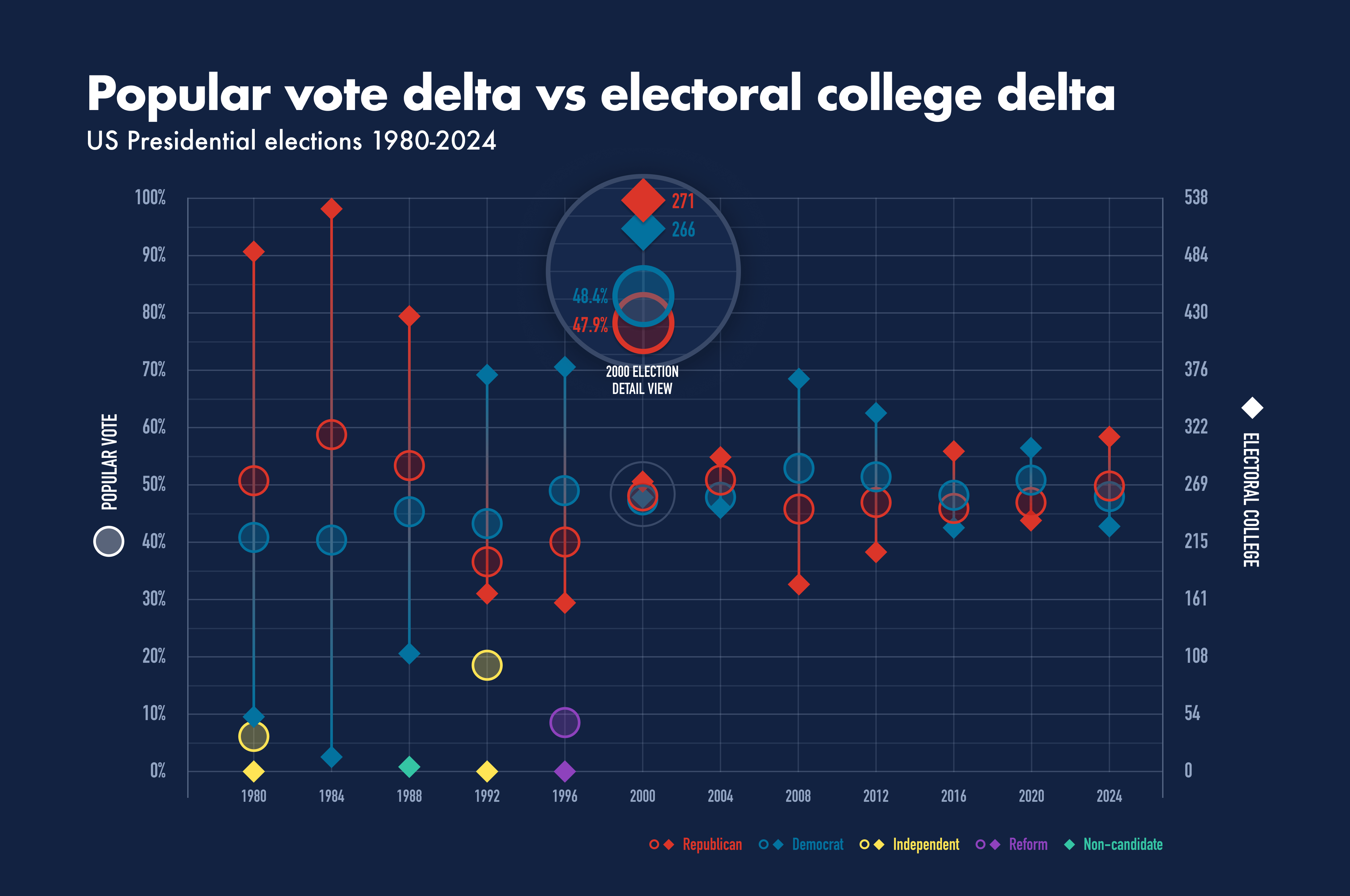
This shows how the delta in the popular vote relates to the delta in the electoral college for elections going back to 1980. It's interesting to me to see that the greatest split in the popular vote has only been 18.2% (the 1984 blowout) and typically stays around 5%, while the electoral college can show a much wider spread.
I added in third-party candidates where they received enough of the vote to be relevant.
Interesting trivia:
* In 1988, Bentsen, who was running as VP with Dukakis, got one electoral college vote from a WV elector
* Ross Perot got 18.9% of the popular vote in 1992 as an Independent, and then got 8.4% in 1996 after getting into the race late in 1996 under the Reform party
* In 2016 there were 7 faithless electors, 5 D and 2 R, so the EC total is only 531
by randomusername3OOO
4 Comments
This shows how the delta in the popular vote relates to the delta in the electoral college for elections going back to 1980. It’s interesting to me to see that the greatest split in the popular vote has only been 18.2 ppt (the 1984 blowout) and typically stays around 5%, while the electoral college can show a much wider spread.
I added in third-party candidates where they received enough of the vote to be relevant.
Source: Wikipedia
Tools: Google Sheets, Figma
I always find it interesting and annoying that not only does the electoral college dismantle the will of the people on occasion, but it is also a really bad predictor of the votes. I mean obviously it would make the percentages more rigid but it makes it look so much more dramatic than needed.
Well done. It took me a second, but I was able to interpret the the data on each axis (because I actually looked at the legend symbols on each side 🙂 and then everything clicked.
One small improvement suggestion is to somehow denote the 270 Electoral College votes needed to win. Could be a note on the axis legend, or maybe a line across the chart.
This is really nice looking. A+, OP