
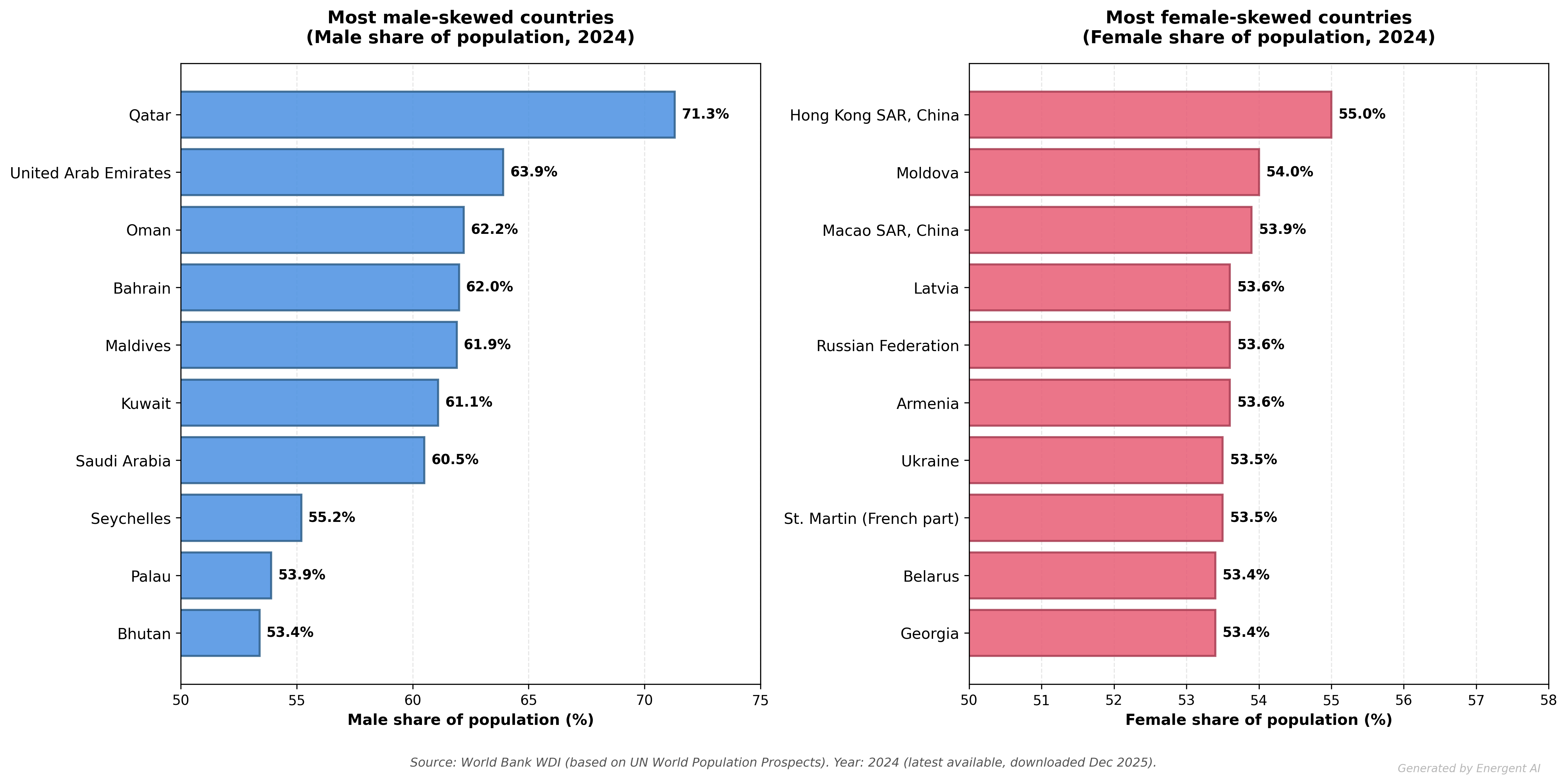
Two-panel bar chart of the most gender-skewed populations by share of total population (World Bank WDI, latest available year in the dataset I pulled: 2024).
- Left panel: Top 10 countries with the highest male % of total population
- Right panel: Top 10 countries with the highest female % of total population
Percentages shown are share of total population, not “sex ratio at birth”.
by Fantastic-Spirit9974
7 Comments
**Data source:** World Bank World Development Indicators —
Male %: SP.POP.TOTL.MA.ZS
Female %: SP.POP.TOTL.FE.ZS
(World Bank estimates based on UN World Population Prospects age/sex distributions.)
**Tool(s):** Energent AI (visualization), minor formatting cleanup (optional: Google Sheets).
**Notes:** Big male skews often reflect labor migration patterns; big female skews often reflect longevity + higher male mortality in some regions.
Ukraine is getting smoked
Regarding Qatar – this is almost entirely due to short-term labor migration. Qatari citizens are close to gender-balanced
Qatar-Hong Kong date nights
What’s the most surprising country on either side for you?
Also: reminder this is % of total population, so two big drivers are migration and age structure. A version split by age bands would probably explain a lot of the “why” — happy to make that next if people want it.
What is interesting here is that the male skew is mostly middle eastern countries whereas the female skew is mostly easter european countries.
Someone knows why Latvia have that imbalance?