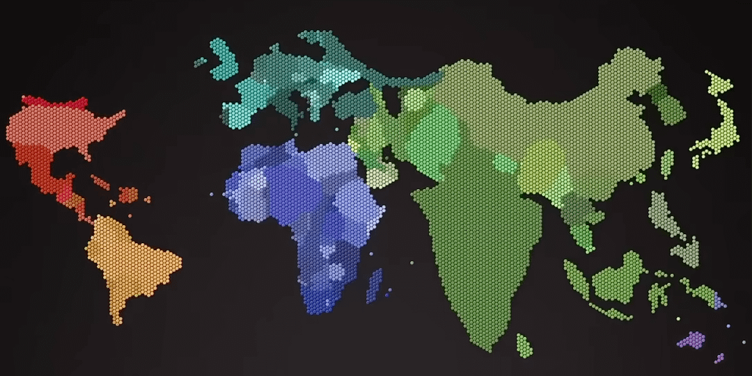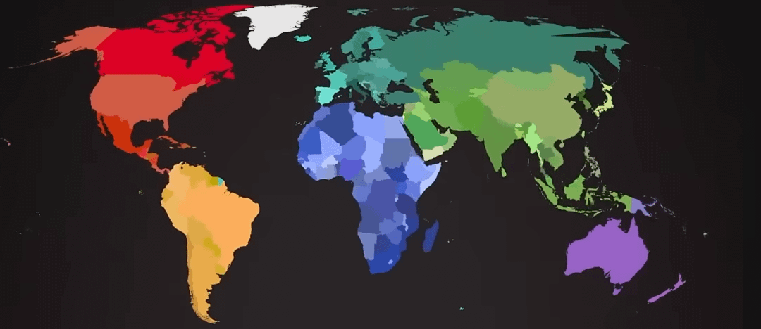

I grabbed a screenshot from this video showing the world map in 2020, where each hexagon represents 1 million people. Countries with less than 500k people don't get any hexagon.
The full video visualizes how human population has grown and shifted across the globe from ancient times to today and into the future.
Video (youtube short) can be found here: https://www.youtube.com/shorts/S4qkMsPTtsE
by 72chambers

3 Comments
Italy really let itself go…
Nice.
Just to nitpick: might be better to color contiguous countries very differently rather than very similarly to make the borders prominent.
well, it looks like “overpopulation” is a very new problem.