
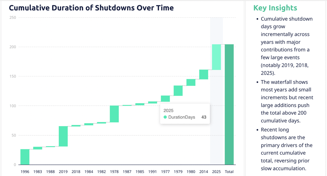
I was looking at historical U.S. government shutdown data and visualized the cumulative number of shutdown days over time.
What stood out immediately is how uneven the accumulation is.
For decades, shutdown days increased slowly — most years only added a handful of days. But a few major shutdowns completely changed the curve, especially:
- 2018–2019, which alone contributed a massive jump
- 2025, adding another ~43 days and pushing the cumulative total past 200 days
The waterfall-style chart makes this clear: long stretches of small increases, followed by sudden vertical jumps caused by a single political standoff. In other words, the overall “cost” of shutdowns isn’t driven by frequency as much as a few extreme events.
This helps explain why shutdowns feel more disruptive today than in the past — recent ones are longer, more impactful, and undo decades of relatively slow accumulation.
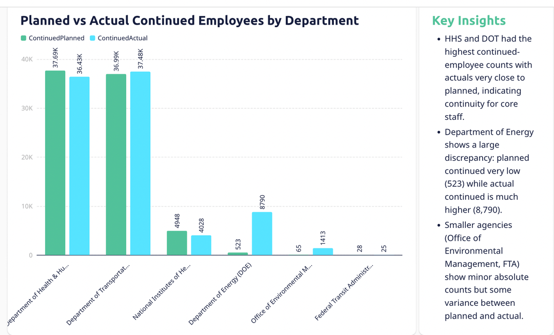
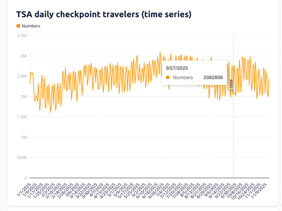
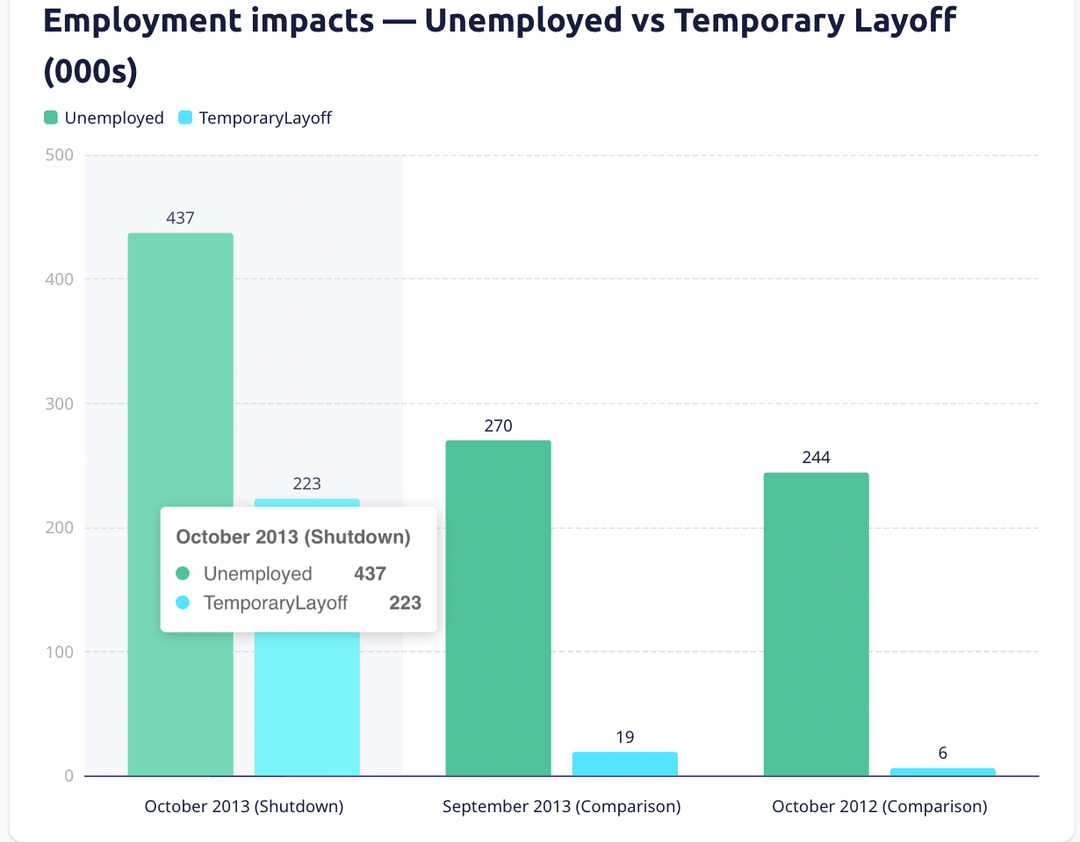
If you’re interested, I built a full interactive dashboard on Bricks with more charts (including department-level staffing impacts and TSA traveler trends during shutdown periods).
Full dashboard: https://app.thebricks.com/file/485c5528-8d5c-4294-99e4-359a6f5c13d2/177@6793f7d4-20f2-4cd5-a4b4-421ca63c8a37:0/visual-board
by Prior_Marzipan_4146
5 Comments
The X axis of the first chart is a disaster
Nonsensical graph, the x axis is a mess
I dont even want to try to understand what the first chart is saying. What is that x-axis? Was it AI generated or something?
This data is formatted terribly.
Also based on the use of em dashes and the randomly bolded info in your description this is AI generated.
Most Governments dissolve when you can’t pass a budget, the fact that they still get paid and carry on a usual after pointing fingers for two months is most of the problem.