
Source of data: https://pmc.ncbi.nlm.nih.gov/articles/PMC2621124/
Tools used: Google Sheets (geo charts) and Preview for Mac
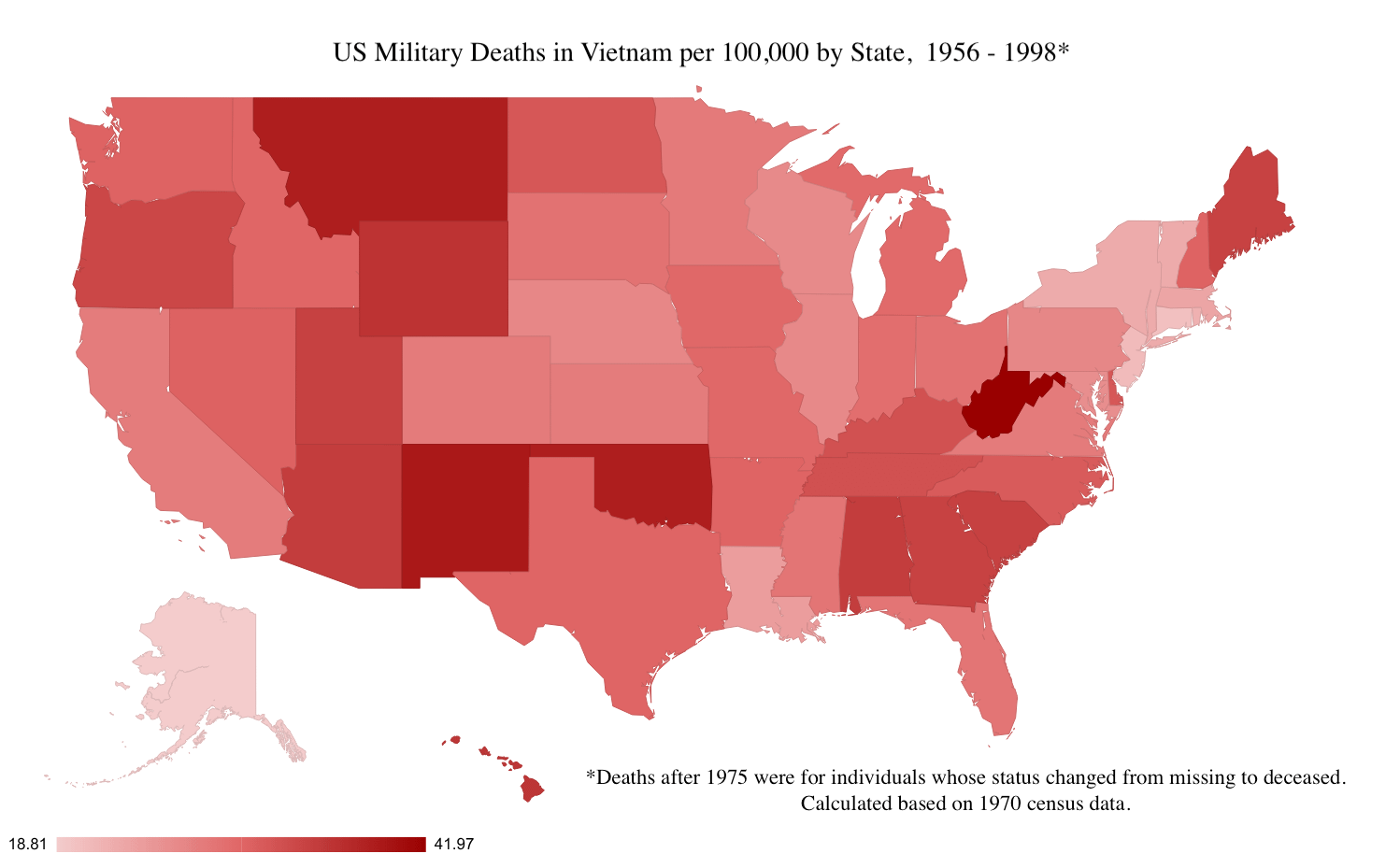
I believe deaths in Laos, Cambodia, etc are included in this data
by previousinnovation
Source of data: https://pmc.ncbi.nlm.nih.gov/articles/PMC2621124/
Tools used: Google Sheets (geo charts) and Preview for Mac
I believe deaths in Laos, Cambodia, etc are included in this data
by previousinnovation
4 Comments
An interesting chart from the source:
|Characteristic|(n=58,193)|
|:-|:-|
|Age in Years (median)|21|
|Men|100%*|
|White|86%|
|US Army|66%|
|US Marine Corps|25%|
|Enlisted Personnel|86%|
|Hostile death|81%|
|Ratio of Wounded to dead|2.6/1|
*8 military women died in Vietnam, but the source rounded up
The original source compared all of this data to data from the War in Iraq, but only from 2003 to 2008, so I chose to omit it.
[https://pmc.ncbi.nlm.nih.gov/articles/PMC2621124/](https://pmc.ncbi.nlm.nih.gov/articles/PMC2621124/)
The elites using the everyman as cannon fodder. Always the case.
Looks like draftees from West Virginia and Montana, presumably knowing how to shoot, were disproportionately selected for more dangerous infantry assignments?
I actually wonder what the average education and enlistment status is between states for this same time for those drafted or voluntarily enlisting was too. I imagine certain education levels and/or whether or not you got drafted vs signing up yourself affected your station and whether or not you were out to the front somewhat but I would be curious to know if it’s actually correlated or not