
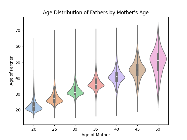
The above plot shows the probability distribution of the father's age (partner's age on the y axis) relative to the mother's for all 3.6 million children born in the US in 2024. I have created this plot using Matplotlib and the data found here. You can see how women generally tend to have children with men very close in age to her. Note that there are very few births for a woman of age 50, which impacts the shape of the distribution.
by lorisaurus
9 Comments
that particular plot style while talking about mothers sure is….a choice
I know it’s not the case, but the larger distribution coloring makes it look like there are more births to mothers in their 50s than in their 20s.
I should call her… wait no
If I’m interpreting this chart correctly, father’s age distribution is wider / higher variance for 50 year old moms than 20 year old moms? Thats the opposite of what id expect. Intuitively, it’s much more common to have young moms with much older dads than it is to have old moms with much younger dads.
Either I’m interpreting this wrong, or the data isn’t reliable (or I’m just mistaken!)
This particular shape reminds me of something about pregnancy.
No wonder girls love guys 5-10 years older than them.
They just hit the right spot
I assume outliers are excluded cause I have a tough time accepting that no 40 year old males ever impregnate a 20 year old woman.
I thought we all agreed not to use ~~labia~~ violin plots anymore.
One thing that is interesting to me, is how this is related to the data about young men being disproportionately single compared to young women. Some people have suggested that it is due to age gap dating. But if that were the case, wouldn’t these age gap relationships show up in the birth data? Since some of them would be getting married and having kids. But according to this data is doesn’t appear anywhere near common enough to cause an “epidemic of singleness” among young men.