
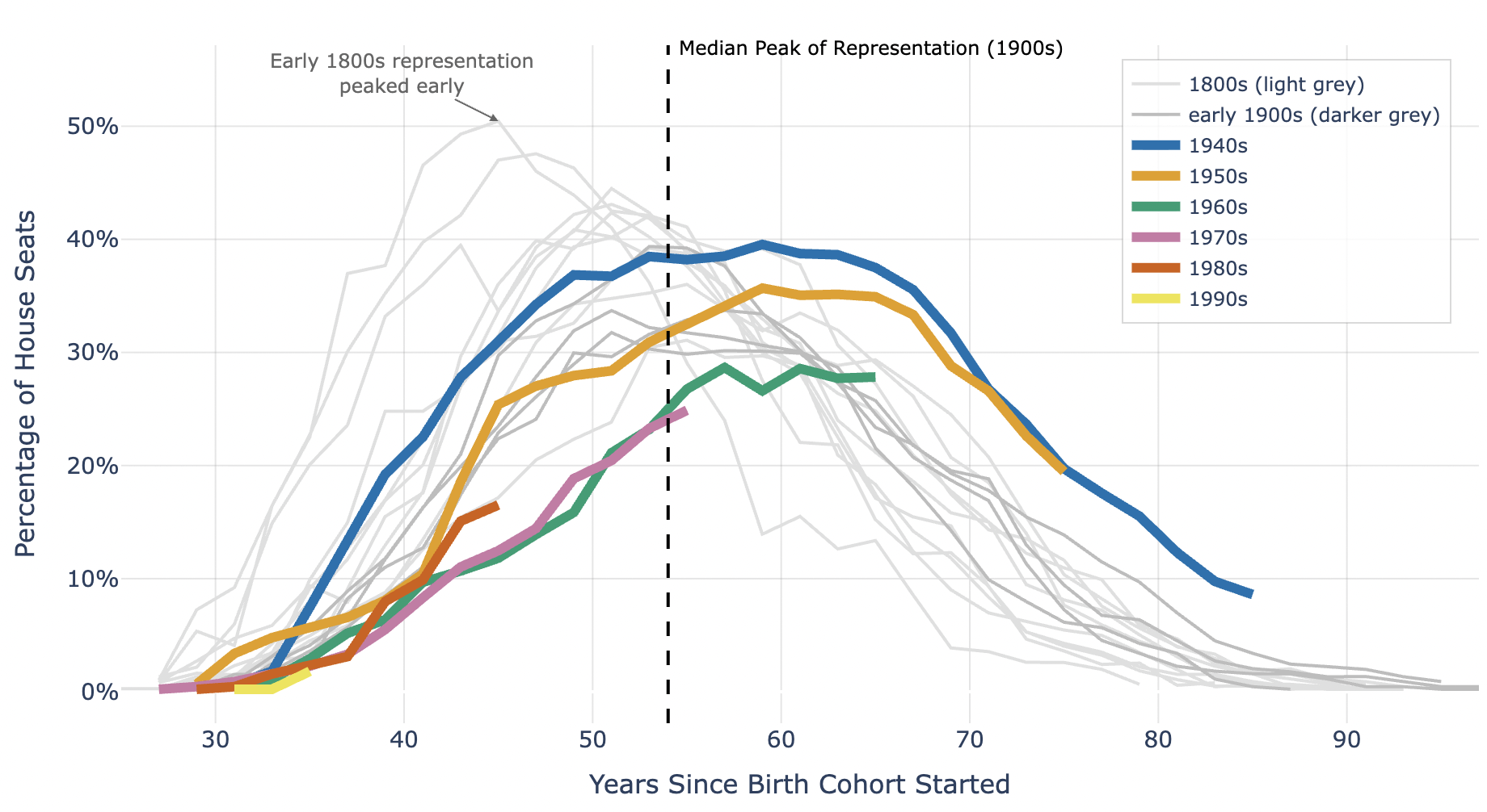
This chart tracks how different birth cohorts gained and lost representation in the U.S. House over time. Each line shows the share of total House seats held by people born in a given decade, measured by how many years have passed since that cohort began. The thick colored lines represent postwar generations, while lighter lines trace earlier centuries.
Most cohorts reach their peak share around 50–55 years after birth, shown by the dashed vertical line. The 1940s generation hit that peak recently, dominating Congress for the past decade. The 1950s and 1960s cohorts are now tapering off, while the 1970s–1990s generations are still climbing toward their peak. The early 1800s generation, interestingly, peaked much earlier in life.
by DataVizHonduran