

A quick rant – but also a reality check.
Every week I see posts like “I analyzed 100 startups with ChatGPT and here’s what I learned…” and the results always read like fiction.
No sources, no numbers, just vibes.
So instead of complaining, I pulled real data:
- Crunchbase company financials
- Kaggle startup datasets
- Mercury’s 2025 benchmarks
- Public filings + industry reports
I actually built a BI model from it – 50 startups, 12 sectors, over 300 metrics tracked.
The results were… a bit humbling.
What surprised me most:
- Startups raising $10M+ often have worse unit economics than bootstrapped ones.
- FinTech looks glamorous but burns 7× more capital per dollar of revenue.
- 40% of startups hit a “$1M plateau” and stall there for years.
- High margins can create low urgency – the “80% comfort trap.”
I’d honestly love to make a community version of this – a dataset anyone can add to and analyze together (open, transparent, real).
Would anyone here be interested in contributing anonymized data or even just ideas for what to measure next?
Full write-up + charts are on our website if you’re curious : link
TL;DR: I’m not anti-AI – I just think insights should come from truth first, tools second.
by Mob_sterino
12 Comments
“This ain’t AI!” Proceeds to post AI guesstimates.
What in the world is this? I feel like a crazy person trying to parse through this post
I’m not reading your post because your chart is terrible.
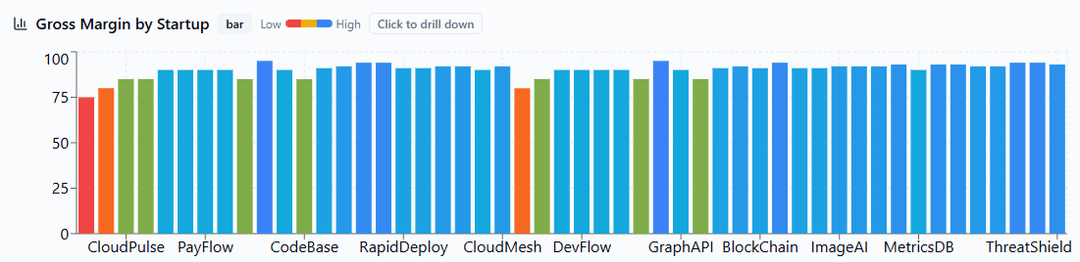
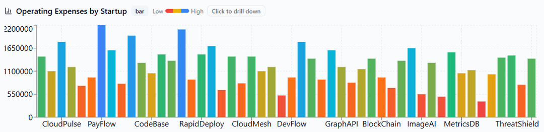
We don’t need a color to tell a data that’s already known (low/high), this should be used to tell apart what’s currently on the X axis, and to take advantage of that to present the data in a sorted order, and we can figure trends naturally.
Currently I’m looking at rainbows of random heights.
For those new to data visualization, this is a great example of how not to do it 😅
—
Edit: a bit more detail on why this is bad now that I can type comfortably with my computer.
First of all, the colours are useless and distracting. What does it mean to be low/red? Low in comparison to what, to all the samples or the group? I can’t get this information from just a glance.
What does the x-axis mean? Sure the 3 or 4 bars are for one startup, but what’s the order from left to right? Is it year? Is it weeks? Is it funding round? I can’t get this information from looking at the graph. There is also no unit on the y-axis. What’s the unit? Dollars or thousands of dollars as it’s often used in financial documents?
It’s also presented in a way that’s just a palette of colour. Why is there no separation between startups/groups? A good graph shouldn’t need the viewer to manually count the bars and figure out which belongs to which. There is also massive inconsistencies in the third graph. Why does Data Analtyics and AI/ML seemingly having 3 bars, but FinTech all of sudden has just one or two? I can’t figure out which bar is for what
First, it’s a great idea!
Second, I cant parse the charts. What’s the X axis? What are the colors?
Sorry, dude. I appreciate your work and commitment to the idea, but your charts are unusable.
So basically all of these companies are braindead and we’ll be lucky to see any of them survive. They raise the money, and either spend it poorly or can’t figure out what to (productively) do with it
This is a first for me— a post generated by GPT (incl. description and comments) that complains about the overuse of GPT.
https://preview.redd.it/az38gwz4jhzf1.png?width=3000&format=png&auto=webp&s=f4c44da86e2e42cf5af2072576322e1ecd9d85eb
https://preview.redd.it/0wu54ak9jhzf1.png?width=3000&format=png&auto=webp&s=052abcdd220bcc79afc57d1412466bb130d015f9
https://preview.redd.it/v04lseqajhzf1.png?width=3000&format=png&auto=webp&s=6522fb41e99c75162dc6c16b1f99ad1fa4dc9309