
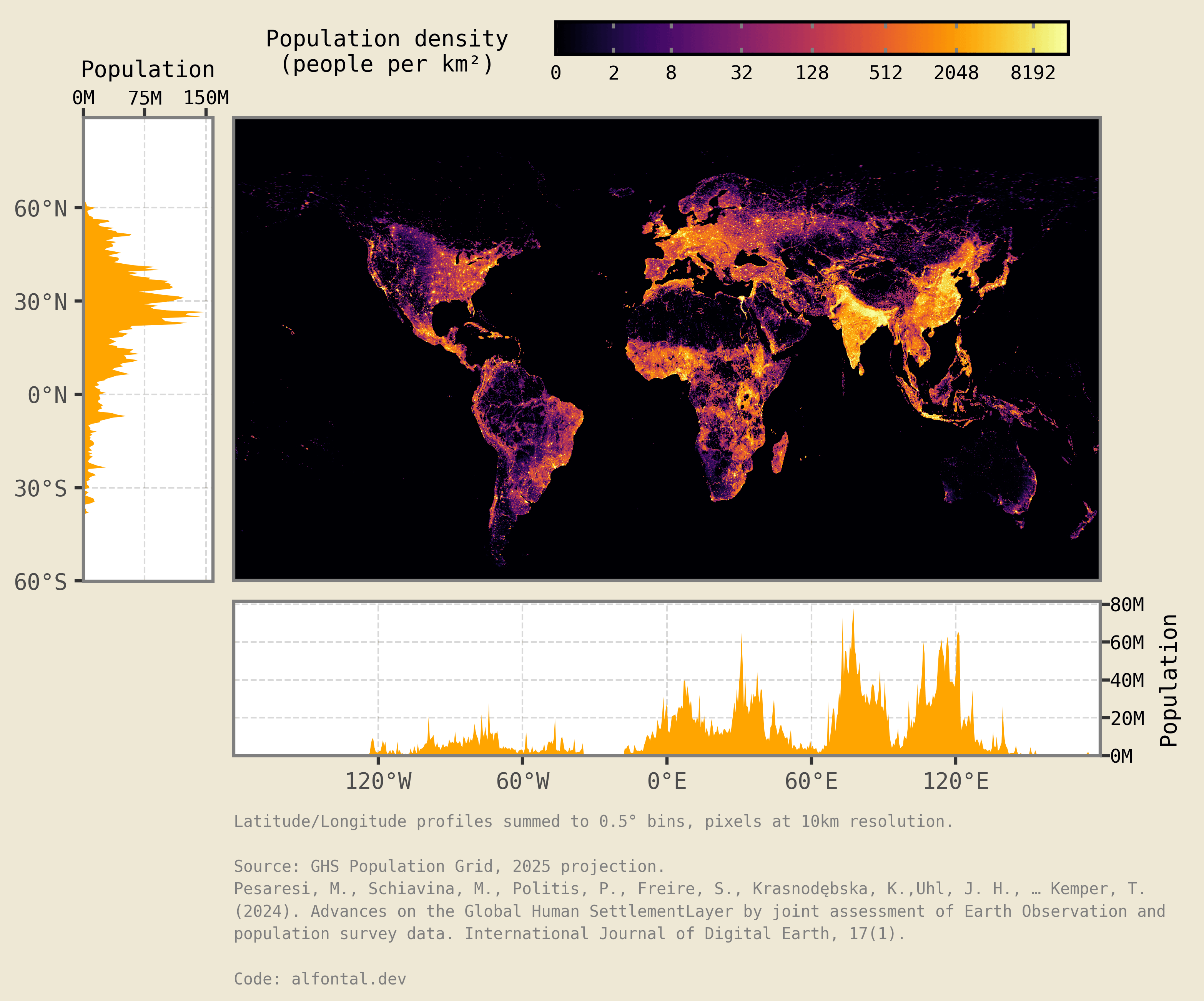
I saw an old picture at very low resolution on a Facebook post and thought I might be able to reproduce it with new data and some Python data viz. It's quite fascinating to see how most of humanity is concentrated in a rather close-by quadrant.
Data source: Global Human Settlement population projection grid for 2025 1km resolution.
Tools: Python. xarray library for the data wrangling and plotnine for the visualization.
Code source: Python code to reproduce the data source download, wrangling and plotting in:
by fontalovic
1 Comment
This one is what this sub was made for