

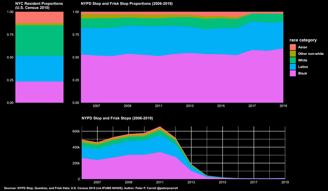
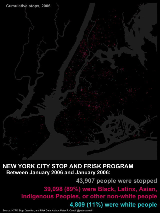
I made these visualizations that include linking NYPD Stop, Question, and Frisk (aka, stop and frisk) stops to census tracts. These graphs show the racial bias of stops, which has been more thoroughly explored elsewhere, including the necessary nuance and adjustments not included in these visualizations. I would point those interested to, for example, Knox et al. (2020), which suggests that the bias I detect here is likely an underestimate. Also see the scholarship of Gelman et al. (2007) and Levchak (2021) on the stop and frisk program in particular. (Links to articles below.)
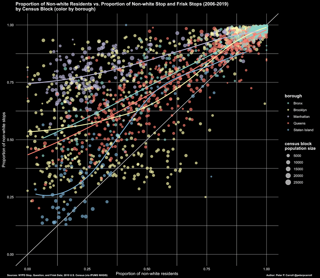
I’m particularly proud of the scatterplot (frame 3) which shows each census tract and the proportion of non-white residents by the proportion of non-white stops. Make your own assumptions about what a just curve would look like but any dot above the diagonal means a disproportionate number of people of color were stopped in that census tract, relative to the residential population.
Data from 2006 through 2019, sourced from the NYC open data portal, 2010 census data from IPUMS; wrangled by moi. Made in R. ✌️
Knox et al. (2020) https://www.cambridge.org/core/journals/american-political-science-review/article/administrative-records-mask-racially-biased-policing/66BC0F9998543868BB20F241796B79B8
Gelman et al. (2007) https://sites.stat.columbia.edu/gelman/research/published/frisk9.pdf
Levchak (2021) https://www.sciencedirect.com/science/article/abs/pii/S0047235221000040
by no_regret_coyote
2 Comments
Data from the NYC open data portal and the IPUMS 2010 census data repository. Created in R.
Why did the amount of stop and searches rapidly drop after 2011?