
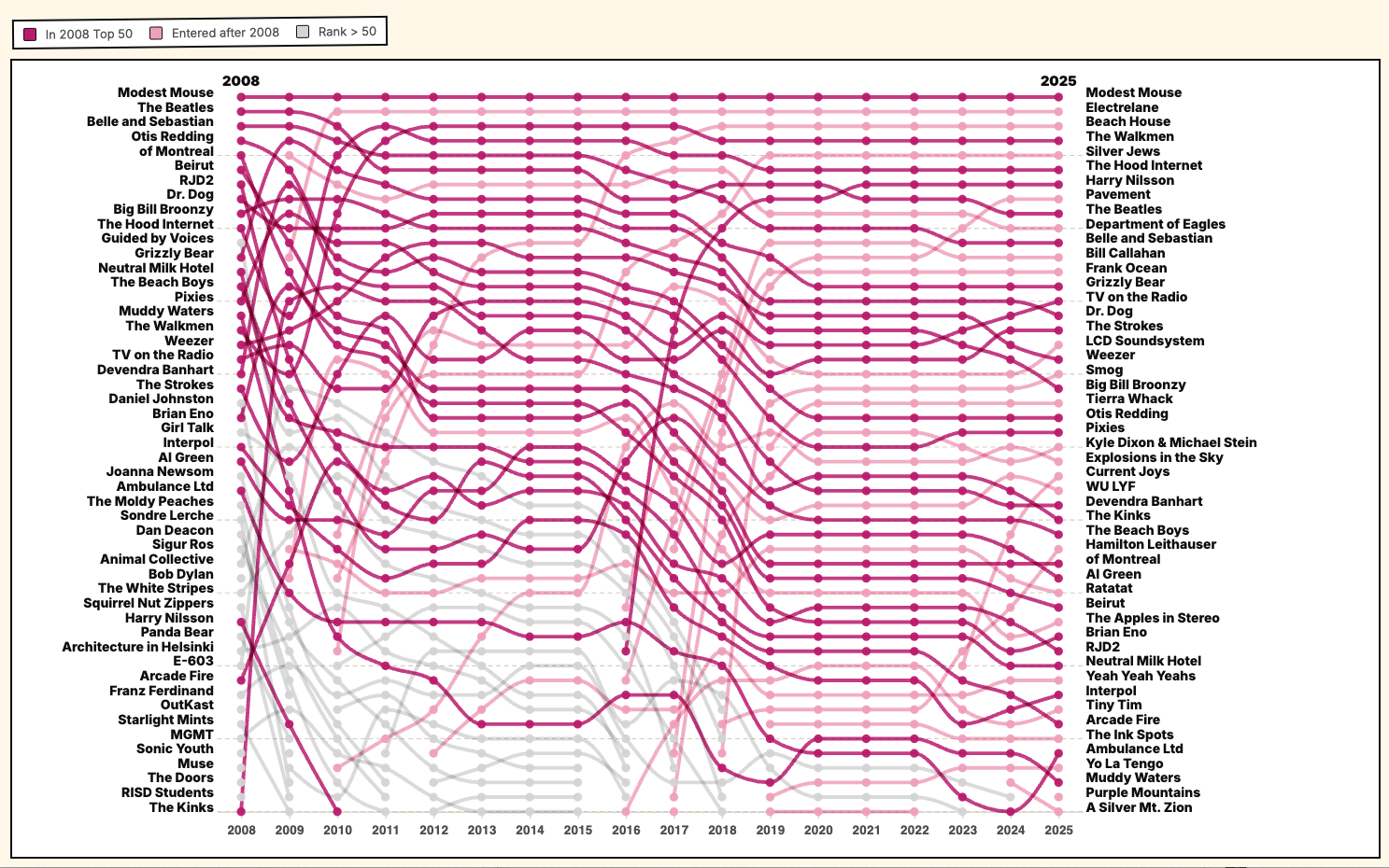
Over the past 18 years, I’ve logged more than 300,000 songs on Last.fm. There were a few gaps when the scrobbler stopped working or when I switched from Spotify to Apple Music, but it still captures most of my listening habits.
The chart pulls from all that data to show how my taste has shifted over time. Unfortunately, there’s still no way to include long drives (for someone with nothing to think about) with CDs or the radio. It’s been fun to see the evolution from indie playlists to full-on sad dad music.
I used to build this chart by hand every quarter via Illustrator and decided to try chatgpt to help build an interactive version. Since I intimately pull every data point, I found it easier to locate any data issues it may have produced.
Interactive version: https://winkitude.com/charts/lastfm.html
Tools: D3.js, excel, chatgpt, itunes API (for album images)
by linksfromwinks
13 Comments
Color schema here is so good )
I don’t respect Modest Mouse because their #1 hit was a rip off of Lupe Fiasco’s The Show Goes On
Always wanted this data personally but switched platforms far too many times and never setup last.fm. Really amazing work. Interactive version is really nice.
2008 was really great, 2025 is just sad
This could be a table with two columns and no lines in the middle and it’d be easier to use.
Interesting alternation between stable periods and big shakeups. What happened in 2016–17 — did you get a new partner or something?
I recognize like 5 of these artists
I’m amazed his similar, your music listening is.
Sigur Ros going right into a nose dive made me laugh.
This is really nice, also upvote for electrelane 😉
I see a lot of things I hear(d) a lot too (like kinks, dr dog, arcade fire, lcd and so on)… so I suggest to you to give ‘man man’ and ‘future islands’ and ‘cocorosie’ a go …0
So proud of you seeing the walkmen, silver jews, and pavement near top ranks in the 2025 stack.
Bob Dylan dropped off? How old are you? Must be past 30 🙂
Your colour scheme is as good as your music taste