November 2, 2025Change in power sector emissions this year compared to 2024 – for the six largest CO2 polluters
November 1, 2025In 170 Years, Wild Mammal Biomass Has Halved, While Livestock Biomass Has Quintupled. 95% of Mammals on Earth Are Now Livestock and Humans, Leaving Only 5% for Wildlife
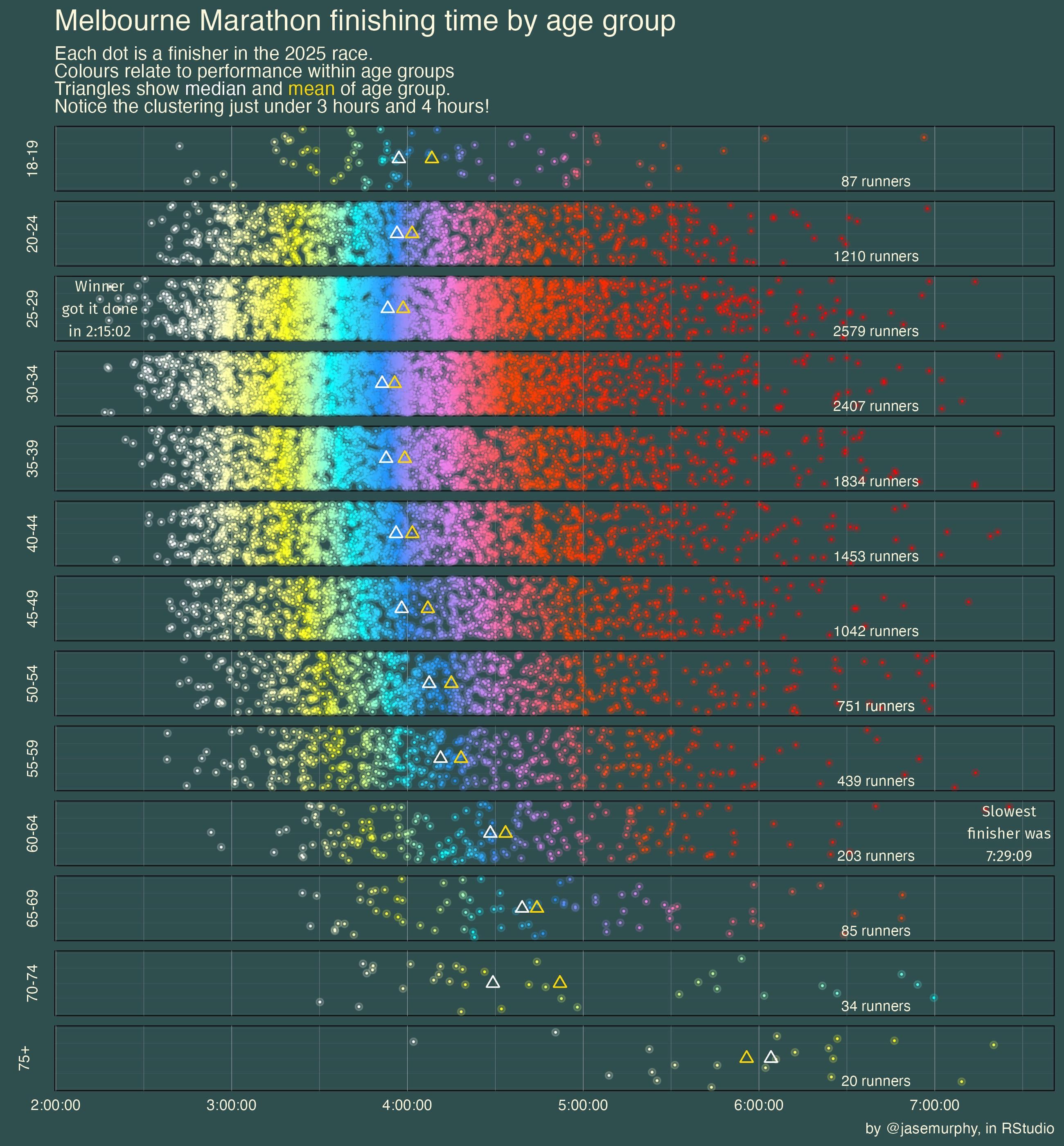
TomasTTEngin on October 31, 2025 9:17 pm made in RStudio by scraping the multisport Australia website. My favourite part of this visualisation is overlaying two separate geom_points to create a glowing look with a bright dot surrounded by a faint little halo. 🙂 library(rvest) library(tidyverse) marathonresults <- vector(mode = “list”, length = length(242)) for (i in 1:242){ marathonresults[[i]] <- paste0(“https://www.multisportaustralia.com.au/races/melbourne-marathon-2025/events/1?page=”, i) } marathonresults <- unlist(marathonresults) marathonresults2 <- vector(mode = “list”, length = 242) for (i in seq_along(marathonresults)){ marathonresults2[[i]] <- read_html(marathonresults[[i]]) %>% html_table() } stragglers<- read_html(“https://www.multisportaustralia.com.au/races/melbourne-marathon-2025/events/1?page=243″) %>% html_table() stragglecrew<- stragglers[[1]] %>% select(-8) %>% filter(Pos!=”DNS”) %>% select(time = `Net Time`, age = `Category (Pos)`) mara3<- marathonresults2 %>% bind_rows() %>% select(time = `Net Time`, age = `Category (Pos)`) %>% rbind(stragglecrew)
Fatkuh on October 31, 2025 9:24 pm That is a really nice graph! You can see the decline by age and speed groups pretty vell, which is a totally fun extra layer of information.

4 Comments
Running a 4 hour marathon at 75+ is insane work
made in RStudio by scraping the multisport Australia website. My favourite part of this visualisation is overlaying two separate geom_points to create a glowing look with a bright dot surrounded by a faint little halo. 🙂
library(rvest)
library(tidyverse)
marathonresults <- vector(mode = “list”, length = length(242))
for (i in 1:242){
marathonresults[[i]] <- paste0(“https://www.multisportaustralia.com.au/races/melbourne-marathon-2025/events/1?page=”, i)
}
marathonresults <- unlist(marathonresults)
marathonresults2 <- vector(mode = “list”, length = 242)
for (i in seq_along(marathonresults)){
marathonresults2[[i]] <- read_html(marathonresults[[i]]) %>% html_table()
}
stragglers<- read_html(“https://www.multisportaustralia.com.au/races/melbourne-marathon-2025/events/1?page=243″) %>% html_table()
stragglecrew<- stragglers[[1]] %>% select(-8) %>%
filter(Pos!=”DNS”) %>% select(time = `Net Time`, age = `Category (Pos)`)
mara3<- marathonresults2 %>% bind_rows() %>% select(time = `Net Time`, age = `Category (Pos)`) %>%
rbind(stragglecrew)
I wonder how much of the shape is selection bias
That is a really nice graph! You can see the decline by age and speed groups pretty vell, which is a totally fun extra layer of information.