
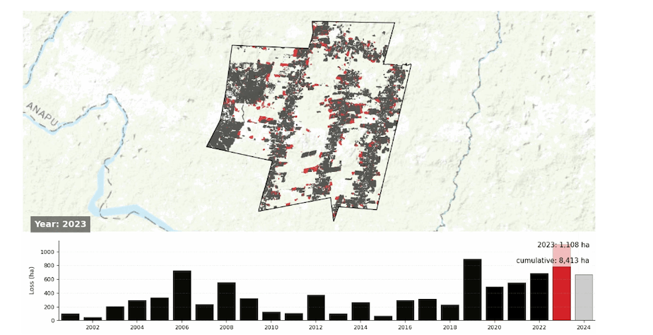
Always playing around with howw to better visualize deforestation over time. Here are four interesting gids of deforestation over time within a set polygon in the Amazon. I find it much easier to see/understand than typical GFW deforestation images. Thoughts? In Emblematic Case studies on drop down menu: https://cri.org/reports/chainsaws-smoke-and-silence/#elementor-toc__heading-anchor-16
by Accomplished-Carob52
1 Comment
I think this is exactly the use case that calls for a raster model of the underlying data instead of a vector model for visualization (even if you have to do a vector to raster conversion, which an animated gif functionally is anyway).
Or, at the very least, the polygon representation should be zero bordered. At this scale, the border color of the individual polygons dominate, making it difficult to see the actual red polygons.
If you really wanted to make this interesting, I would look to do a [conversion to h3](https://h3geo.org/) at an [appropriate level](https://h3geo.org/docs/core-library/restable) for the precision of the data.
I would also experiment around with different contextual basemaps or potentially omit the basemap altogether and just have vector representations of the border and rivers (it is not at all clear what the dark green areas are in the original images). For basemap selection, some thought should go into what factors actually influence deforestation, e.g. if topography plays a role then include hillshade, if not, use flat coloring. It’s also not a great choice to use a landcover based basemap underneath data on landcover change. Instead, I would consider using landcover as a separate thematic layer and include only the relevant landcovers. (This includes satellite imagery in this case, because satellite imagery is typically a proxy for landcover in these types of visualization.)
All that said, I would certainly prefer this as an interactive map with a rubber-banded max extent. (So if you go outside the max extent, it snaps back to the original extent.)
As a sidenote, the basemaps do not have an attribution string. They should have an attribution for the tiles or the source data, similar to the attribution for the original deforestation data.