
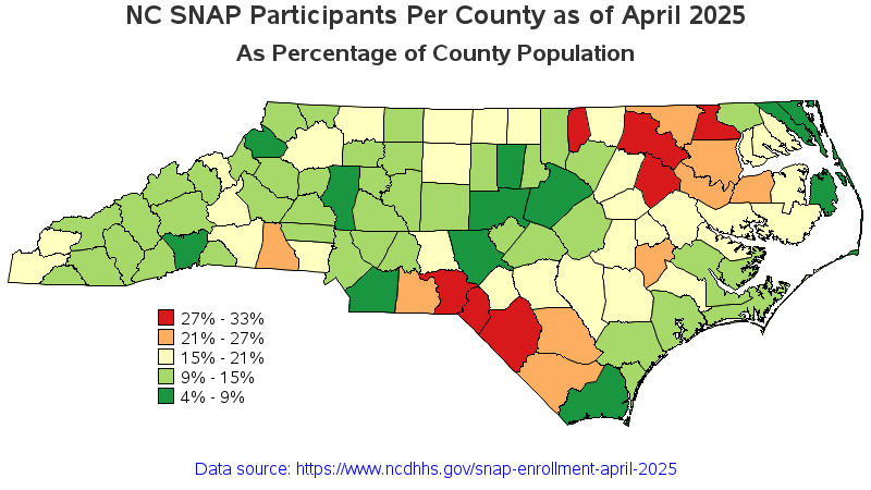
The data had been posted as a table, and I thought it would be more 'beautiful' as a map.
Data source: https://www.ncdhhs.gov/snap-enrollment-april-2025/open
Software used: SAS/Graph
Version of map with html mouse-over text: https://robslink.com/SAS/democd104/nc_snap_map.htm
by graphguy
2 Comments
It’d be interesting to see who those counties voted for.
wait…what does red signify…? My county is in the middle btw