Data Source for S&P500 prices: TradingView
Charts made with Google Sheets (sorry :<)
My interpretation of the data:
In general, the stock market has performed better overall under Democrats compared to Republicans. However, this is _greatly_ influenced by the abysmal performance under Hoover (which, as you may know, coincided with the Great Depression).
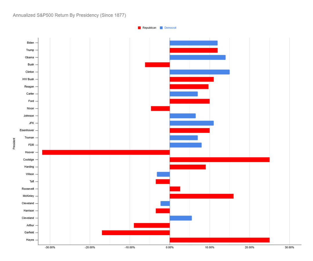
The first chart shows annualized stock market performance under each president, color coded by the party of that president. In general, after Hoover, performance under Democrats and Republicans has been pretty similar except for Nixon and Bush which saw negative returns during their presidency.
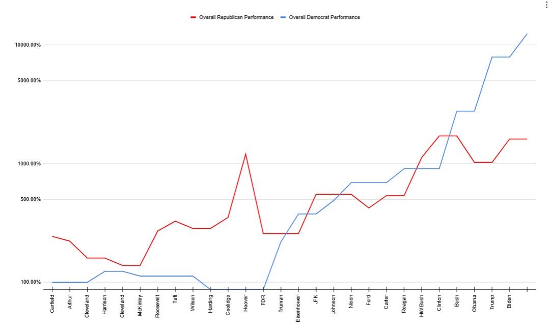
The second chart shows a hypothetical scenario in which you invested in the stock market, but only during Democrat or Republican presidency specifically (being 100% cash when the other party is in power). In general, Republicans outperform Democrats until Hoover, then they trade places until Clinton’s legendary stock market of the 90s, which point Democrats pull far ahead. As of the end of the Biden administration, the Democrat portfolio is up around 12,400% since 1877, while the Republican portfolio is up only 1,610%.
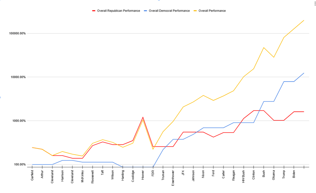
The third chart attempts to put this into context by comparing both of those funds to simply holding the S&P500 regardless of who’s in charge. This third fund saw about a 20,000% gain since 1877, greatly beating both the Democrat and Republican portfolios. Thus proving the adage “Time in the market beats timing the market”.
My interpretation of this is that Democrats and Republicans actually see highly similar stock market performance, but there have been a few instances of recessions happening right at the end of Republican presidencies, allowing the succeeding Democrat president to take credit for the recovery that followed. This explains most of the stock market gains under Biden, Obama, and FDR.
DecoyOne on
r/dataisbeautiful should be about thoughtfully designed and aesthetically pleasing visuals. Not standard lines and bars where the legend is inconsistently colored and there are unlabeled or unclear data points.
Also, I don’t understand what you’re trying to say overall. Comparing the parties pre-1980 is wobbly, pre-1960s is problematic, and pre-FDR is just plain pointless. Grover Cleveland’s policies aren’t exactly 1:1 with the modern Democratic Party.
Last, more context is always needed. The economy you inherit matters. Inheriting great market performance and then having mediocre performance is worse than inheriting and maintaining mediocre performance.

2 Comments
Data Source for S&P500 prices: TradingView
Charts made with Google Sheets (sorry :<)
My interpretation of the data:
In general, the stock market has performed better overall under Democrats compared to Republicans. However, this is _greatly_ influenced by the abysmal performance under Hoover (which, as you may know, coincided with the Great Depression).
The first chart shows annualized stock market performance under each president, color coded by the party of that president. In general, after Hoover, performance under Democrats and Republicans has been pretty similar except for Nixon and Bush which saw negative returns during their presidency.
The second chart shows a hypothetical scenario in which you invested in the stock market, but only during Democrat or Republican presidency specifically (being 100% cash when the other party is in power). In general, Republicans outperform Democrats until Hoover, then they trade places until Clinton’s legendary stock market of the 90s, which point Democrats pull far ahead. As of the end of the Biden administration, the Democrat portfolio is up around 12,400% since 1877, while the Republican portfolio is up only 1,610%.
The third chart attempts to put this into context by comparing both of those funds to simply holding the S&P500 regardless of who’s in charge. This third fund saw about a 20,000% gain since 1877, greatly beating both the Democrat and Republican portfolios. Thus proving the adage “Time in the market beats timing the market”.
My interpretation of this is that Democrats and Republicans actually see highly similar stock market performance, but there have been a few instances of recessions happening right at the end of Republican presidencies, allowing the succeeding Democrat president to take credit for the recovery that followed. This explains most of the stock market gains under Biden, Obama, and FDR.
r/dataisbeautiful should be about thoughtfully designed and aesthetically pleasing visuals. Not standard lines and bars where the legend is inconsistently colored and there are unlabeled or unclear data points.
Also, I don’t understand what you’re trying to say overall. Comparing the parties pre-1980 is wobbly, pre-1960s is problematic, and pre-FDR is just plain pointless. Grover Cleveland’s policies aren’t exactly 1:1 with the modern Democratic Party.
Last, more context is always needed. The economy you inherit matters. Inheriting great market performance and then having mediocre performance is worse than inheriting and maintaining mediocre performance.