
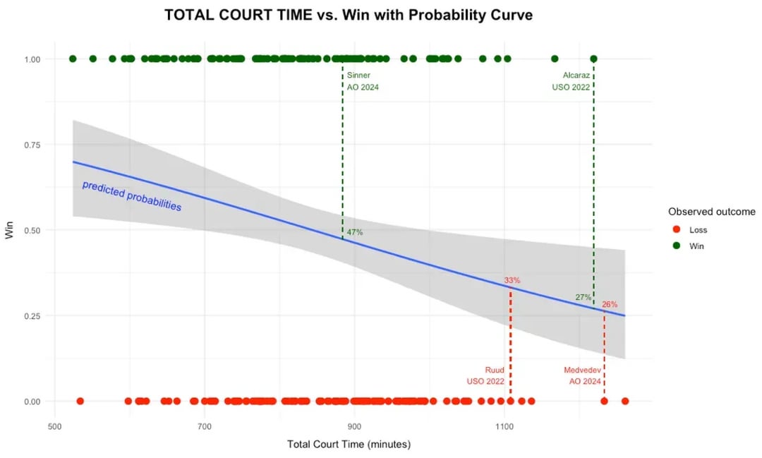
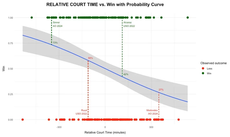
We published an article, where we look at 30+ years of data to analyse the impact of total time and relative time on court. The graphs below show the shift in win probability between the two models. If you think this is interesting and want to read more the link is below. Any feedback welcomed
🔗 theanalyticssports.com/game-set-time/
by Omorelo
6 Comments
I assume you’re showing the win probability of male players in Grand Slam finals based on the amount of time they’ve spent on court in the tournament? As a tennis fan I can infer that from the data points you selected, but I don’t see how most people would figure out what’s going on here. It’s a cool thing to chart, it’s just not clear what exactly it is that you’re charting.
I’m not following this.
What is court time?
What do total court time and relative court time mean?
The fact that your prediction of win probability decreases as court time increases — meaning more of it makes you less likely to win — suggests it’s a proxy for fatigue or something. Is it the number of minutes your matches have lasted in a given tournament?
That doesn’t seem right, since there’s such a strong negative correlation with total court time and expected win probability, even at the really high numbers.
Isn’t total court time the same for the winner and loser of each match?
While the study is interesting, the visualizing is not really great. For as simple of data as you are presenting, it is very difficult to read the graphs (which is why I had to read the associated article). I still can’t make sense of the dots at the top and bottom — I know those are the data points, but why are they there, and why do you need to show them like that — is the clustering relevant (and if so, why then do you only show the smooth fit curve separately — and so then why is it so difficult to match individual data points who are playing against each other in the relative court times for example?)
For men’s tennis I’d consider the duration of an individual match (and related factors) to be the thing important to the hypothesis — so you can win or lose a match, but if that match lasts an unusually long time, then that can indicate or predict a number of problems going forward for the player — they may no longer be as dominant with their serve as they’d like, and they’ve got the physical and mental fatigue that’s beginning or has been building up. If that long match was the match immediately preceding the one being analyzed, that might be an even more significant predictor. (Having a single bad long match a few days prior may no longer be much of a problem physically or psychologically.) Total court hours is a fair proxy, but I’m not sure if it’s the best one you can find. (Or you don’t test whether it is, in comparison to others — or did you?)
I think there are confusing cause and effects going on here. In general, if a guy has played less than his opponent throughout the tournament it means he is winning games easier which is a good indicator that he is the best player. You should try to separate this somehow, but if you are only looking at the grand slam finals I don’t think you have enough data to do so.
I understand nothing. Maybe i am too dense / lazy here, but i do have a degree in mediadesign and – in general – if a consumer has to study a graph carefully to even know what the result remotely is supposed to be, then there is a clear usability problem.