
blog post with code and analysis: https://aaronjbecker.com/posts/comparing-child-share-population-1990-vs-2024-by-state/ (repost due to technical issue earlier)
by aar0nbecker
blog post with code and analysis: https://aaronjbecker.com/posts/comparing-child-share-population-1990-vs-2024-by-state/ (repost due to technical issue earlier)
by aar0nbecker
9 Comments
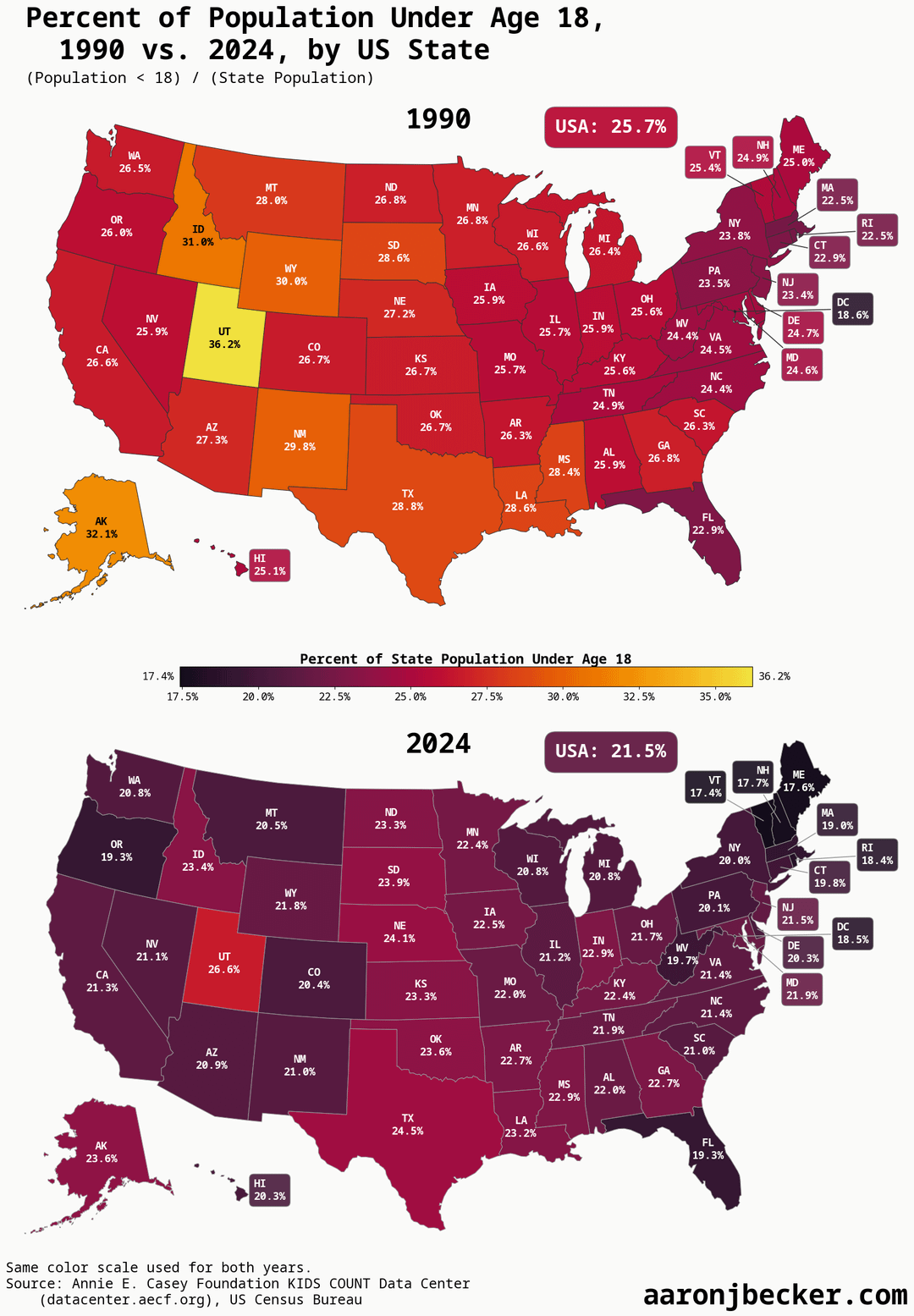
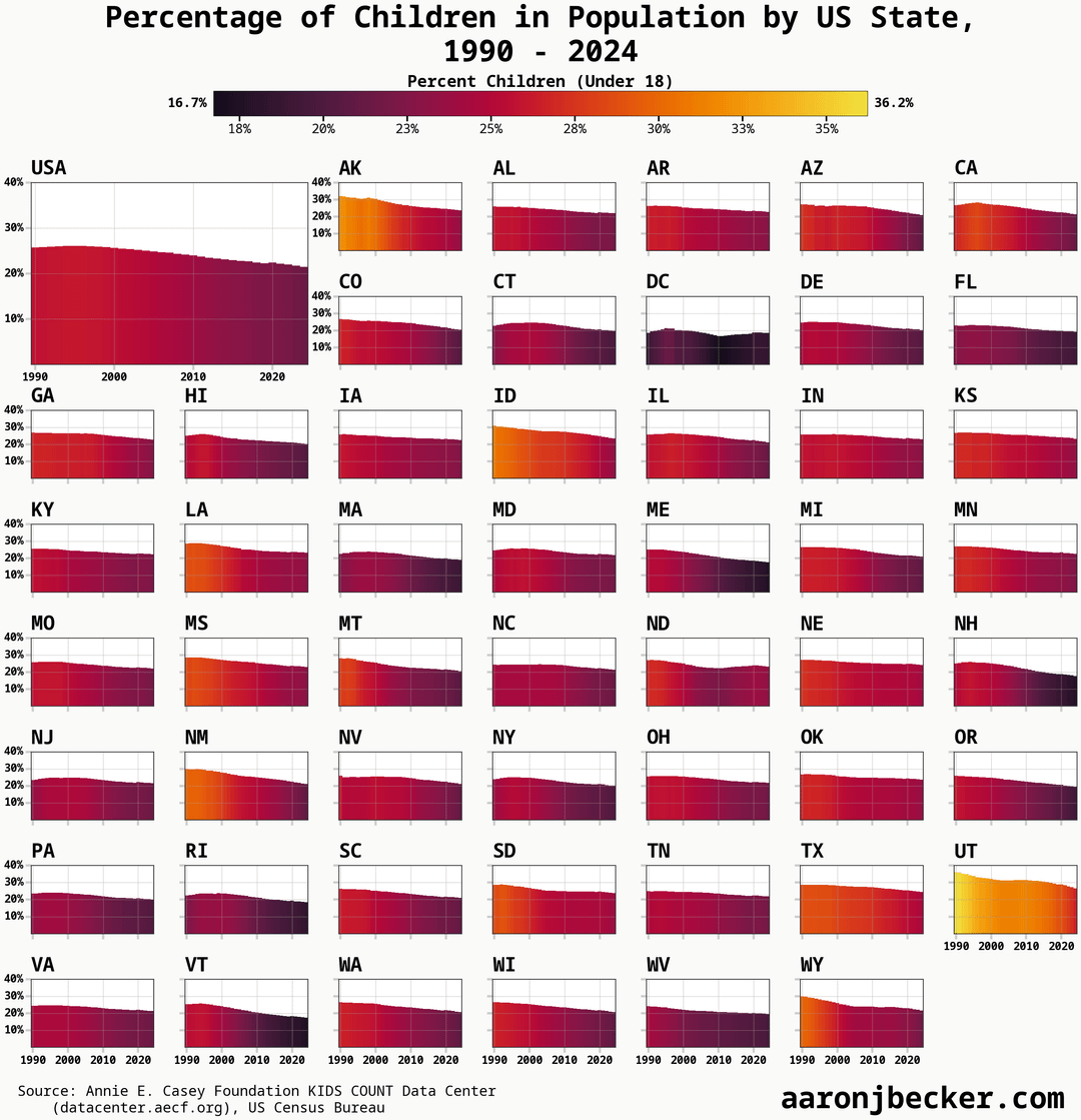
Data source: [US Census Bureau intercensal estimates analyzed by Annie E Casey Foundation KIDS COUNT Data Center](https://datacenter.aecf.org/data/tables/99-total-population-by-child-and-adult-populations?loc=1&loct=1#detailed/2/2-53/false/1096,1/39,40,41/416,417)
Tools: python, jupyter, matplotlib, geopandas, pandas, polars
[Blog post with full replication code, walkthrough, and analysis](https://aaronjbecker.com/posts/comparing-child-share-population-1990-vs-2024-by-state/)
Is Utah just like that because of the Mormons?
having kids is rewarding, but damn its expensive
Sounds like a combination of people living longer and everything being more expensive for larger families to be less desirable.
The color coding is pretty misleading here, ngl
Too many mega billionaires preventing money from doing as much as it could be doing. Not enough left for young people to feel like they can start families.
I feel like these colors should be swapped, with the darker colors being higher population of under 18. Not surprised by the results on this one, higher cost of living/less religion = less kids.
I think it’s almost always more intuitive to have lighter, less saturated colors depict smaller numbers. Or warmer colors for higher and cooler colors for lower.
An aging population into a monetary system that requires a growing population. What could possibly go wrong?