
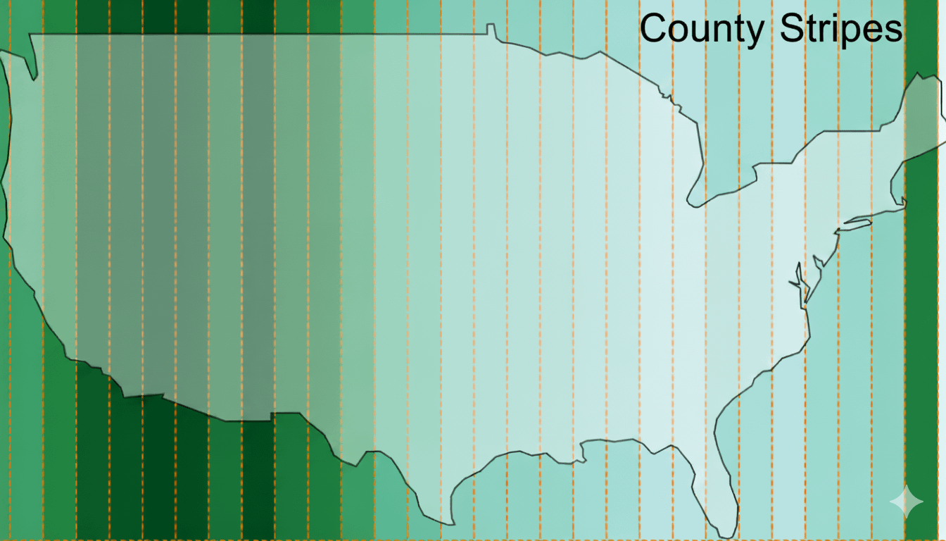
The United States divided into vertical longitude bands – with each band colored based on the average land area of counties within it (darker = bigger).
You can clearly see the shift from the small, densely clustered counties in the eastern U.S. to the much larger counties across the Great Plains and the West.
The map was created with MapLibre GL JS using Turf.js to calculate average county areas within each longitudinal strip. The underlying data comes from the U.S. Census Bureau’s county boundaries.
You can play with the interactive version here – https://mapsmania.github.io/uscounties/
by Cornea
4 Comments
This map shows the United States divided into vertical longitude bands – with each band colored based on the average land area of counties within it (darker = bigger). The underlying data comes from the U.S. Census Bureau’s county boundaries.
The map was created with MapLibre GL JS using Turf.js to calculate average county areas within each longitudinal strip.
You can play with the interactive version here – [https://mapsmania.github.io/uscounties/](https://mapsmania.github.io/uscounties/)
Why did you do Michigan so dirty ?
Had a family visitor that I took on a hike in the Laguna Mountains on the eastern side of San Diego County that overlooks the Anza Borrego Desert, and they said “and that’s still really San Diego County down there??”
Sweet, now add some horizontal stripes and you’ll have a grid! And then make them narrower and narrower aaaanddd oops I reinvented pixels didn’t I?