
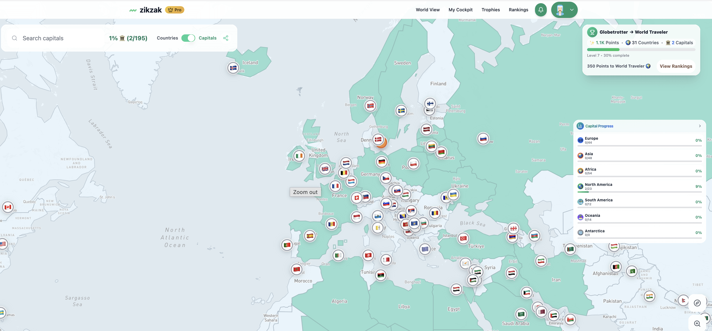
I’ve been tracking every country I’ve visited and decided to visualize it – each flag represents a capital city I’ve been to.
It’s been fun seeing the patterns: clusters in Europe, gaps in Africa and Oceania.
The map updates automatically when I add new destinations, and I plan to visualize flight distances and “time zones covered” next.
Built the visualization myself using React + Mapbox + Supabase.
Always curious what kind of data other travelers track – would love to hear how you visualize your own journeys!
by fberggreen
1 Comment
That’s cool. I find it funny as a Canadian, this is like “you’ve traveled between 2 provinces” at least distance wise.