
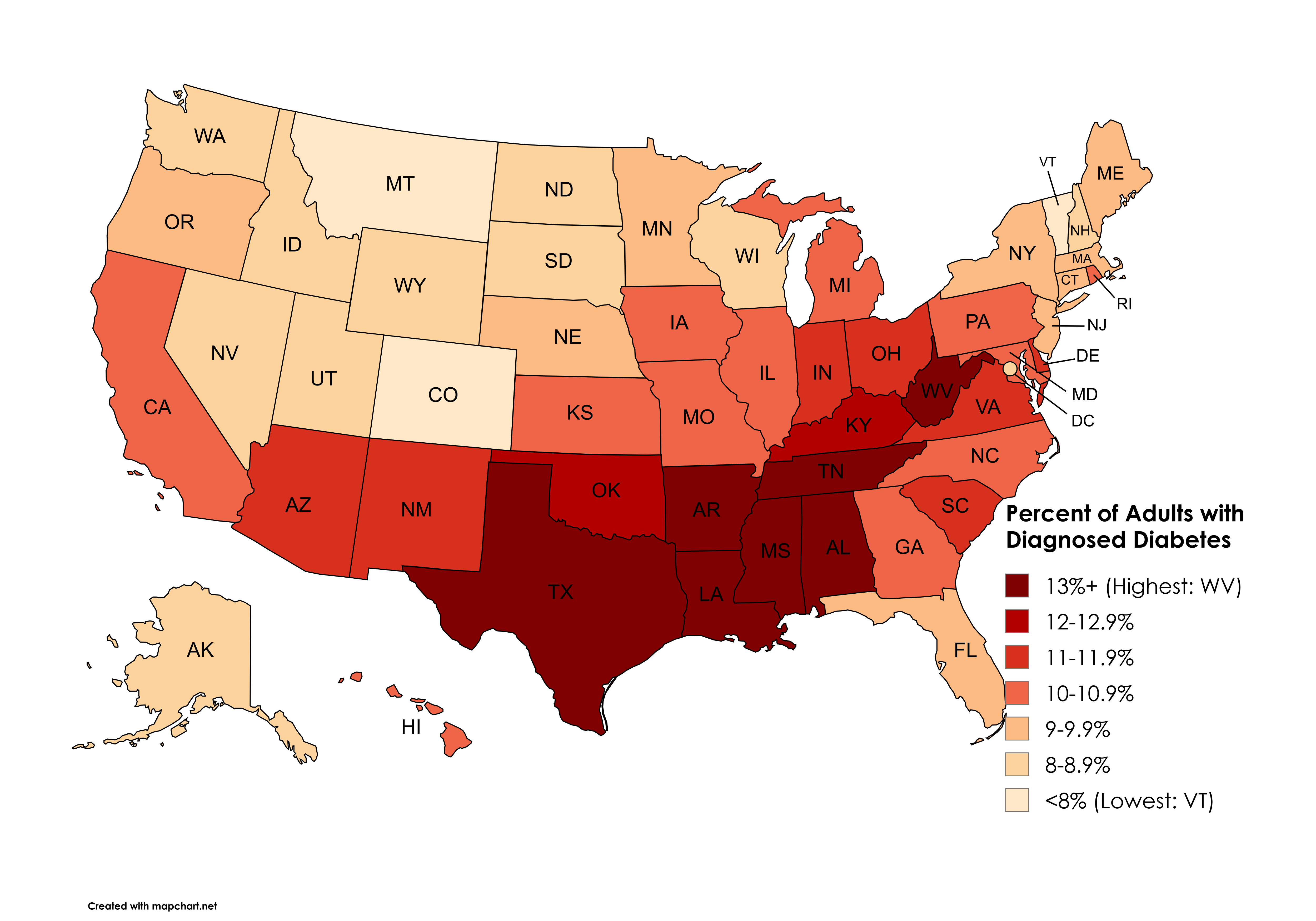
Data: CDC (https://gis.cdc.gov/grasp/diabetes/diabetesatlas-surveillance.html#)
Tool: Mapchart (https://www.mapchart.net/usa.html)
by snakkerdudaniel
Data: CDC (https://gis.cdc.gov/grasp/diabetes/diabetesatlas-surveillance.html#)
Tool: Mapchart (https://www.mapchart.net/usa.html)
by snakkerdudaniel
11 Comments
Data: **CDC (https://gis.cdc.gov/grasp/diabetes/diabetesatlas-surveillance.html#)**
Tool: **Mapchart (https://www.mapchart.net/usa.html)**
Colorado beat Mass for once.
Oh yeah, the South leading the way in another shitty stat. Lots of leopard face eating going into on there
Is it states that use more lard and crisco shortening in their cooking? Or just poorer where they eat more processed garbage?
[deleted]
I bet it’s because of sweet tea and beer.
Rhode Island, the armpit of New England again
I would love to see this pattern by county and next to a map of poverty rate by county next to it. Like, are rich white people in the south getting diabetes just to spite black people? Or are there just that many poor people in those states that it drags down the averages?
Apparently 3 things now come from Texas.
These type of color coded maps almost always look the same. Same states always in the bad shade of whatever color they are using….
Oh look, it’s The Map again.