
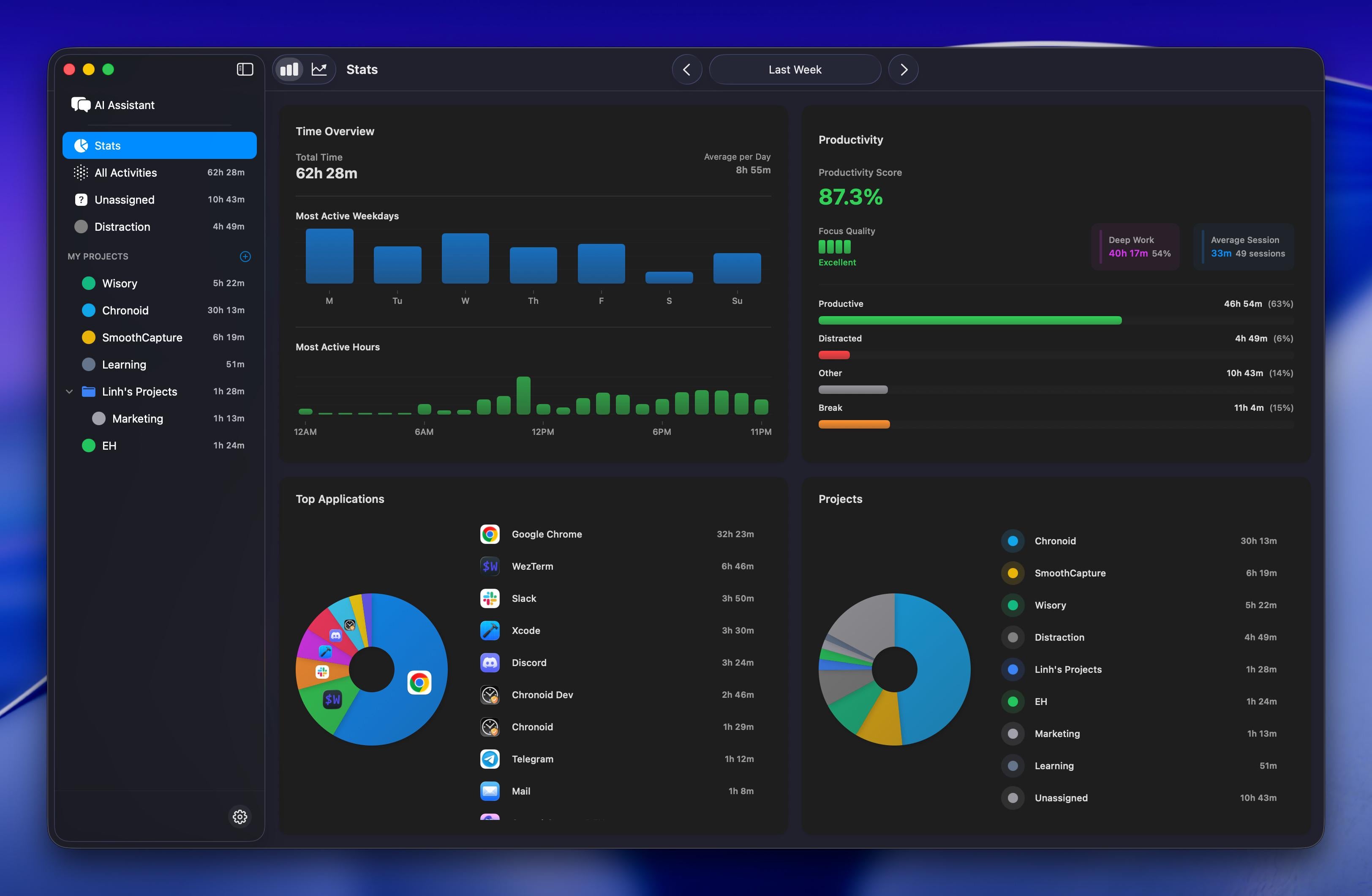
This is a visualization of my own productivity and app usage data from the past week, automatically tracked on my Mac
Each bar and chart reflects how I actually spent time across weekdays, hours of the day, projects, and applications.
- Total time: 62h 28m
- Productivity score: 87.3%
- Deep work: 40h 17m
- Most active hours: 10 AM – 8 PM
- Top apps: Google Chrome, WezTerm, Slack, Xcode
This visualization shows how automatic time tracking can help understand real work patterns — not what I think I do, but what actually happens
by tuanvuvn007
2 Comments
* **Data source:** Local activity logs tracked automatically
* **Tools used:** Swift + SwiftUI for visualization, GRDB/SQLite for data storage, internal analytics engine for productivity scoring.
* **Computation:** Activity classification based on app usage, window titles, and custom rules (distraction, productive, other, break).
Wow, this is super interesting! I love how clear the “deep work vs. general work” split looks visually.