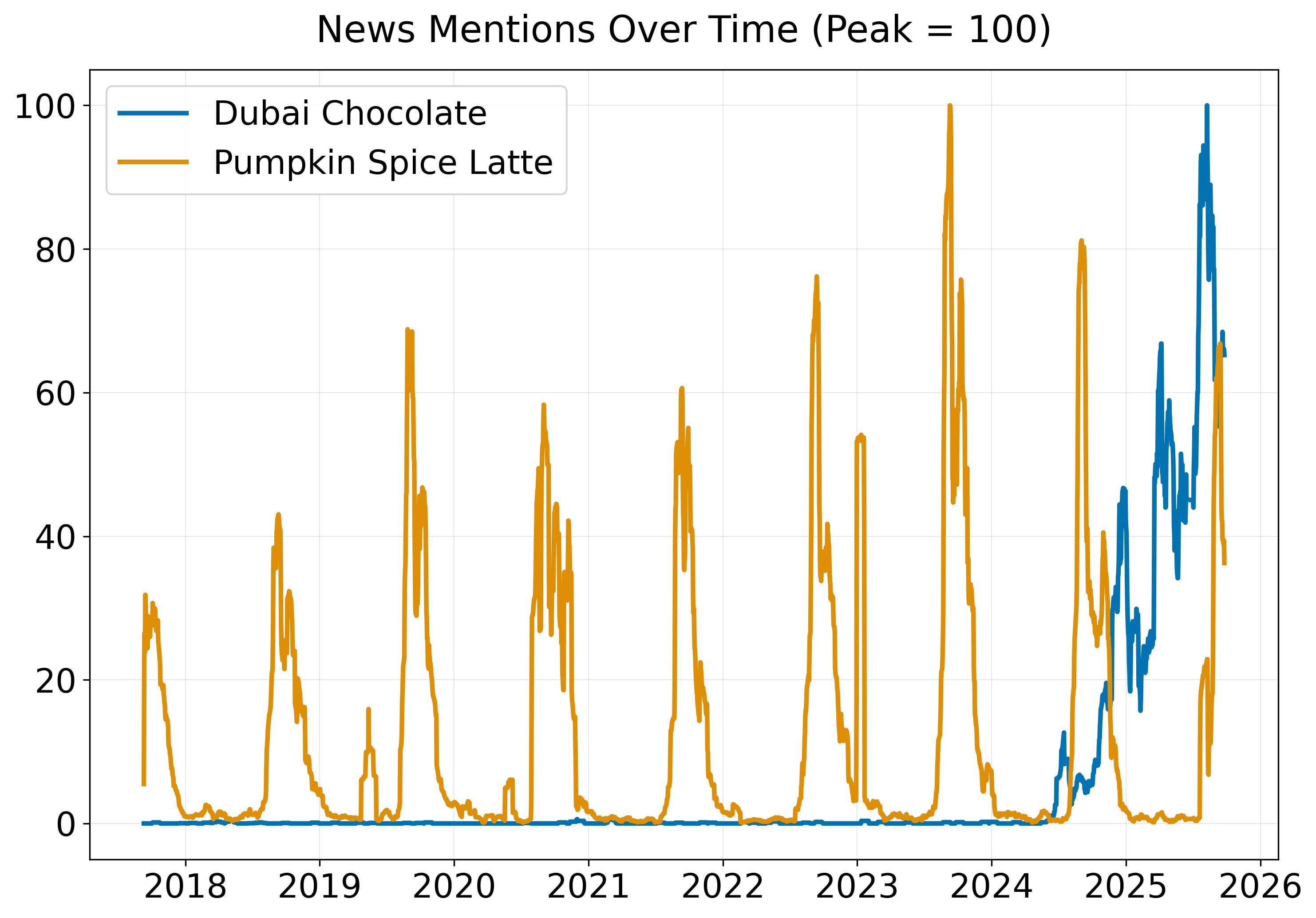
Using GDELT, a database that tracks more than 100,000 online news sources in over 100 languages and processes about 250 million articles each year, I pulled daily article counts of how often each was mentioned between 2017 and 2025. The counts are indexed to 100 = maximum mentions.
by DataVizHonduran

11 Comments
Source: GDELT [https://www.gdeltproject.org/](https://www.gdeltproject.org/), Tools: Python and Plotly
Does anyone actually *enjoy* Dubai chocolate? As in, like the taste and texture?
Omg are we…post pumpkin spice finally?!
There’s a conspiracy around Dubai chocolate. It’s almost believable given that it came out of nowhere.
Why the regular bumps of dubai chocolate? Its not seasonal right?
This looks like you indexed it within each series? If so, it’s obviously kind of useless.
I tried pumpkin spice once, nearly threw up, not my thing. Chocolate was pretty good though
and as you can see its crashing because it’s just a trend
So why does the graph go to 2026?
Because the series are indexed to themselves independently, the comparison is pretty useless
They now try to do it to kiwi. Every fitness influencer talks about kiwi. They soon be 5 bugs a piece. Stop them!