“Am I watching things on television that are different from what’s happening?”
Amazing
Vi1eOne on
But then how would they addict everyone to staring at the screen for 7hrs and sell all those sweet sweet ad dollars?
phdoofus on
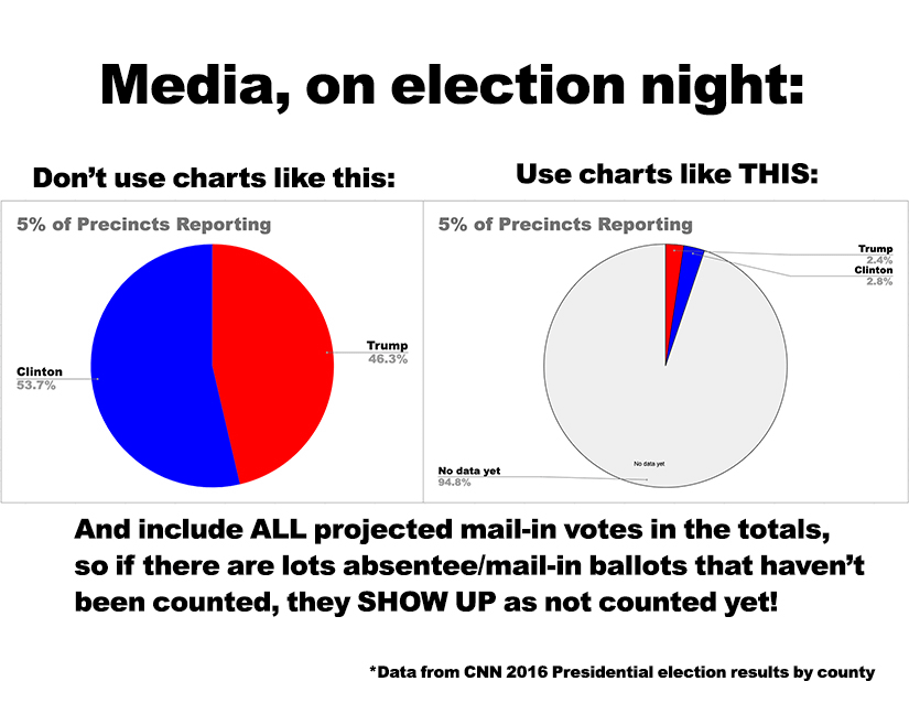
Generally results are shown not as a pie chart but as X% for candidate A, Y% for candidate B, with Z % of the county unreported. Why is that not sufficient?
brakeb on
Nah, some squid said that Clinton was gonna win, so they win…
violentpac on
Do they already know how many people have voted before they know who the votes are for?
bzogster on
I mean I don’t even recall that a pie chart of any kind is used. It’s literally just the percentages. And your suggested pie chart makes it seem like the remaining vote could go either way, when it’s very dependent on what voting areas are left. That’s why they have the county by county maps that show you where the vote is still to be counted.
yesirsky on
Yall still living in the past
GamingDragon27 on
“Political post and it isn’t Thursday” 👋😊
chainsawx72 on
I watched all of election night footage from CNN, NBC, PBS, CBS, FOX, and ABC on election night 2024, and didn’t see a single pie chart used to show election results…
Ambitious_Egg9713 on
Most coverage in the US is just bar charts or percentages. There’s always a notation about % reported which gives you an idea of how much of the vote is still out.
Presidential elections are different because of the electoral college, so usually there’s a bar chart showing the electoral votes towards 270 with a “finish line” that a candidate has to reach in order to win.
AdVegetable7181 on
Honestly, just more clarity on EVERYTHING is absolutely needed. I remember them saying that the vote counting was stopping for the night in 2020 with Trump with a pretty “definitive” lead. I then woke up in the morning to discover counting had not stopped, Biden took the lead, and was going to be president. Now, for anyone who’s gonna comment, I’m not saying Biden didn’t win. He did. But this looked very suspicious, and the reporting above would’ve helped a lot. We need to wait until all the facts are in and be as clear as possible on things. Nobody benefits from misleading information and incompetency.
oldcrow907 on
What about renaming the No Data section to read ‘go fucking vote’ instead? Apathy is killing our democracy.
PresidentZeus on
It’s common to calculate the expected turnout based on regional voting patterns like turnout, party alignment, and advanced voting. If you’re showing projections, including the votes not counted like this is stupid.
wileysegovia on
I would even suggest you portray the full pie as elegible voters, so that by the end of the night, only 60% of the pie is filled in.
Serebriany on
I would love this—my state moved to vote-by-mail a decade ago, and someone’s always pissed off on election night and the next day because the charts don’t make the “no data yet” portion obvious enough either for the state or the nation.
ieatpickleswithmilk on
If you have to label a graph with numbers to understand what’s going on then it’s a shit visual representation. Don’t use pie graphs with little slivers.

17 Comments
What’s the quote?
“Am I watching things on television that are different from what’s happening?”
Amazing
But then how would they addict everyone to staring at the screen for 7hrs and sell all those sweet sweet ad dollars?
Generally results are shown not as a pie chart but as X% for candidate A, Y% for candidate B, with Z % of the county unreported. Why is that not sufficient?
Nah, some squid said that Clinton was gonna win, so they win…
Do they already know how many people have voted before they know who the votes are for?
I mean I don’t even recall that a pie chart of any kind is used. It’s literally just the percentages. And your suggested pie chart makes it seem like the remaining vote could go either way, when it’s very dependent on what voting areas are left. That’s why they have the county by county maps that show you where the vote is still to be counted.
Yall still living in the past
“Political post and it isn’t Thursday” 👋😊
I watched all of election night footage from CNN, NBC, PBS, CBS, FOX, and ABC on election night 2024, and didn’t see a single pie chart used to show election results…
Most coverage in the US is just bar charts or percentages. There’s always a notation about % reported which gives you an idea of how much of the vote is still out.
Presidential elections are different because of the electoral college, so usually there’s a bar chart showing the electoral votes towards 270 with a “finish line” that a candidate has to reach in order to win.
Honestly, just more clarity on EVERYTHING is absolutely needed. I remember them saying that the vote counting was stopping for the night in 2020 with Trump with a pretty “definitive” lead. I then woke up in the morning to discover counting had not stopped, Biden took the lead, and was going to be president. Now, for anyone who’s gonna comment, I’m not saying Biden didn’t win. He did. But this looked very suspicious, and the reporting above would’ve helped a lot. We need to wait until all the facts are in and be as clear as possible on things. Nobody benefits from misleading information and incompetency.
What about renaming the No Data section to read ‘go fucking vote’ instead? Apathy is killing our democracy.
It’s common to calculate the expected turnout based on regional voting patterns like turnout, party alignment, and advanced voting. If you’re showing projections, including the votes not counted like this is stupid.
I would even suggest you portray the full pie as elegible voters, so that by the end of the night, only 60% of the pie is filled in.
I would love this—my state moved to vote-by-mail a decade ago, and someone’s always pissed off on election night and the next day because the charts don’t make the “no data yet” portion obvious enough either for the state or the nation.
If you have to label a graph with numbers to understand what’s going on then it’s a shit visual representation. Don’t use pie graphs with little slivers.
Wait the US still has elections?