
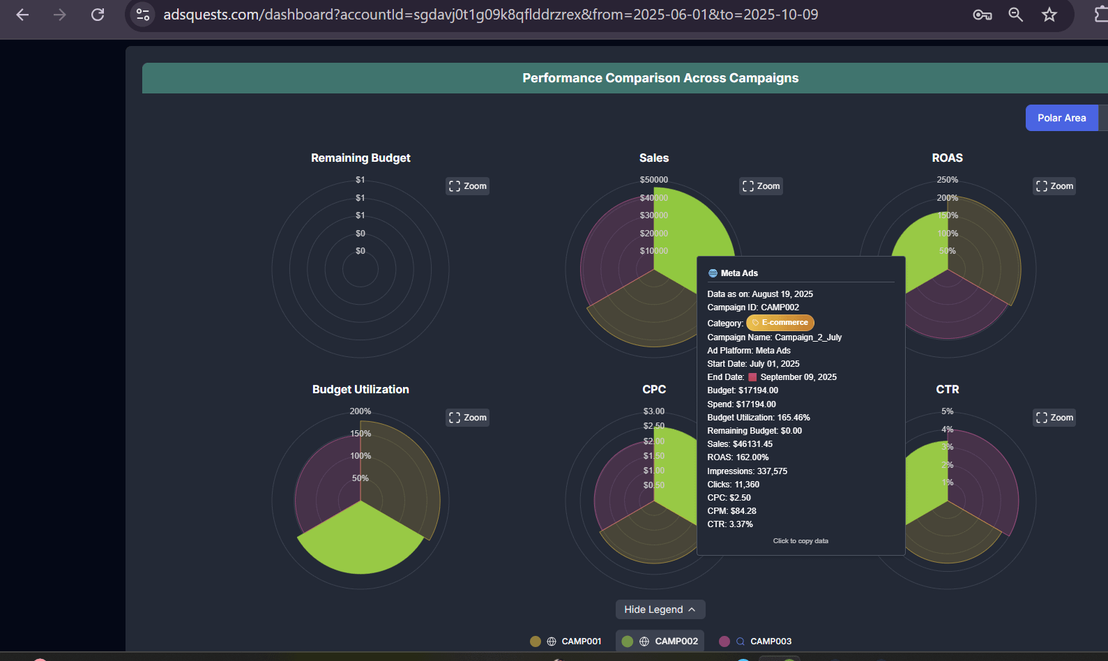
In an effort to get a quick, comparative overview of our ad performance, we created this dashboard showing how three different campaigns stacked up against each other. It visualizes several key metrics, like Sales, ROAS, and CTR, to help us identify which campaign is performing most effectively at a glance.
Aggregated data from our ad campaigns, anonymized for this visualization.
The dashboard was generated using Adsquests, a tool I built to automate ad reporting and centralize data.
This visualization provides a quick, comparative view of three different ad campaigns (CAMP001, CAMP002, and CAMP003) across six key metrics. It uses a polar area chart format to make it easy to see the performance spread and compare each campaign's contribution to metrics like sales and ROAS.
I'm happy to answer any questions about the data or the visualization process.
by Superb-Way-6084